https://www.facebook.com/photoproonline/videos/101551076
https://www.tedfordphoto.com/
http://photoproonline.com/photo-products.html
http://www.artcellarcr.com/


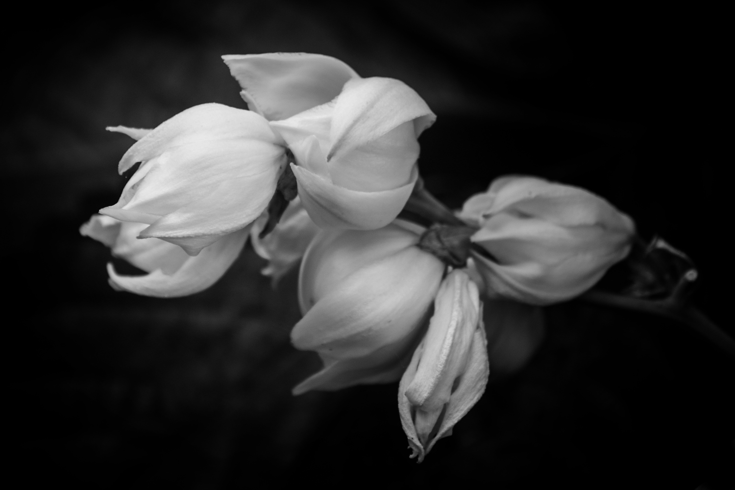
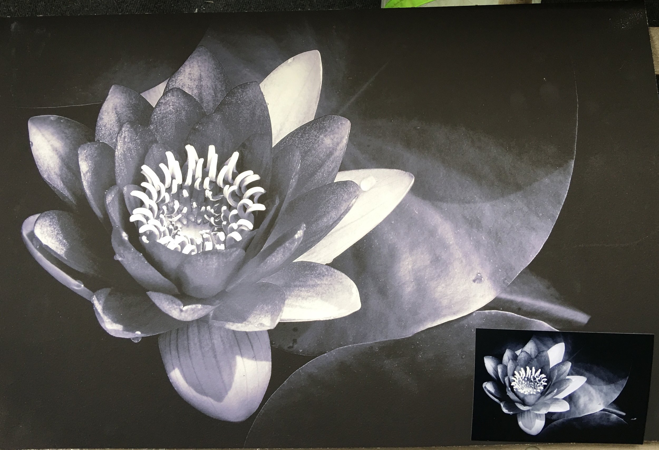
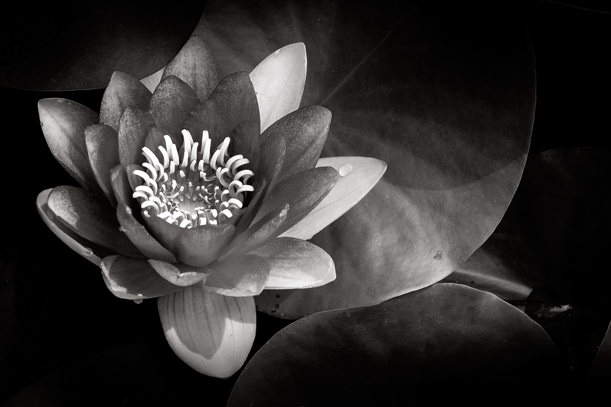
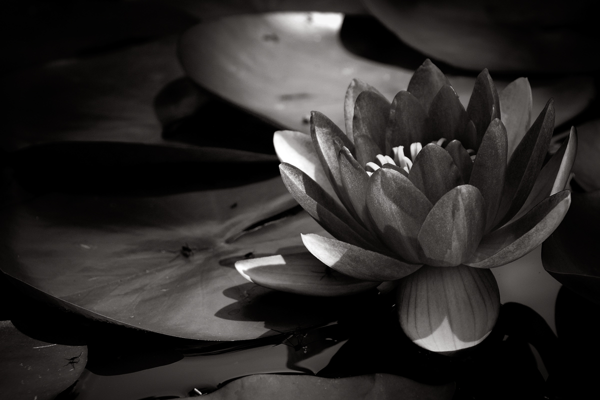
The third and last image I felt was one for the hospital was this waterlily opening up for the first time. A new flower breaking through and opening up for the first time in the sun with some peddles not fully stretched out. Again, the spot light on its coming out with the pads playing a support roll.
Why I chose this one;
Like the last image this photograph has layers created by the light that gives subtle details pleasing to my eye. I find the reflection of the flower soothing as water can be in an image whether it is a painting or photograph and the bug in flight give scale to the subject.
Compositionally the motion of my eye is circular but I don’t have as much detail as I did in Waterlily; Absent of Colo, but that is not to say that this image is devoid of interest. The main pad that leans against the flower has patterns that pleasing both on the bottom and edge on to us. Moving along the edge I can see the motion of the bug in flight pushing me to the back and into the shadows and eventually around to the reflection of water. Reflections I find peaceful, calming element of water. Under the surface of the water is the pads moving to the edge of the main pad again. Like the one image before this works so much better in black and white. There is more depth to the story of this image without the color that I feel influents emotion and motion.
What do you think? Now that I have shown the three images it is time to decide and maybe have a conversation the broader picture. Let me know what you think. Is there at least one image you believe is the best or maybe I should start over with a whole new set. Maybe I shouldn’t bother with it? Leave your comments or email me and the one you pick. One lucky person will be chosen to win their pick, enlarged, matted and signed.. Thanks again for your feedback and feel free to pass this or any other post along.

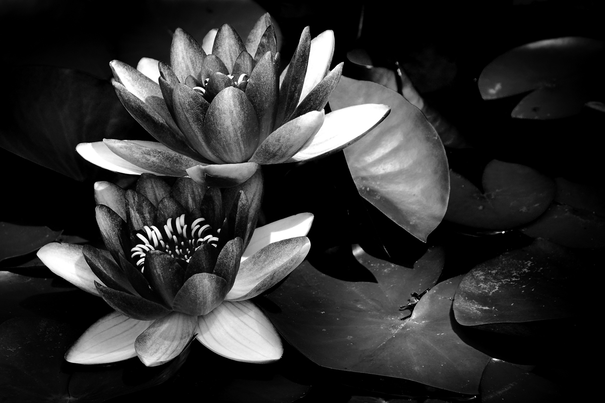
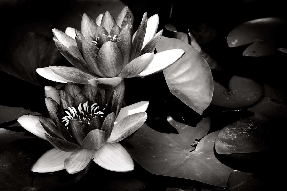
The second image I had chosen is this image of my waterlilies in my back pond. This was the template I had used in my head for the Yucca plants. The success of the direct sun and the dark shadows grabbed me. It reminds me of a film noir as far as the scale of gray tones from the dark shadows to the bright whites. This is probably the more successful tonal range in a black and white that I had accomplished.
Why I chose it.
Light, I chose to photograph this subject because the layering of light brings out and the details throughout this image that holds my interest. My eye is drawn first to the flower itself, bright, detailed and textured in the grayscale of the darker peddles. The lighter peddles has a look of collar, reflecting the light on to the subject of the darker and a separator from the leaves around it. Though the flowers are in the spotlight my eye doesn’t stop there but move to the right and down following a circular motion of the leaves. Each pad having just enough light falling on it to give detail and motion from front and moving to the back into the shadows. With the light and softening of focus I can’t help feeling that there is depth to the composition that compels me to explore.
I find beauty in compositions that have depth and motion pleasing to the eye and emotionally gratifying. I did not get the same feeling from the color version of this photograph, in fact I felt conflicted by the red of the flower and the lighting of the subject. I could not get past the red to explore the rest of the image. The red of the flower essentially flatten the composition and stalling the motion of the image. By switching it to black and white the image came alive, more interesting leaving me wanting to look from the bright whites of the flowers to what was hidden in the shadows. Like a good story, this image has layers that moves us through the image, to leave and return to discover more.
I know they are only flowers and the depth I see maybe self-serving but I do think this image has a story and moves the view not only to search the image but upon returning, find new details missed from before. To me that is what I am hoping for, an image that is not only pleasing but one that makes you want to look at more than a few times. This is why I feel it would be a good image to donate to the hospital.
What do you think? Am I reading too much into it? Is this a good image for the hospital or not? I’d like to hear from you, good or bad. Leave a comment or email me what you think so far and you could be picked to win a matted and signed copy of your favorite image.
Thanks again and feel free to share this or any other post.

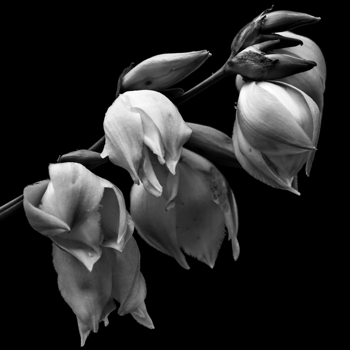
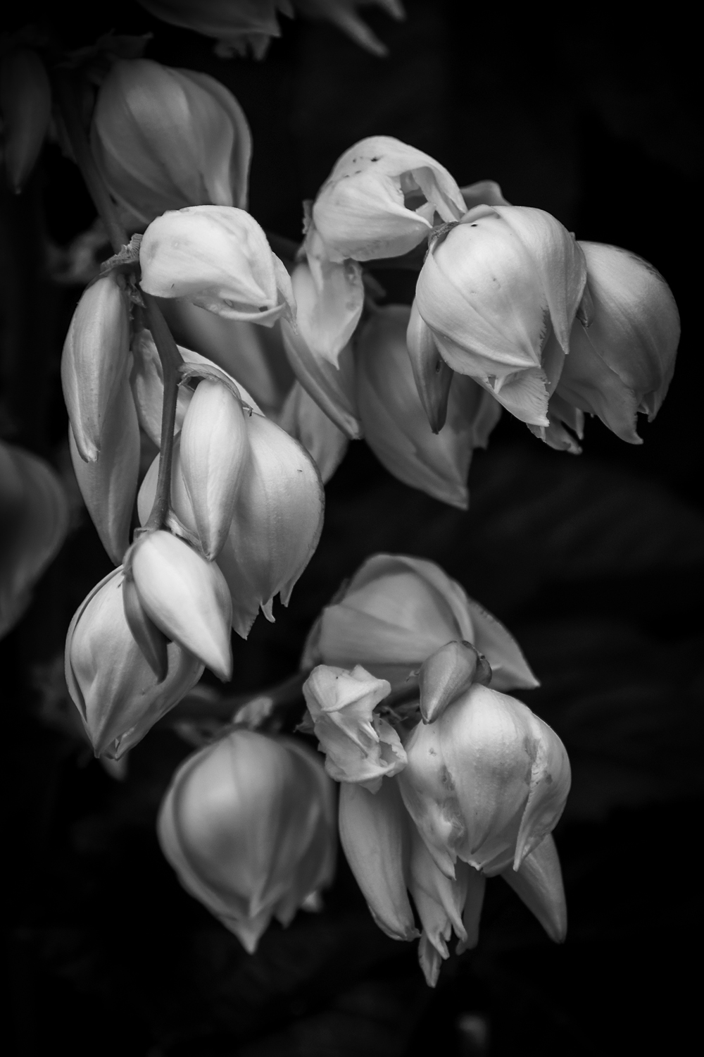
This is the first year I got out and photographed the Yucca Plant in Bloom and I am glad I did. Last year I did not take the time and create a group of proper photographs of the blooms as they should have been. The difference from this year to last, I think is the fact I took the time and had the vision of light I wanted. Of course, when the Yucca plant bloomed the light I was seeking wasn’t there and instead I got this spectacular light instead. Happy accidents are sometimes the best.
This is the first of tree images I have chosen to donate to the hospital and here’s is why.
First thing that I am drawn to is the quality of light. Soft, delicate light that wraps around the peddles of the flowers, pods and branch of the plant. The light’s ability to show the detail in the highlights, the ridges and lines of the blooms show up so well against the black background. This quality not only shows up in the whites of the blooms but the pods. The rich texture of the pod is captured so well in both the highlights and shadows of the image.
The subject matter is simple in composition which give a minimalist feel to it. As a viewer, I am not overwhelmed with what to look at. I can take my time and discover new details of the photograph without feeling the need to take it in all at once. I find it pleasing to start with the highlights of the blooms and move my way through the that detail then to the mid-tones and finally to details in the shadows. I also find the tonal range pleasing. The lack of great contrast between the background and subject matter give a since of peace, relaxed feeling when I view this image. Had I gone with a harder contrast I would have had a feeling of tension with this piece.
Finally, the composition; a soft diagonal line in a square format. The downward line of the main branch is not steep. This is repeated in the line of the bottom tips of the blooms as well as their positions and size on the branch. For me this shallow line does not add tension to the image but helps the viewer slowly move through the photograph. Had it been steep I know it would have given an unintentional speed in which the eye would have traveled form the top to the bottom corner, while missing details.
Over all I find this image peaceful and would fit very well with what the hospital is trying to do. Beautify and give an emotionally pleasing image to help lift the spirits of their patients as well as visitors. I hope if this or one of the others are chosen that the views find it as pleasing as I do

I would like to hear from you. Help me choose one out of the three images and you could win your choice in a 8x12 (or 12x12) matted and signed. Just leave a comment or email me your choice and on Aug 12 I will announce the winner. Thank you for your help.

Links: Ted Forbes: The Art of Photography
Now I did mention a podcast he does and you can find it on ITunes , but the bulk of work is on his YouTube Channel
Here is the first of hopefully many audiocast or podcast that I do. Enjoy


I’d like to say that I am a professional photographer making a great living off the images I create. Maybe someday I will be able to say that but now I can’t. Instead, I can say I am an amateur photographer who has a job to help pay the bills and support my passion for photography. And I can say this knowing that I am not alone. Many photographers have jobs that has little or nothing to do with their pursuit of photography and that is okay. Well it’s okay for me now. But I do think that my other job is a good part of who I am. See I am, by profession, a Phlebotomist, a person who draws blood for a lab. In this case I work for a lab in a hospital and I love what I do. This profession has nothing to do with creating images directly but indirectly it does. This job is a part of who I am, a caring compassionate person who is willing to do what it takes to help you get better.
My job is to collect the blood from the patients in the hospital, in the correct tubes with the proper amount without damaging the blood cells. Now overall it seems like an easy job but let me tell you it is not. There are many things that could go wrong; pull too hard and you can rip blood cells apart and depending on the test, you will have to go and recollect it. Blood bank tubes have to be perfectly hand labeled and if they are not then you must recollect. And for the obvious, no one likes you. You are the person who inflicts a bit of pain each and every time you visit them. So how does all this indirectly contribute to my images?
This job helps me see life in it fragility. Every day I can experience someone’s worst day and another’s best day all in the same 10-hour shift. In the ED I have seen the aftermath of gunshot wounds, stabbings, motor vehicle accidents, one’s own stupidity and much more. I have seen a fair share of people die and the devastation that has on a family. I have also experienced joy of a new member of the family in the birth center. The great warmth of love surrounding the new family member who is now in the arms of parents. I have also seen that love in the ending of one’s life. The family surrounding their parent or sibling who has lived with an illness and it is time to remember, laugh, cry, and let go. I have seen all that and it has left its mark on me changing me and the way I view life and my work.
I can’t say exactly what image best illustrates this, maybe I could say it is my Yucca or Lillie’s series that puts my experience in the art. I just know I am a different person because of this job and that I want to express that in my images or start to. I believe that if people were able to see what I see every day then we would change the way we treat ourselves and people around us. That we would take just that one extra moment to lend a hand to a stranger or do something healthy instead of sitting in front of the TV. Maybe change the thought that “we don’t matter” to others when we see the impact a suicide has on family and friends.
I might not be the most loved person in a health care setting but what I get out of my job is the satisfaction that I make an impact on lives as well as my job impacting me in a positive manner. Not many people can say that.

A few days ago, I created this image of a barren branch of a Yucca plan. With the peddles of the blooms all but gone I felt that this image was a statement on three levels about life. First is our need for everything to its perfection. Second is the fact that things in our personal life changes and the blinders we put on to the world around us in order to deal with it. And third, the beauty in death and the life that flourishes around it. I see these things more so now than I had before and it comes from the stage of my life that I find myself in. And because I see it in nature I feel I can draw comfort from it when it gets hard to press on. So here is what I see when I look at this image.

Perfection, or the lack of it. Normally when most photographers create an image they take in account the light, time of year, the state of the subject and the final image. If most of the criteria have been met then the image is created with the knowledge that any flaws found will be corrected in the editing stage. But I find that even in this stage of defoliation still to be a perfect image because it embraces the flaws as well as the beauty that surrounds. In society of today, we are so obsessed with perfection that we can’t tolerate the flaws in our lives. This is displayed so overtly in the way we present ourselves in public and on our social media pages. Anyone who doesn’t fall into our box of perfection is often shunned and relegated to the fringed where “those people” belong. We don’t even tolerate failure. Failure is the way we move forward and learn but to fail in our society risks a negative stigma therefore it is tucked away in a dark place. I have failed and I celebrate this not because I have, but because I learn and move on to succeed. If we just would open up and let people know that it is okay to fail and not to be perfect we may not have so many people to move forward in their lives.
This image conveys to me about personal change, and how we may feel isolated and things have stopped, but it doesn’t stop. If we just look beyond our bubble we can see the beauty around us and with that draw courage and comfort to move on. In my life, there has been a lot of change that I have been processing, some of it well and some of it I choose to ignore. My first bit of change is the fact that my Son has grown and move out, which you would think I would celebrate and I am in ways. The part I find sad is that the time we had with him as a child is gone and as long as his childhood seemed, it wasn’t. Sometimes I think about in a few years we maybe involved in a wedding and then grandkids. On the surface that seems cool but it is just a reminder of my own mortality and that that my time is growing short with so much yet to accomplish.
I also feel that this image is analogous to the beauty in the changes of life. Even in death, life around this barren branch flourishes and continues. Despite this branch looking dried and brittle, in a few weeks seed pods should be sprouting from them to begin life’s cycle again. This brings me to my thoughts of my parents who are in their 90’s. A part of me had always thought that my parents would be there for me, to be the solid foundation that keeps life stable. The subtle changes of aging are often missed as a child and sometimes a young adult. It is when you are not constantly around them you see the toll of years drawn upon them. Still we ignore the inevitable as way not to be paralyzed by their impending end, but a way we can celebrate the life together. I believe that is why a sudden death of a loved one or even an acquaintance hits us harder than someone who is suffering a terminal illness. With someone terminally ill we can prepare for the passing of them. Where is a sudden death we are still in the stage of denial that it will happen.
I know this is a lot to read into an image that is just a dead branch in soft lighting surrounded by green leaves, but that is what I see. I plan to do a series of these life and death moments throughout the summer and fall. Who knows I may put them together and build a book or hang them on the wall for a show. I guess we’ll see as the time comes.
I wanted today to write about my favorite image I have at this moment. I feel if I explain what I love about the images I feel are my best then as a viewer you may have a better understanding of my work and me. The photo I am going to talk about is one that I had created with an image in my head but when it came time to photograph it, well things weren’t exactly what I wanted. But that is okay because the image turned out much better than I anticipated. I could have waited for the right conditions but the subject matter had a short life span so it was a make the best of it situation, and I did.

So, what I love about this image:
The first thing that catches my eye is the soft light that wraps around the pedals of the flower. It is just the right amount so that the deals in the highlights are there. To many times I have blown out the highlights and the soft details are gone, spoiling the overall image but not his one. The softness of the light adds or enhances the delicateness of the flowers, even to the flowers that have expired. They too are soft even though their form has collapsed and dried up in their death. As soft as the highlights are so too is the shadows. I find the soft shadows of the blooms complement the contrast the highlights, soft and rich with detail. Had I used the sharp sun as I thought to, the harshness of the light would not have complement the softness of the subject thereby wrecking the whole concept of the image.
I also love how the darkness that frames the subject and gives an overall punch to the image. This is where the contrast is best as a frame and not in the actual subject. So many times, I have lost details in the shadows that could have made the subject more interesting but instead I used the dark or black as a complementing or secondary subject to give it a punch.
I love the shallow depth of field that I created with choice of lens. There is a vine growing in the back of the Yucca Flowers and in combination of defused light and shallow focus I got a modeled background that adds depth to the photograph. As the background is blurred so is the subject. The brightest and the blooms closes to us are sharp with the focus gradually softening the farther you look back. This to helps give a depth or dimension my subject that in concert with the highlights and shadows gives a feeling of realness to the photo.
I am also drawn to the fact that each bloom is not perfect. There are blooms at their best mixed with the ones that have expired. I see this as a metaphor for life for me right now. If I were to take one at either it’s best or worst, individually the image would fail but in combination it is successful. That is the way I feel about us. We celebrate and idolize the perfect person in looks or successes at that moment and not recognize all the failures and ugliness of what people go through to arrive to that moment. To even expand it further, as a collective we move forward and succeed no matter what stage of life we are in the group.
If you like this or any of my images and would like a print, please contact me and we can work out the details. And as always if you like the post please share. Thanks!
I felt that I needed to expand my previous post about making a print. I would like to say first that I have made many of my image into prints before but all of them were on photographic paper and not the watercolor paper. My favorite paper to print on is the Metallic Paper that Kodak produces. Talk about pop of rich colors and contrast. What I am inexperienced with is printing on different media of paper and inks and with the last image I learned I needed to do a little more research before committing to it.
So here is what I envisioned; I wanted this water lily printed on watercolor paper by an inkjet printer and have the look of a photograph. You know that pop of contrast of darks and lights. I wanted then to have ruff torn edges and then float it in a matte and frame it. I was excited about the image I selected and the proof was perfect in the look I wanted. A week after I dropped it off I picked it up and instead of being excited I was disappointed. It was not the printers fault. The image matches the proof but it did not have that pop I was looking for. And why? Because it is the medium I printed on. What I wanted this paper to do was not going to happen. My concept for the image was spot on but the reality was that what I wanted was not happing. All is for not. I will still matte this print and sell it because it is a great print even though it doesn’t fit my needs. I will just make this image as well as the rest on photographic paper matte and frame them as normal and maybe explore this paper for other images later.
In this digital age, it is very easy to make prints on almost any medium you want. But as easy as it is to print, it can and will go wrong if you don’t choose wisely. The myriad of surfaces, textures, papers and even metals can be overwhelming with all the possibilities they offer. I had mentioned the Metallic Paper earlier; that is a great paper to make your colors and contrast pop off the walls in almost any light but I wouldn’t use it for a portrait of a person. I am sure that the watercolor paper I chose for this project would be great for an image that is soft and low contrast. It just did not meet my expectation in which I falsely had. So, I guess one of the lessons I learned and want to pass on is that you must be careful about what you print on. Do your homework on your medium before you print in order to get what you want. And above all print your work! Which leads me to this next thought.
The digital age has hurt the art of photography by reducing the desire to print. It is so easy to create an image, work it in PhotoShop and put it on a social media site or two and wait for all to “love” it. Before social sites and digital images, we developed the film, worked the prints in the darkroom to then produce that image in quantities for our audience so they can hang it on their wall. Instead those walls are not at their home but their phone or Facebook page. And those walls are not just where art lives but family portraits hang there as well. Why? Is your family portrait not important enough to grace the walls of your home? I understand the need to carry their images of loved ones around. We have done this for ages but instead of phones it was in our wallets and billfolds. That still doesn’t explain why we don’t hang their images on our wall. Do we not love them enough? I wish I knew the answer.
In this age, many photographers are trying to be different by going back to film or doing tricky manipulations on the camera or in PhotoShop to set themselves apart from the rest. But not enough of us are printing our work. So here is a challenge I echo from a few others. Find an image you love, research the medium you would like to print it on and make a print. But don’t stop there you must matte and frame it to hang on your walls. It’s time to turn the tide of just having images on your phone and social media pages to having prints on your wall. And if your images do not move you to make a print of your best one then you are not making good images. When you have accomplished this task photograph it on your wall and post it on twitter with the tag #PrintingMyWork. I will look for it and post it on my page. Hell, all of us can retweet that to help spread the word. It’s time to start printing again.
Well I have picked up my print and I am meh about it. The printers did a fine job and printed exactly to the proof but I think where I feel it to be a loss is in the punch of the image. I think where I went wrong is not understanding the medium I was printing on. I was hoping that I would have a lot of the qualities of a photograph on the paper when it was never going to happen. But all is not lost
This is what the image has going for it; it is sharp throughout the image. There are no blown out whites or funny digital hiccups that detract from the image. The greyscale is exactly as I had created it and the dark are full. There is not a flaw in the print anywhere in this print. The only thing I don’t like is the lack of a punch in contrast that you get from a photographic paper. With that said, I am not going to trash it but stare at the print for a while and figure out what to do with it. I may just matte and sell it and let buyer frame it themselves. I am, however, going make a large print of the same image on photographic paper.
But to counter that small disappointment I created some images of my Yucca plant that is blooming in the backyard. This is the second year in a row that both plants have bloomed and so I took advantage of my day off and defused sunlight to make these images. Two of these images are shot in front of the vine plant growing next to it. I find that the green textured leaves of the vine plant make a great modeled background when it’s blurred out. The last one is done with black side of my reflector to hide what was behind the flower.
I really liked the soft defused light in the images I created and feel that it is the key that makes the photograph despite what I had originally planned. I was looking for the sunlight streaming through the tree to create drama of highlights and shadows that are in my water lily photographs. Instead I kept battling the high think clouds of the morning so I just went with it and ending up loving them more then what I had planned. Funny how that works.
If you love these or any images on my site feel free to contact me for a price quote on any size of print you want, as well as any questions you might have. I would love to talk to you. And if you have enjoyed this post or the images I have created, feel free to share I would appreciate it.
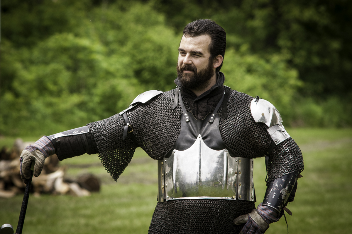
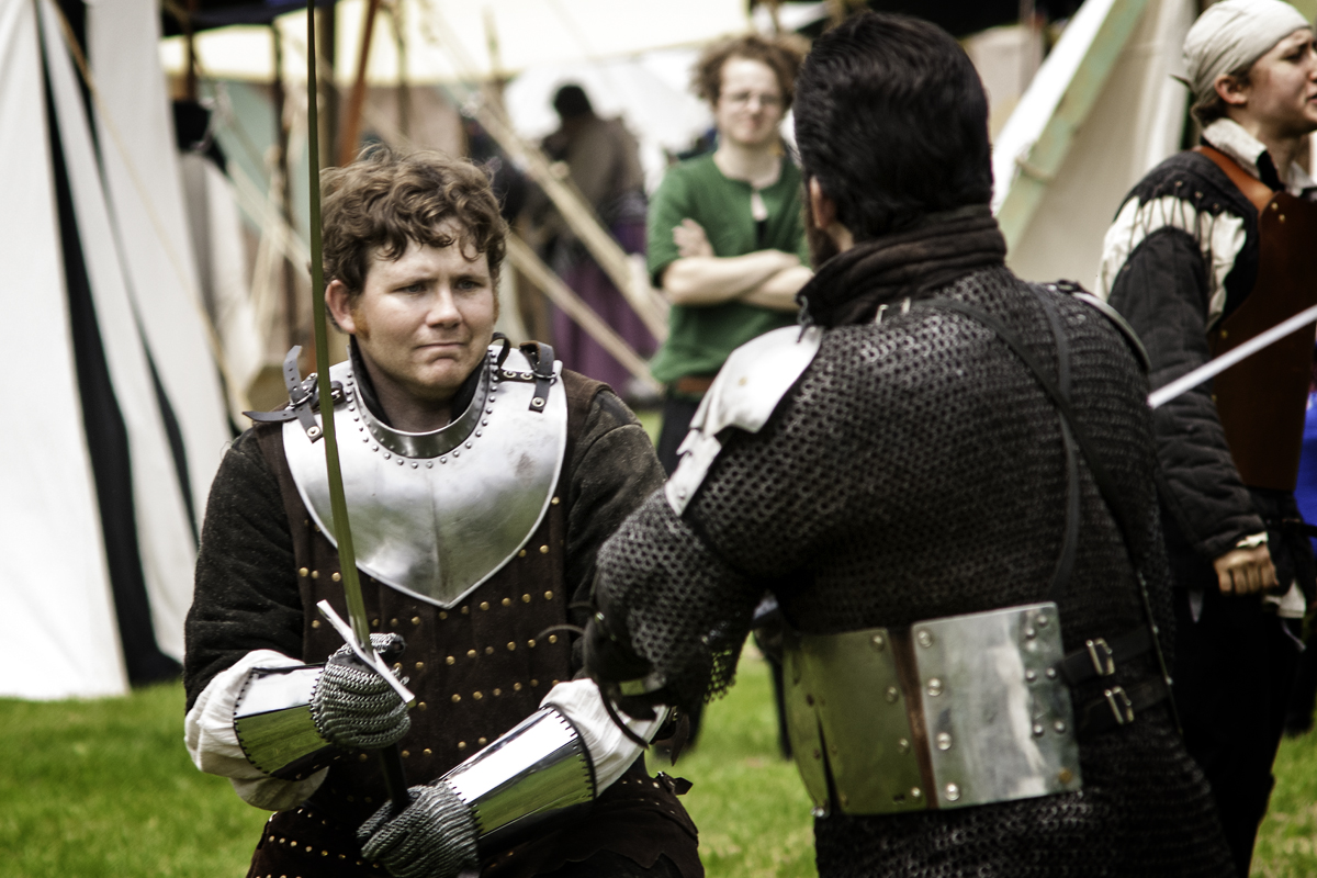
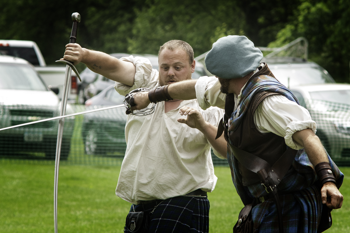
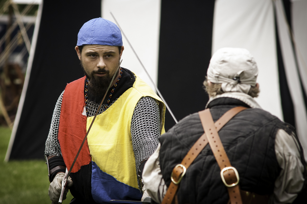
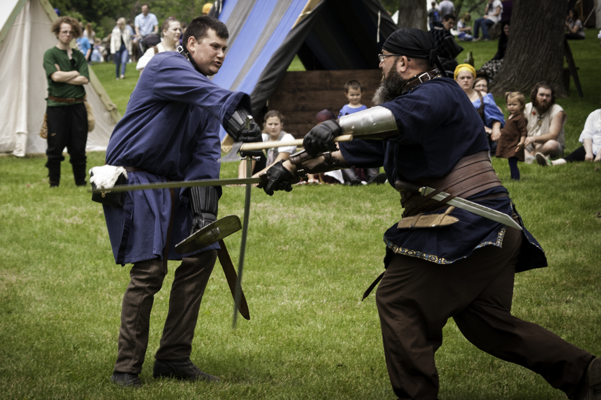
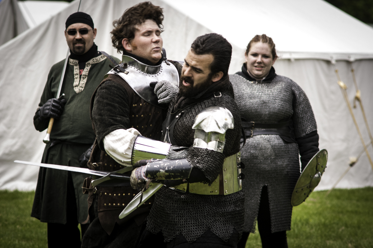
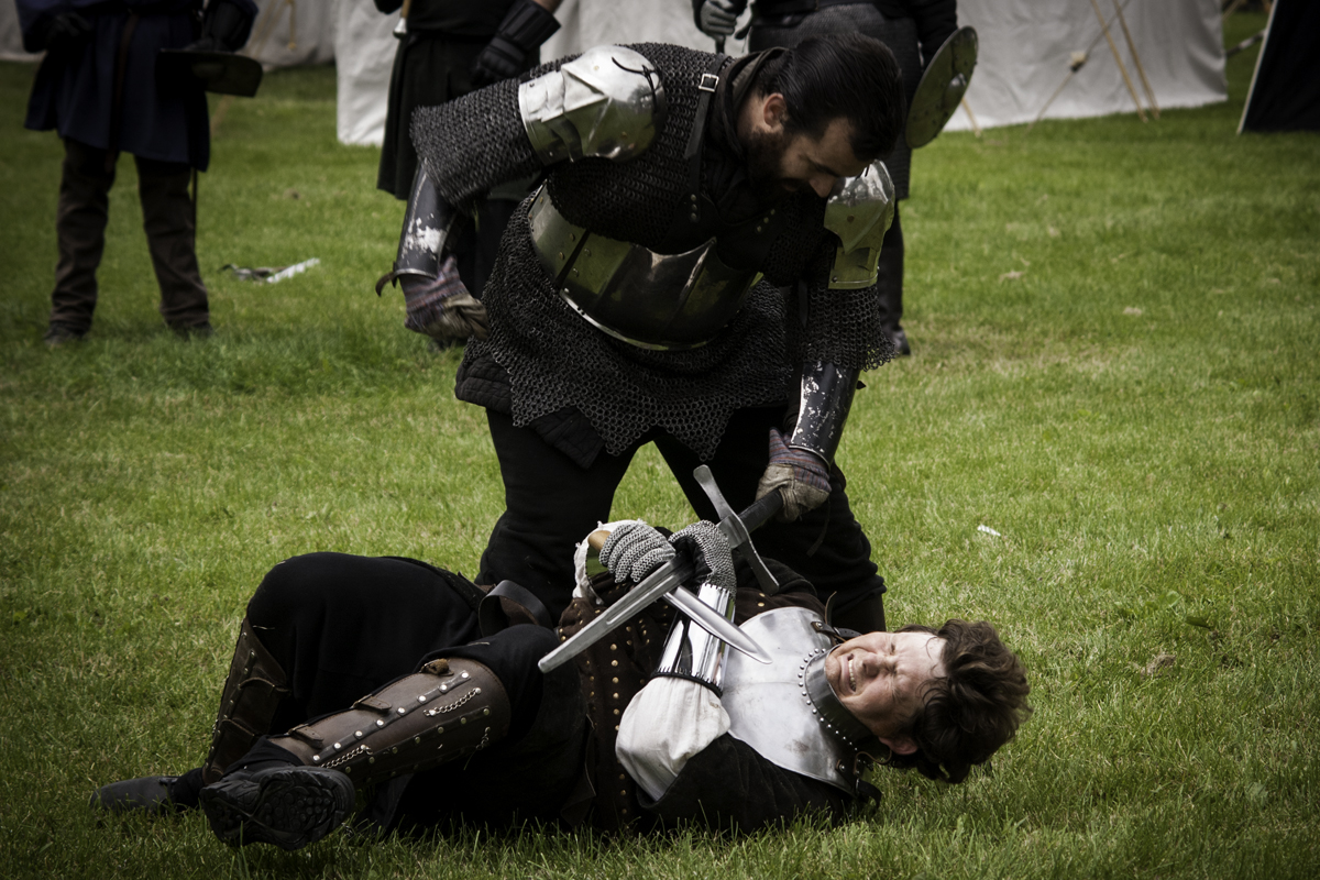
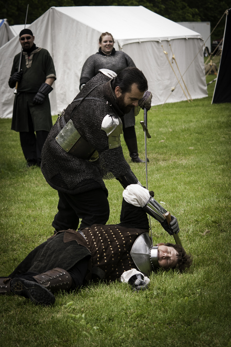
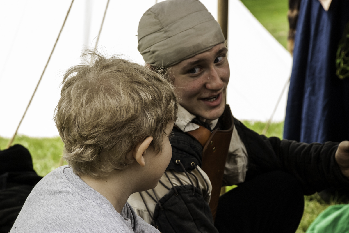
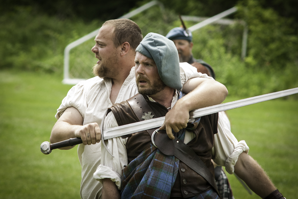
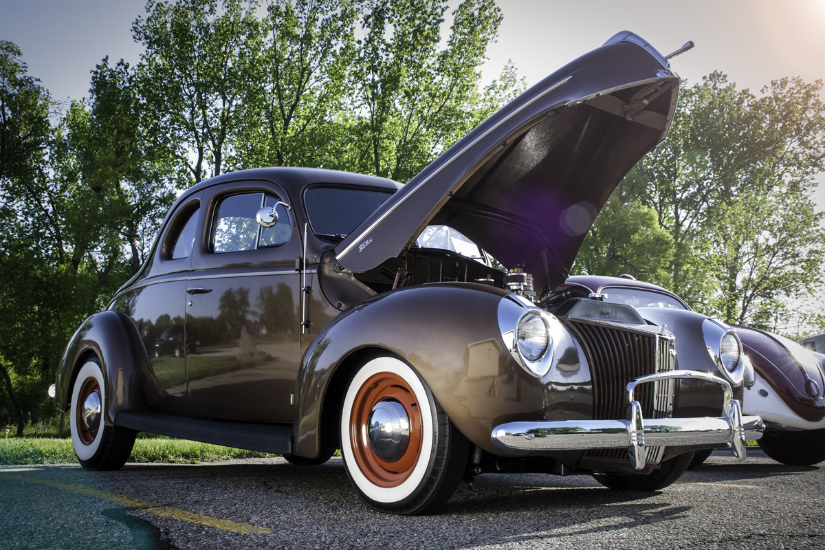
For the past several weeks I have been training, or should I say retraining at my new job. Unlike the group of lucky few photographers, I have not made my passion my fulltime vocation. So, I work as a phlebotomist at a local hospital to support my habit and pay my bills. I started in April and after a couple of months I am now on a solid schedule of 4-10 hour days with having to work every 3rd weekend. My goal is to build my photography up so that I can work part time in a few years. In-between my training I have taken photographs of my son and his Renaissance group at the annual fair, a car show and wedding.
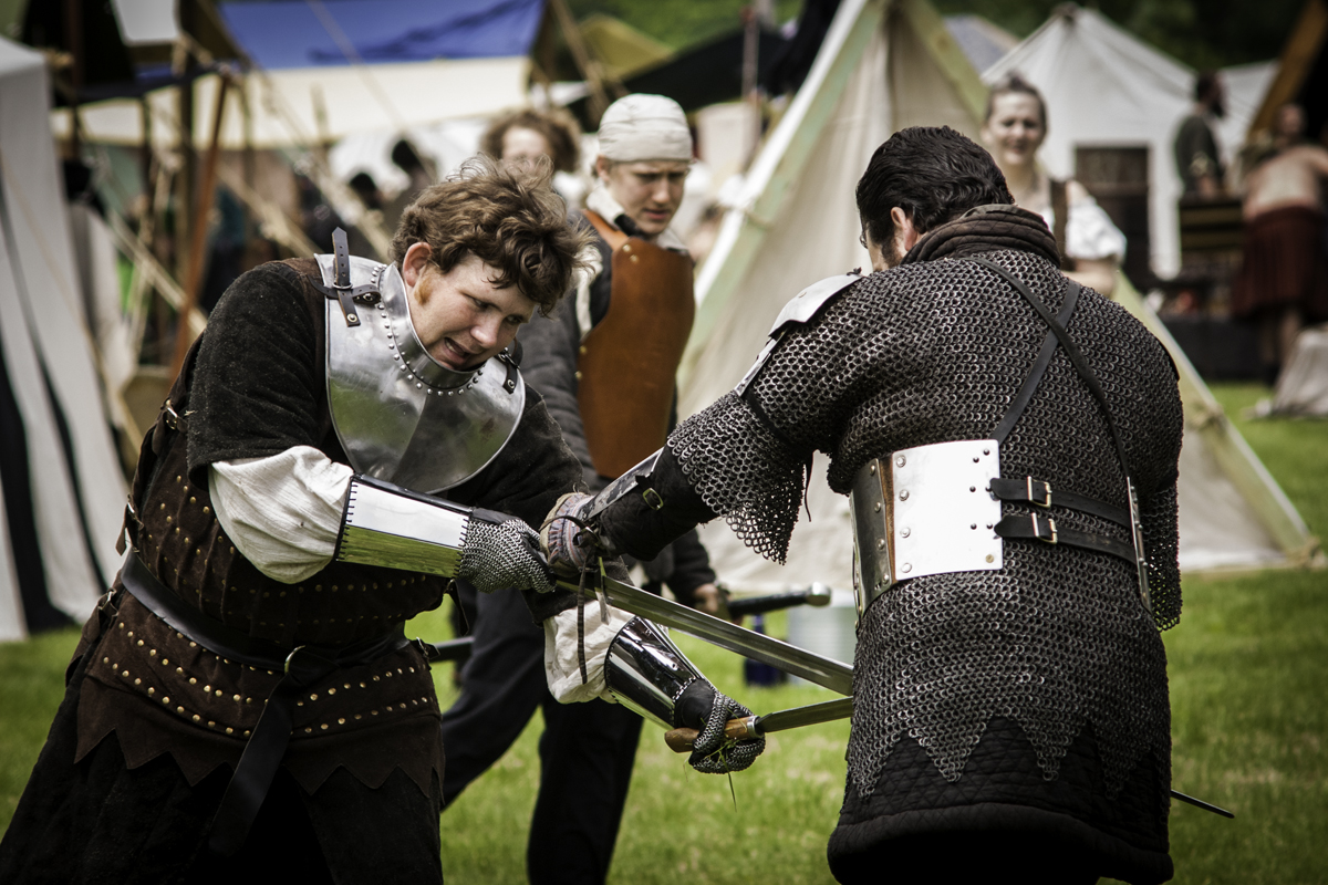
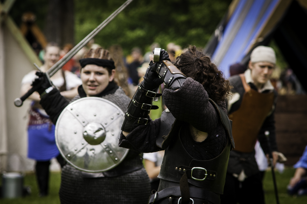
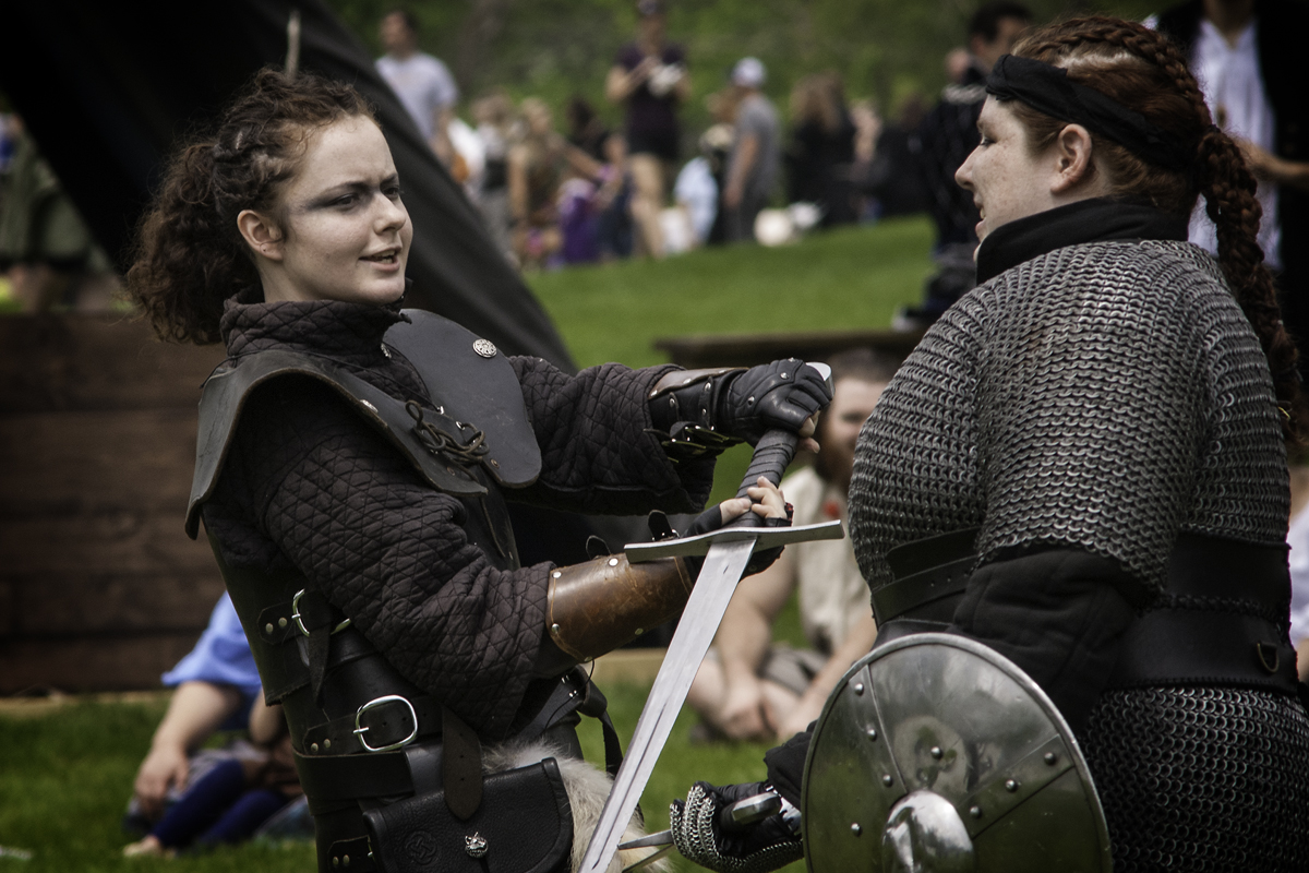
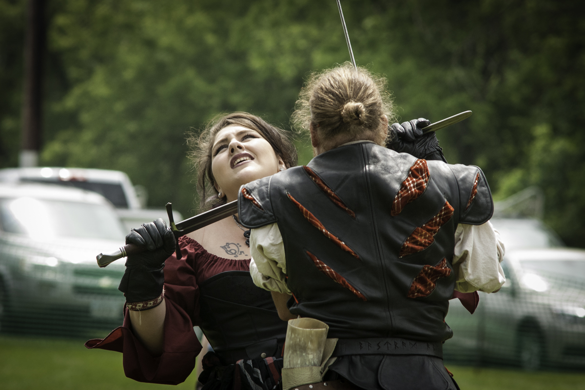
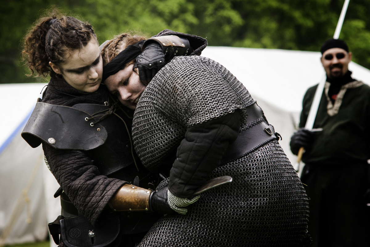
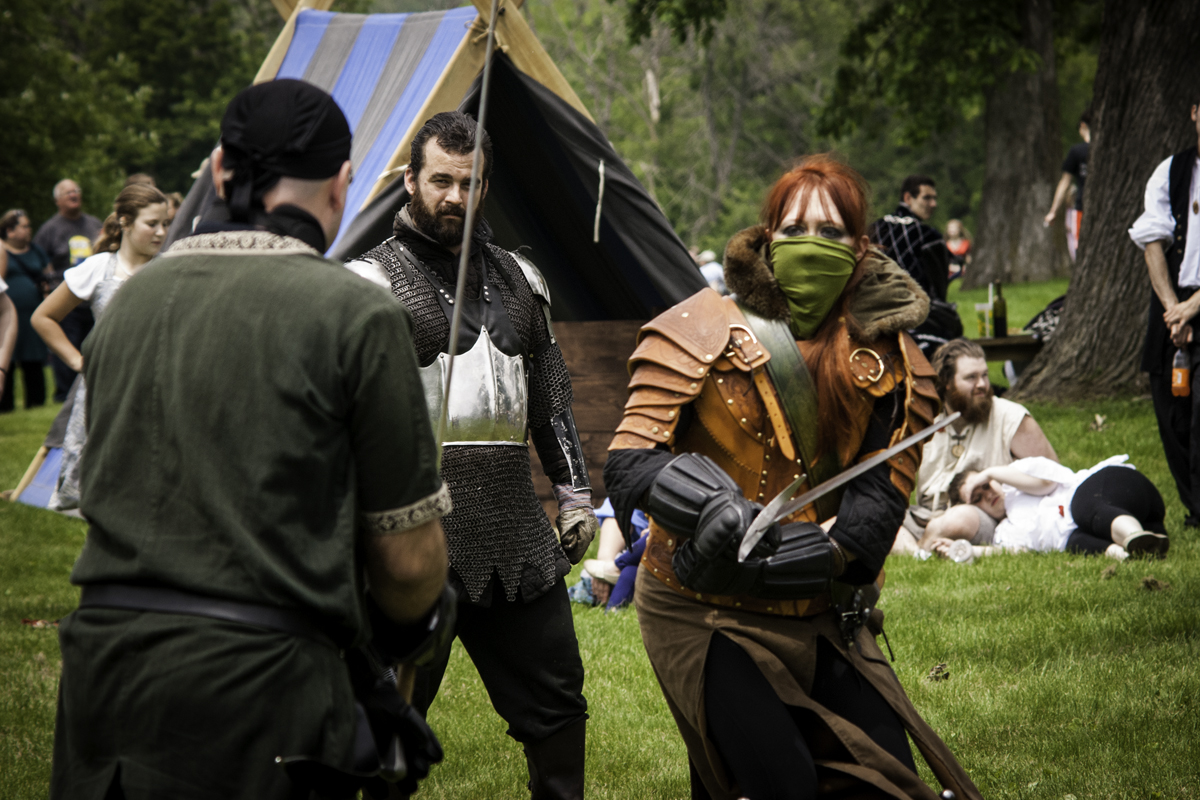
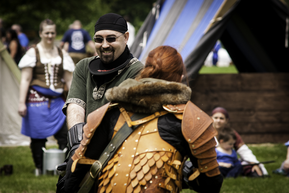
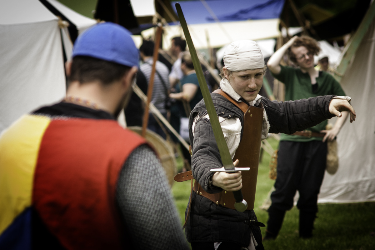
The Renaissance fair was such fun to photograph and surprisingly, the photos turned out better than I had hoped. I usually use a kit lens but this time I wiped out my 70-210 F4 E series Nikon lens. It’s a step between the Nikor lens and a Kit lens. Oh, and did I mention it was a manual lens so yeah that made a little more work for me. I was pleasantly surprised that I did not miss a lot of shots due to soft focus, in fact that lens was better than any of my new lenses I have. It’s the glass I tell you that helps make the shot. Here are a few of my favorite shots. The last few shots were of another troop that my son is not apart of, I just enjoyed their group. And yes those are real and they do fight with swords, javelins and knives.


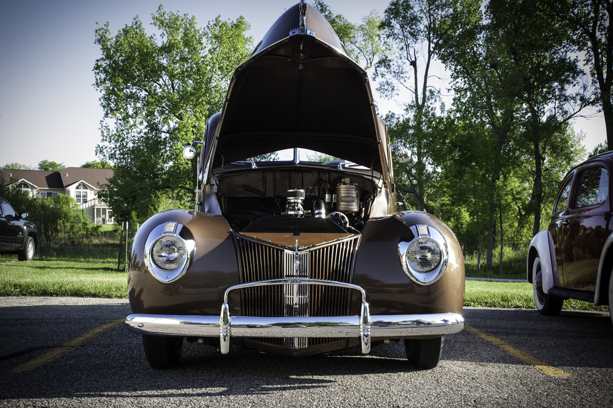
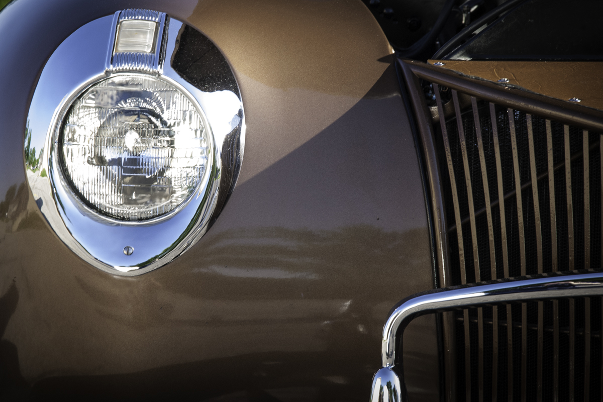
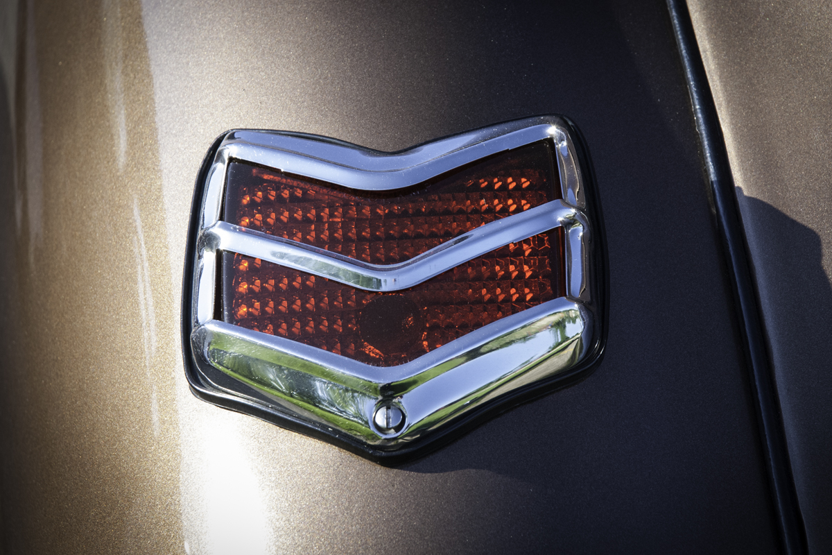
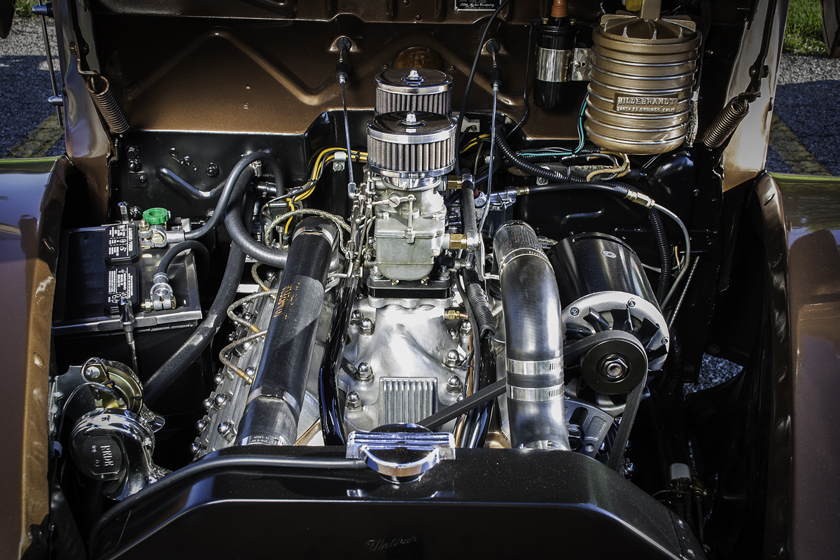
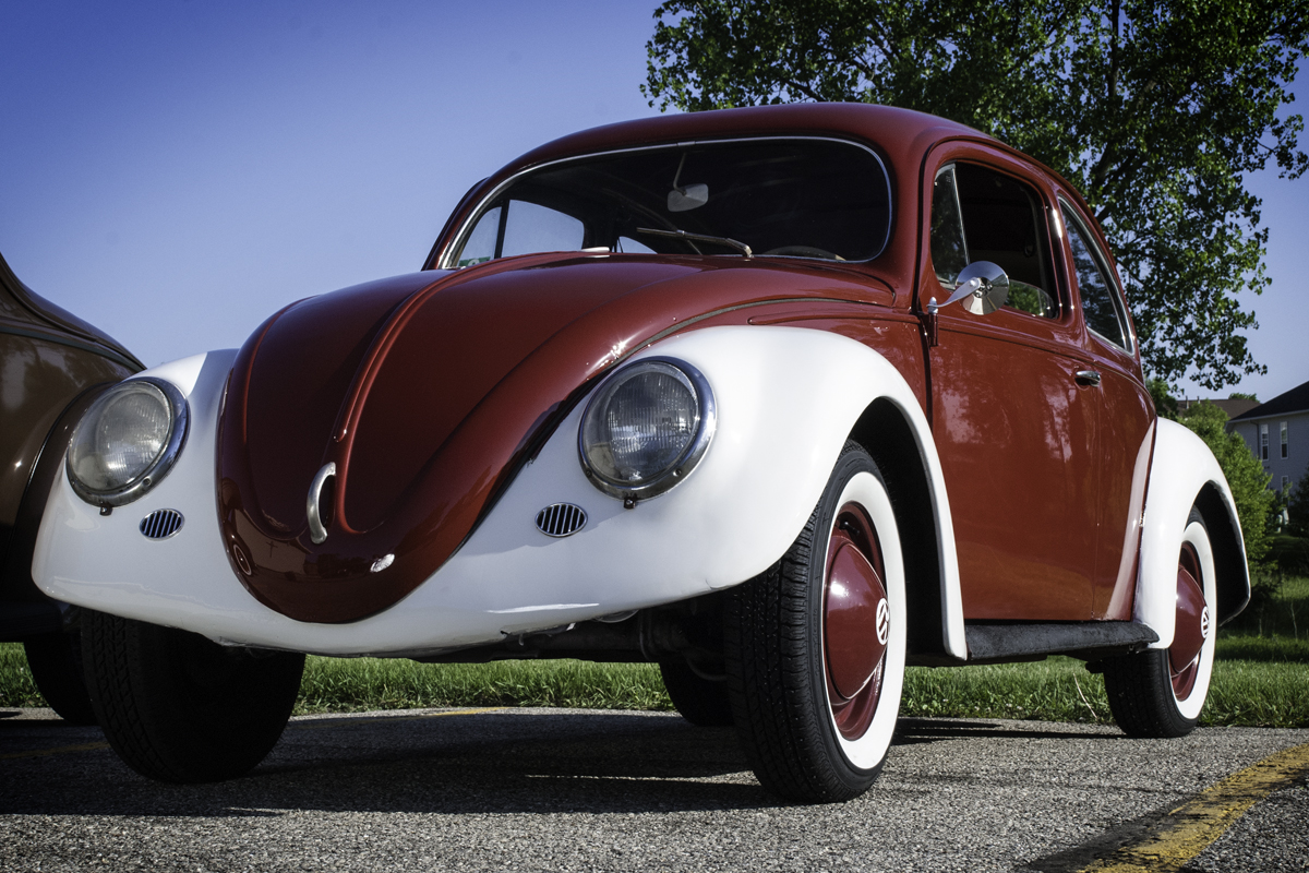
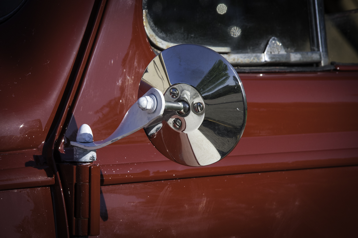
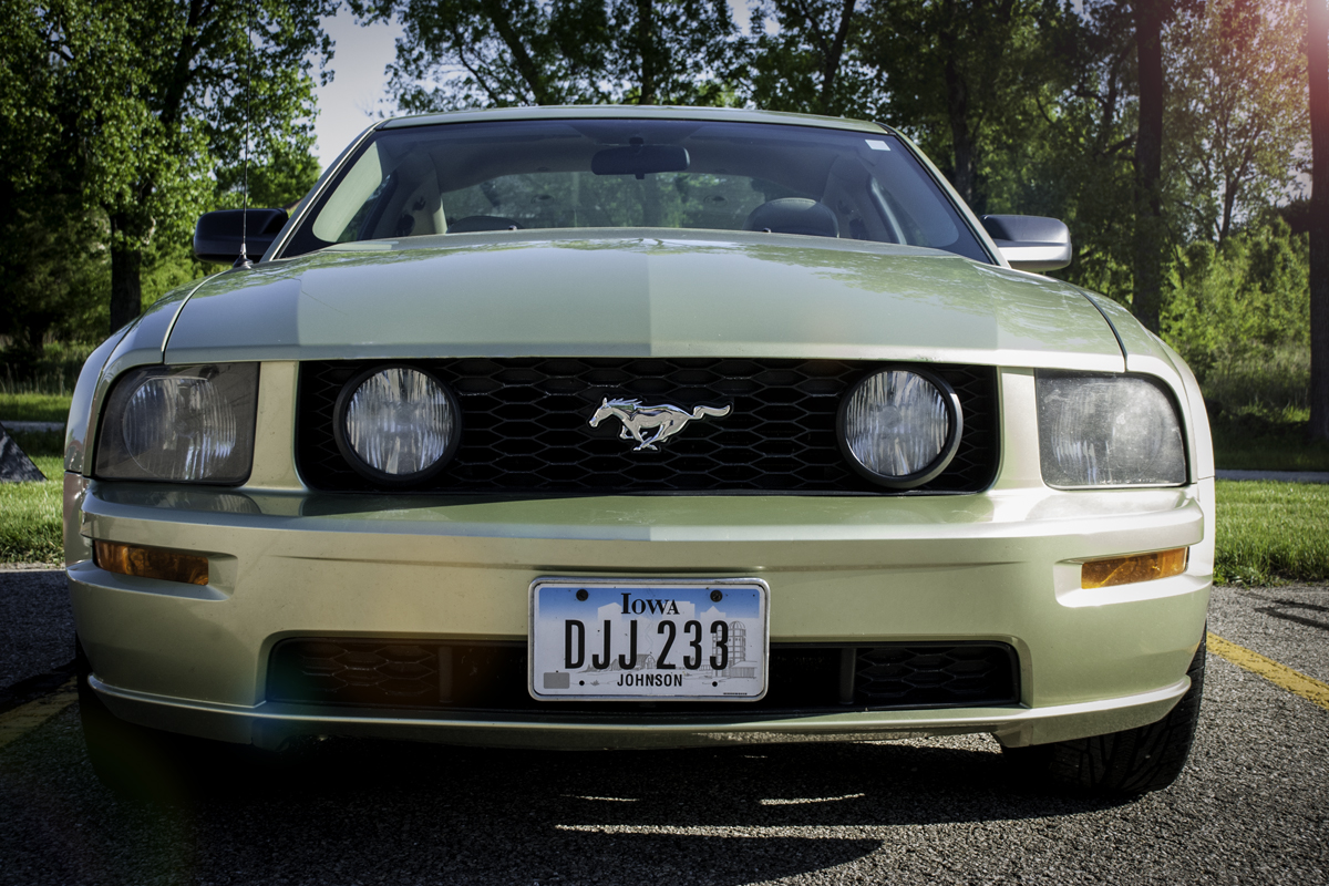
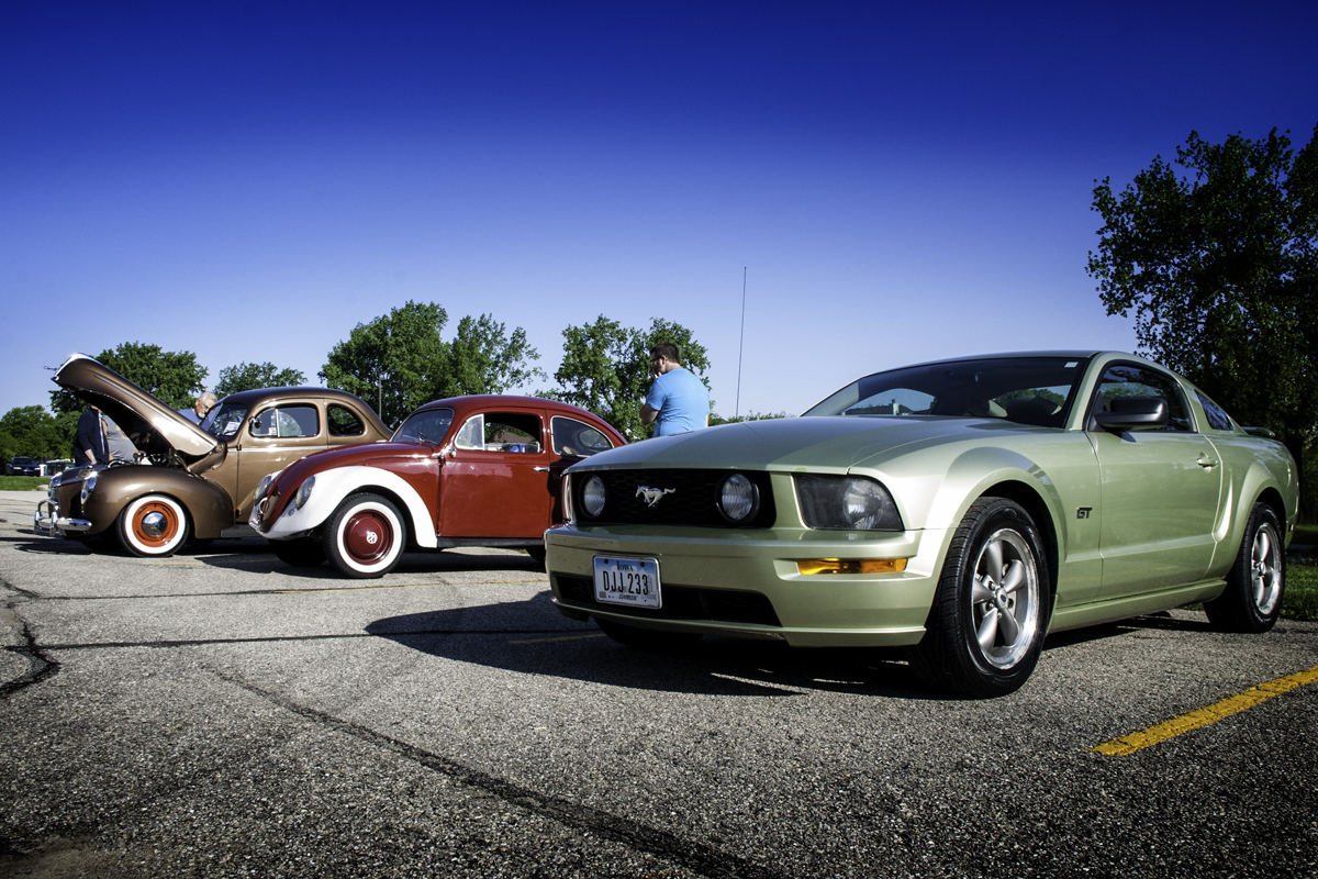
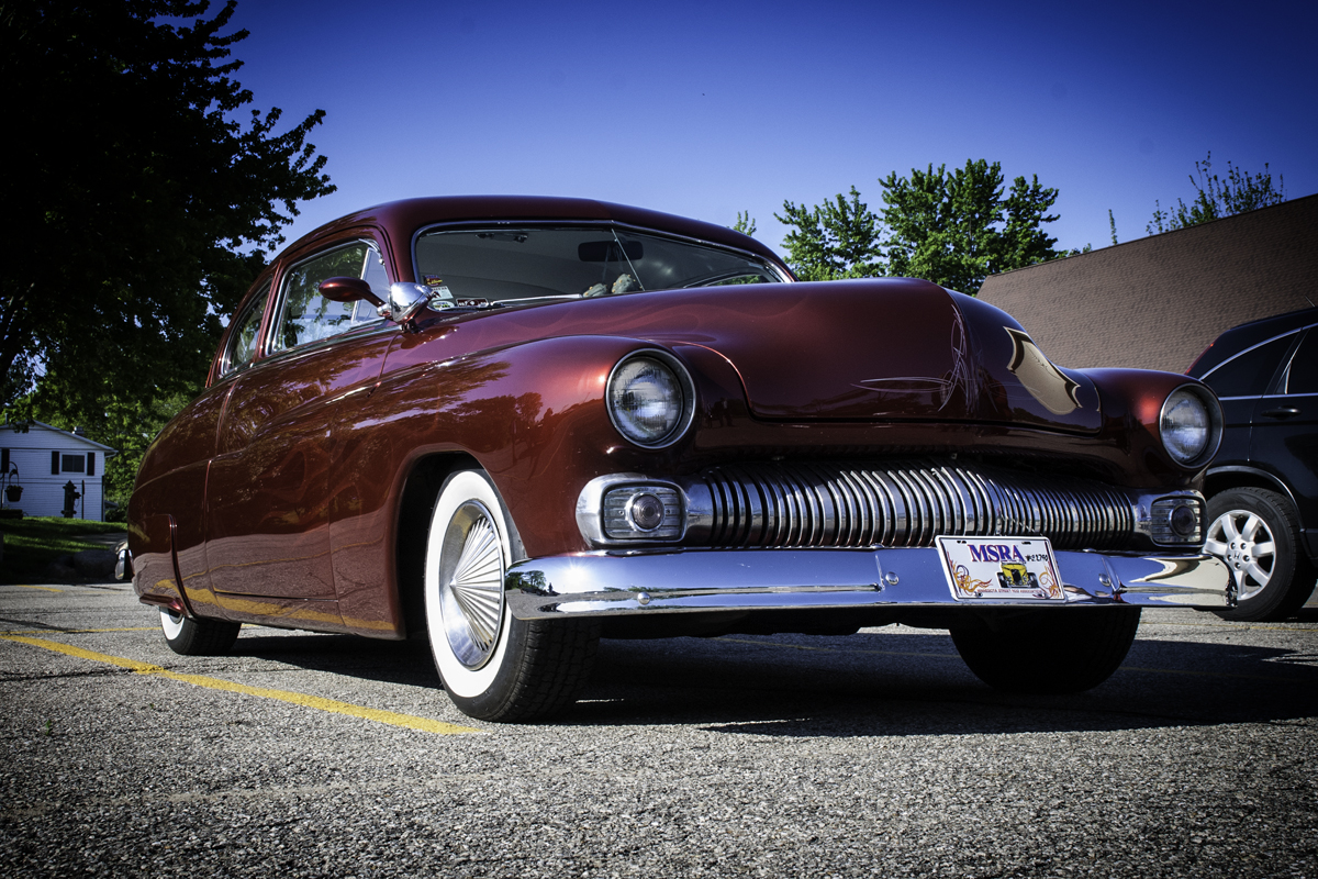
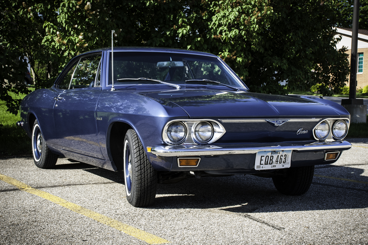
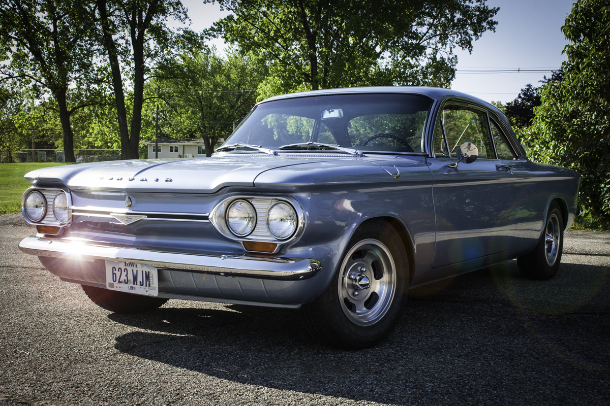
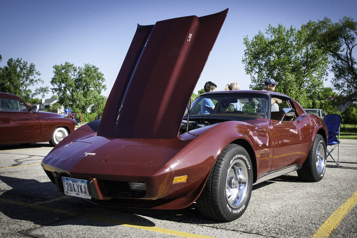
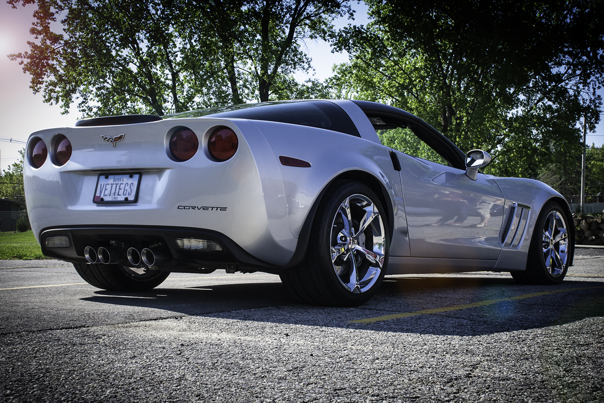
The car show was put on by my church and held in their parking lot. It wasn’t scheduled that way but because of small city council issues it was moved to that space. Which was ok because we wanted great cars to look at and to show off our church as well. The quantity of cars on display was small but the quality was amazing. Some of them were late to arrive and consequently I did not get to photograph them, I was sick that whole weekend and still suffering some effects.

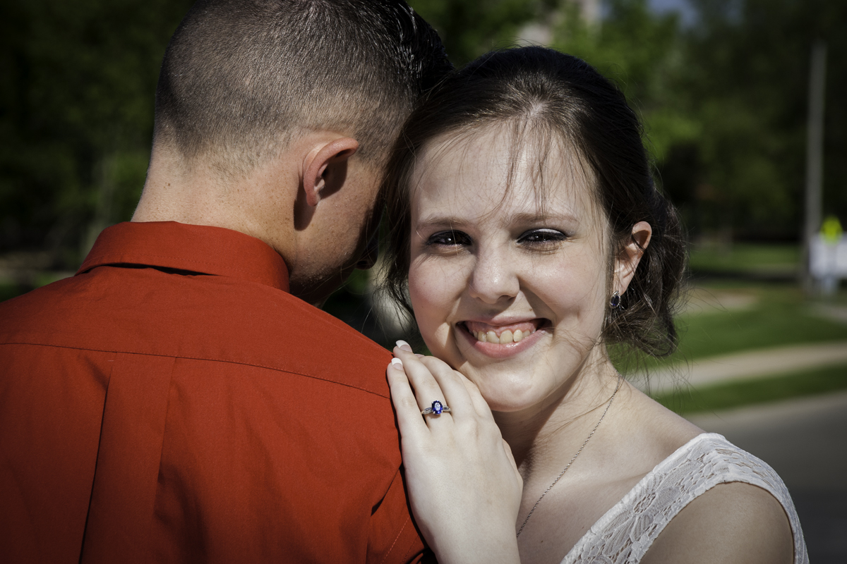
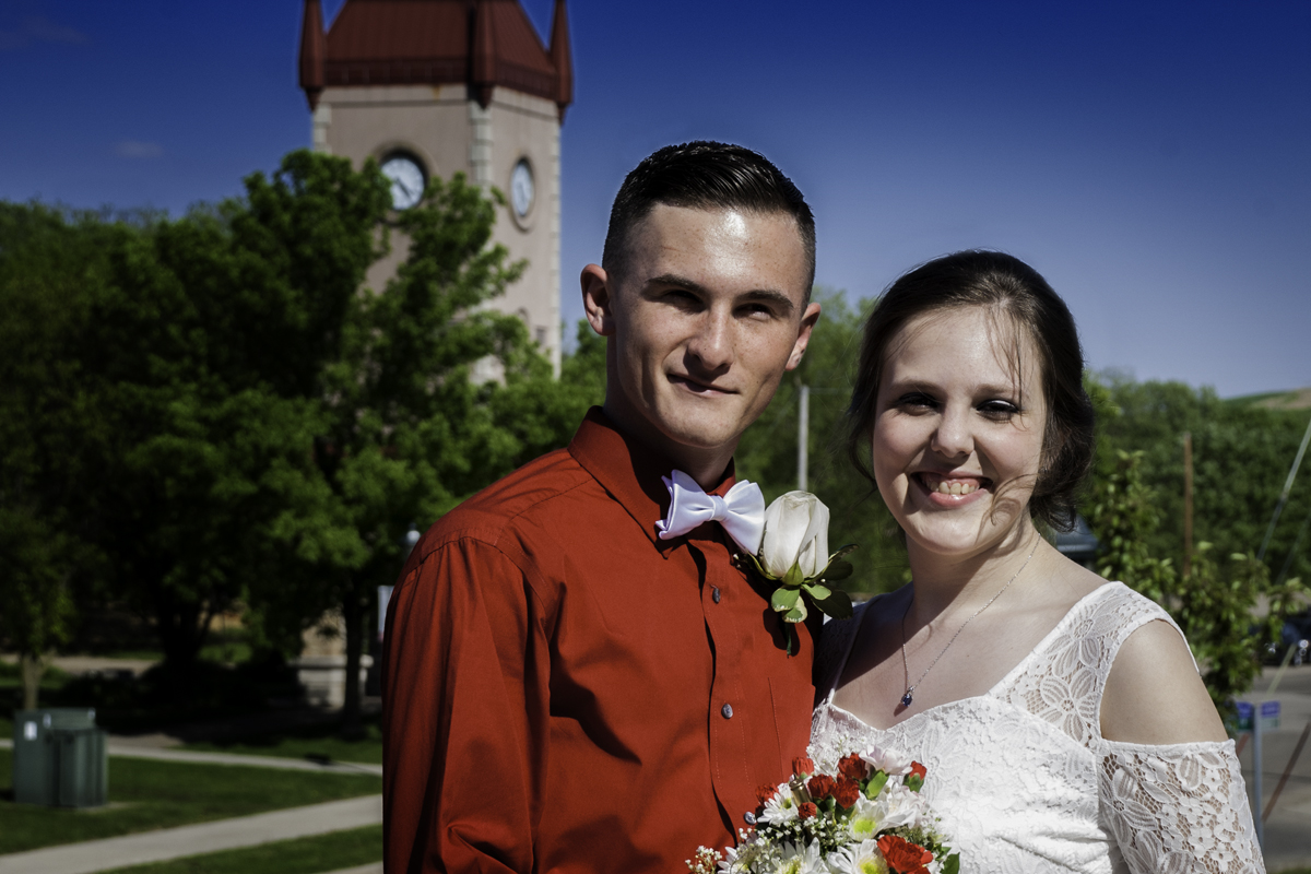
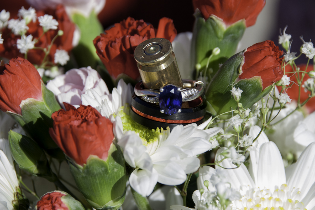
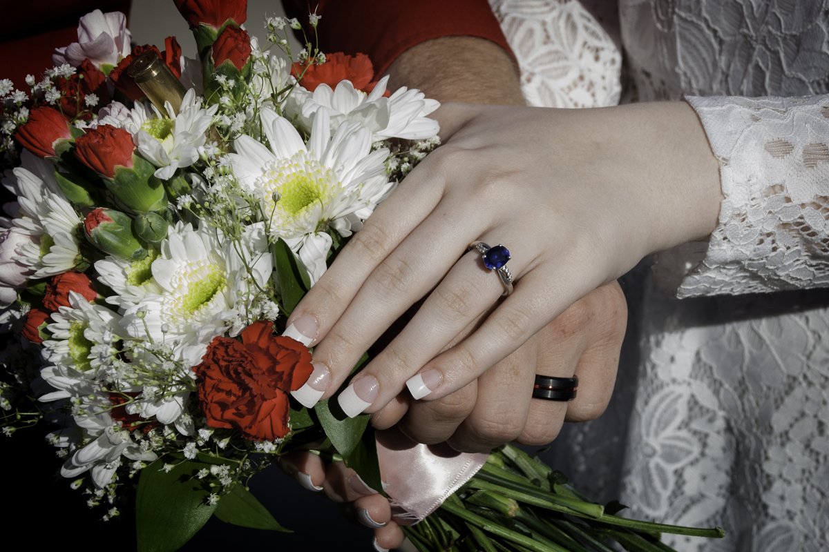
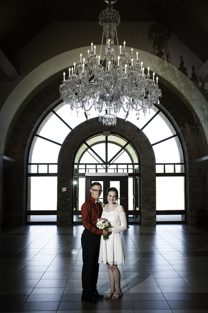
That same day was my niece’s wedding. Nothing big, just us and her family. It was held at our Czech Museum here in town. It was hard to believe she had grown up and was moving to the east coast. For a small wedding, it was very lovely.
I have a few images planned for the weekend and going to work on them as well as getting my stuff together for submitting to the first hand full of galleries not to mention get a print of a lily on water color paper. Its time to get back to work.
I have updated and added the water lilies to my website. This unintentional project was one that was shot over two years as I studied the light and shadow and how they played on the lilies. I say unintentional because after I processed them I burned them to a disc and left them alone. I had hoped to print them but somehow talked out of it because you don’t show flowers in galleries. I thought at one time creating large prints on watercolor paper and float them in a matte. But as I messed with them and turned one into black and white I soon realized my vision of this project was complete.
What I love about creating black and white is the drama of the darker range of the grey scale. What I mean by that is best represented in the lighting of Film Noir. I was always attracted to the dark drama grey scale of the film Maltese Falcon. The dark black shadows to the highlights that was just above middle grey and very few white highlights. That was fine art and that was what I wanted to capture in my images but until recently I hadn’t.
Going back to when I first processed these images I kept them almost biochromatic having only the color of flower and the leaves. I was happy with them as they stood but I felt the image did not have the impact I wanted and I was not sure why. I think it was because I was too close to the images and distracted by events in my life to make the connection of switching them to black and white. And I had just started to show in a small gallery and they had already a large quantity of flower photographs so my attention was drawn away.
Now with my commitment to live in the world of Black and White I believe my images, at least these, make the impact that I was looking for and inspire me to create more. Not only the flowers but in the project, I am currently working on.
I hope you enjoy these images and if you are interested in these or any of my images to purchase for your own collection, please feel free to contact me
The last part of April I took a working trip with my wife to Wisconsin, she worked while I got to play. I visited Cave of the Mounds where in previous years Buffey, my wife, Colin and I checked out the cave. The landscape is pretty in the summer but because it is early spring it was kind of bare. I figured I look around and create images with what was there. To my delight the barn, small building and water feature was still there. I had to photograph it once again and most likely will again when I go back.
The water feature is part of a mining or panning activity. It is not something that most people think to photograph it but I felt it was a good exercise in long exposures and moving water. I think I capture it in the most interesting way it will be ever caught.

The Door is part of a barn that who knows how long it has been standing. I love the texture and lines vertical that the door creates against the horizontal lines of the rest of the barn. I like better this image I created from the last one about 4 or 5 years ago.

I am not sure what the building is housing but since I had been there the vine had grown up the side. I love the broken movement of the vine against the regular pattern of the brick and windows. The roof pattern and texture is the only think akin to the natural pattern and texture of the vine.

I have many more to process and will post them in the coming weeks. If you ever get a chance to visit the Cave of the Mound I would. It is a great cave and the surrounding area is beautiful and not too far from a state park. Not to mention Mt Horeb where you can get the best food and beer at the Grumpy Troll.
Well it took a few weeks but this week I will have my work available to purchase at the Cedar Rapids Art Museum Gallery. I am really excited about it because as I looked around the gallery there are a lot of talented artist’s work I share space with. One, who I am familiar with is my professor of print making, Chuck Barth. He prints using etched plates and creates color prints Mexican flavored inspired figures. Beautiful work.
I placed two pieces in so far but I have plan to do more as I can afford it. My work centers around the City of Cedar Rapids which is unique from any of the other artist in the gallery. I was told that people are generally interested in artwork of this town, who knew? The work I am planning to put in has a bridge theme to it. Two of which are completed, one I need to print and one I am thinking of needs to be created. The bridge I am contemplating in using to create an image is being worked on now so I am waiting until the project is finished.

Now that I have a taste of getting into a gallery I plan to do reach to more outside the city. I’d like to explore the possibility of Iowa City just because my work would have some familiarity but would be to familiar that it would not sell. I am also considering going out to other cities in different states, I just need to research them and see who I might fit. But it all hinges on getting my work completed.
So, this past month I have been occupied with my new job. The unfortunate thing about being an artist is that sometimes you must work a job to pay the bills. I returned to St Luke’s and now working as a Phlebotomist, I draw blood for the lab. I am good at it and you get to meet people from all walks of life. It’s a job that reminds you how fleeting life can be. I think it pushes me to keep photographing and creating work always, now more than ever. Life is short and I don’t think I have a body of work that is complete. I am on the tail end of my training and my hours are closer to my regular schedule so it is leaving me time to create photos and post. I am excited to get back to work and create more photographs.