https://www.facebook.com/photoproonline/videos/101551076
https://www.tedfordphoto.com/
crmuseumofart
http://photoproonline.com/photo-products.html
http://www.artcellarcr.com/


The second image I had chosen is this image of my waterlilies in my back pond. This was the template I had used in my head for the Yucca plants. The success of the direct sun and the dark shadows grabbed me. It reminds me of a film noir as far as the scale of gray tones from the dark shadows to the bright whites. This is probably the more successful tonal range in a black and white that I had accomplished.
Why I chose it.
Light, I chose to photograph this subject because the layering of light brings out and the details throughout this image that holds my interest. My eye is drawn first to the flower itself, bright, detailed and textured in the grayscale of the darker peddles. The lighter peddles has a look of collar, reflecting the light on to the subject of the darker and a separator from the leaves around it. Though the flowers are in the spotlight my eye doesn’t stop there but move to the right and down following a circular motion of the leaves. Each pad having just enough light falling on it to give detail and motion from front and moving to the back into the shadows. With the light and softening of focus I can’t help feeling that there is depth to the composition that compels me to explore.
I find beauty in compositions that have depth and motion pleasing to the eye and emotionally gratifying. I did not get the same feeling from the color version of this photograph, in fact I felt conflicted by the red of the flower and the lighting of the subject. I could not get past the red to explore the rest of the image. The red of the flower essentially flatten the composition and stalling the motion of the image. By switching it to black and white the image came alive, more interesting leaving me wanting to look from the bright whites of the flowers to what was hidden in the shadows. Like a good story, this image has layers that moves us through the image, to leave and return to discover more.
I know they are only flowers and the depth I see maybe self-serving but I do think this image has a story and moves the view not only to search the image but upon returning, find new details missed from before. To me that is what I am hoping for, an image that is not only pleasing but one that makes you want to look at more than a few times. This is why I feel it would be a good image to donate to the hospital.
What do you think? Am I reading too much into it? Is this a good image for the hospital or not? I’d like to hear from you, good or bad. Leave a comment or email me what you think so far and you could be picked to win a matted and signed copy of your favorite image.
Thanks again and feel free to share this or any other post.

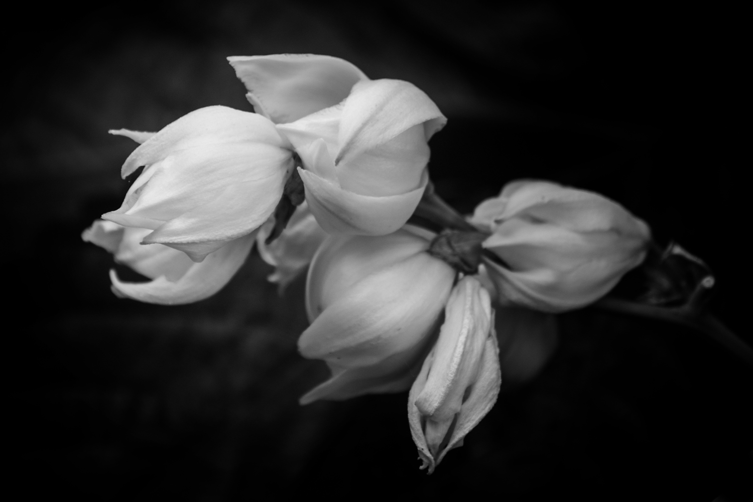
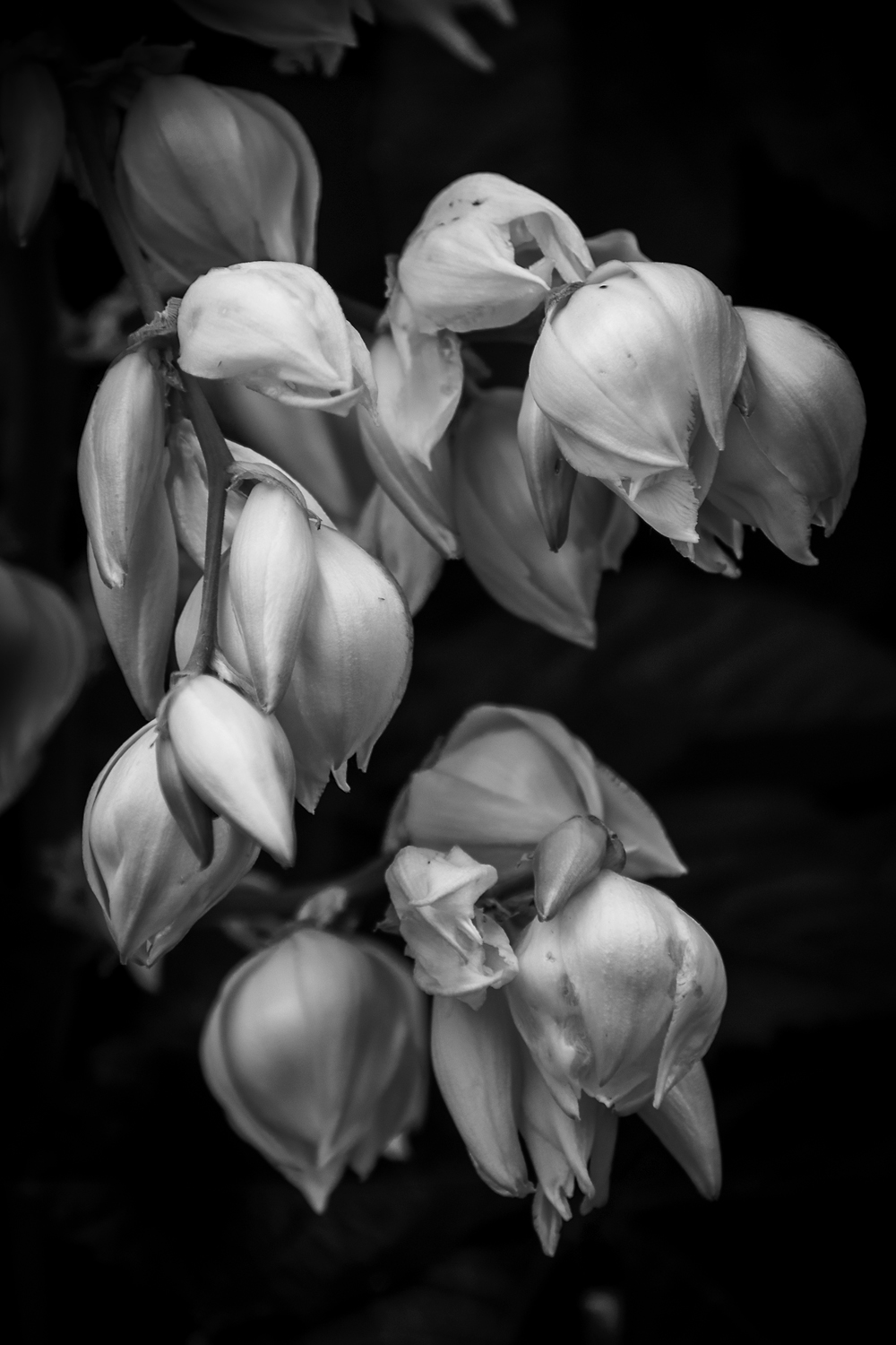
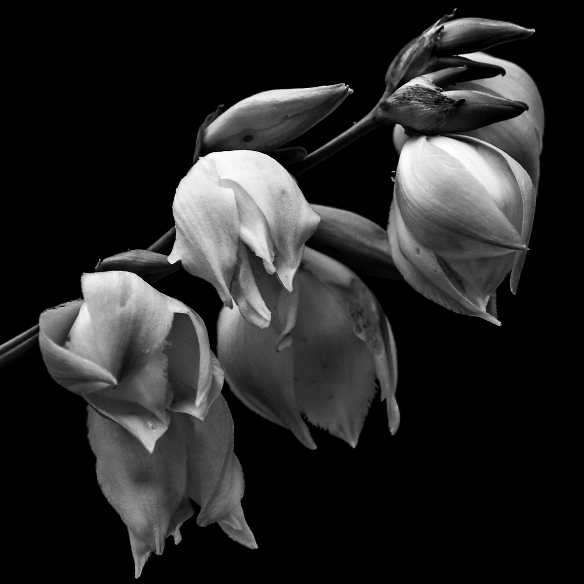
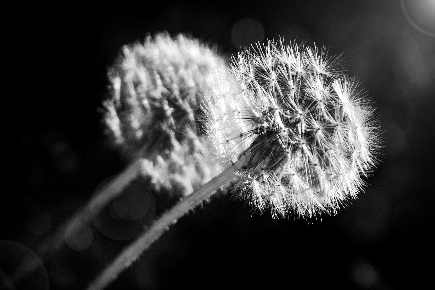
This is the first year I got out and photographed the Yucca Plant in Bloom and I am glad I did. Last year I did not take the time and create a group of proper photographs of the blooms as they should have been. The difference from this year to last, I think is the fact I took the time and had the vision of light I wanted. Of course, when the Yucca plant bloomed the light I was seeking wasn’t there and instead I got this spectacular light instead. Happy accidents are sometimes the best.
This is the first of tree images I have chosen to donate to the hospital and here’s is why.
First thing that I am drawn to is the quality of light. Soft, delicate light that wraps around the peddles of the flowers, pods and branch of the plant. The light’s ability to show the detail in the highlights, the ridges and lines of the blooms show up so well against the black background. This quality not only shows up in the whites of the blooms but the pods. The rich texture of the pod is captured so well in both the highlights and shadows of the image.
The subject matter is simple in composition which give a minimalist feel to it. As a viewer, I am not overwhelmed with what to look at. I can take my time and discover new details of the photograph without feeling the need to take it in all at once. I find it pleasing to start with the highlights of the blooms and move my way through the that detail then to the mid-tones and finally to details in the shadows. I also find the tonal range pleasing. The lack of great contrast between the background and subject matter give a since of peace, relaxed feeling when I view this image. Had I gone with a harder contrast I would have had a feeling of tension with this piece.
Finally, the composition; a soft diagonal line in a square format. The downward line of the main branch is not steep. This is repeated in the line of the bottom tips of the blooms as well as their positions and size on the branch. For me this shallow line does not add tension to the image but helps the viewer slowly move through the photograph. Had it been steep I know it would have given an unintentional speed in which the eye would have traveled form the top to the bottom corner, while missing details.
Over all I find this image peaceful and would fit very well with what the hospital is trying to do. Beautify and give an emotionally pleasing image to help lift the spirits of their patients as well as visitors. I hope if this or one of the others are chosen that the views find it as pleasing as I do

I would like to hear from you. Help me choose one out of the three images and you could win your choice in a 8x12 (or 12x12) matted and signed. Just leave a comment or email me your choice and on Aug 12 I will announce the winner. Thank you for your help.

Links: Ted Forbes: The Art of Photography
Now I did mention a podcast he does and you can find it on ITunes , but the bulk of work is on his YouTube Channel
Here is the first of hopefully many audiocast or podcast that I do. Enjoy


Well I have picked up my print and I am meh about it. The printers did a fine job and printed exactly to the proof but I think where I feel it to be a loss is in the punch of the image. I think where I went wrong is not understanding the medium I was printing on. I was hoping that I would have a lot of the qualities of a photograph on the paper when it was never going to happen. But all is not lost
This is what the image has going for it; it is sharp throughout the image. There are no blown out whites or funny digital hiccups that detract from the image. The greyscale is exactly as I had created it and the dark are full. There is not a flaw in the print anywhere in this print. The only thing I don’t like is the lack of a punch in contrast that you get from a photographic paper. With that said, I am not going to trash it but stare at the print for a while and figure out what to do with it. I may just matte and sell it and let buyer frame it themselves. I am, however, going make a large print of the same image on photographic paper.
But to counter that small disappointment I created some images of my Yucca plant that is blooming in the backyard. This is the second year in a row that both plants have bloomed and so I took advantage of my day off and defused sunlight to make these images. Two of these images are shot in front of the vine plant growing next to it. I find that the green textured leaves of the vine plant make a great modeled background when it’s blurred out. The last one is done with black side of my reflector to hide what was behind the flower.
I really liked the soft defused light in the images I created and feel that it is the key that makes the photograph despite what I had originally planned. I was looking for the sunlight streaming through the tree to create drama of highlights and shadows that are in my water lily photographs. Instead I kept battling the high think clouds of the morning so I just went with it and ending up loving them more then what I had planned. Funny how that works.
If you love these or any images on my site feel free to contact me for a price quote on any size of print you want, as well as any questions you might have. I would love to talk to you. And if you have enjoyed this post or the images I have created, feel free to share I would appreciate it.
Well it took a few weeks but this week I will have my work available to purchase at the Cedar Rapids Art Museum Gallery. I am really excited about it because as I looked around the gallery there are a lot of talented artist’s work I share space with. One, who I am familiar with is my professor of print making, Chuck Barth. He prints using etched plates and creates color prints Mexican flavored inspired figures. Beautiful work.
I placed two pieces in so far but I have plan to do more as I can afford it. My work centers around the City of Cedar Rapids which is unique from any of the other artist in the gallery. I was told that people are generally interested in artwork of this town, who knew? The work I am planning to put in has a bridge theme to it. Two of which are completed, one I need to print and one I am thinking of needs to be created. The bridge I am contemplating in using to create an image is being worked on now so I am waiting until the project is finished.

Now that I have a taste of getting into a gallery I plan to do reach to more outside the city. I’d like to explore the possibility of Iowa City just because my work would have some familiarity but would be to familiar that it would not sell. I am also considering going out to other cities in different states, I just need to research them and see who I might fit. But it all hinges on getting my work completed.
So, this past month I have been occupied with my new job. The unfortunate thing about being an artist is that sometimes you must work a job to pay the bills. I returned to St Luke’s and now working as a Phlebotomist, I draw blood for the lab. I am good at it and you get to meet people from all walks of life. It’s a job that reminds you how fleeting life can be. I think it pushes me to keep photographing and creating work always, now more than ever. Life is short and I don’t think I have a body of work that is complete. I am on the tail end of my training and my hours are closer to my regular schedule so it is leaving me time to create photos and post. I am excited to get back to work and create more photographs.