big prints

Not So Perfect

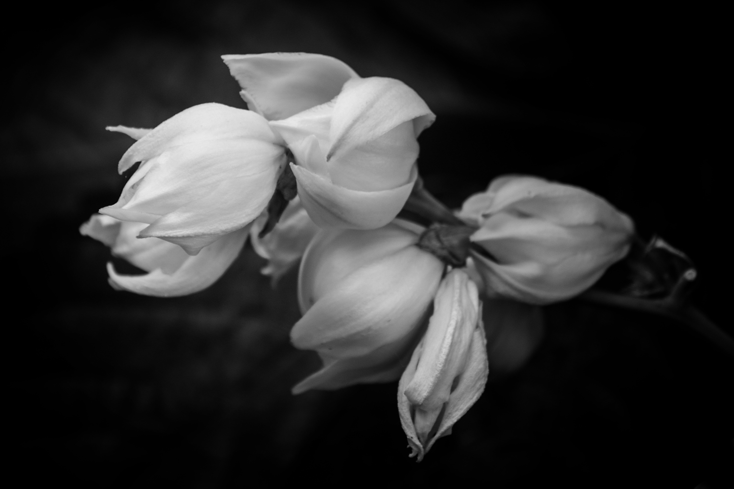
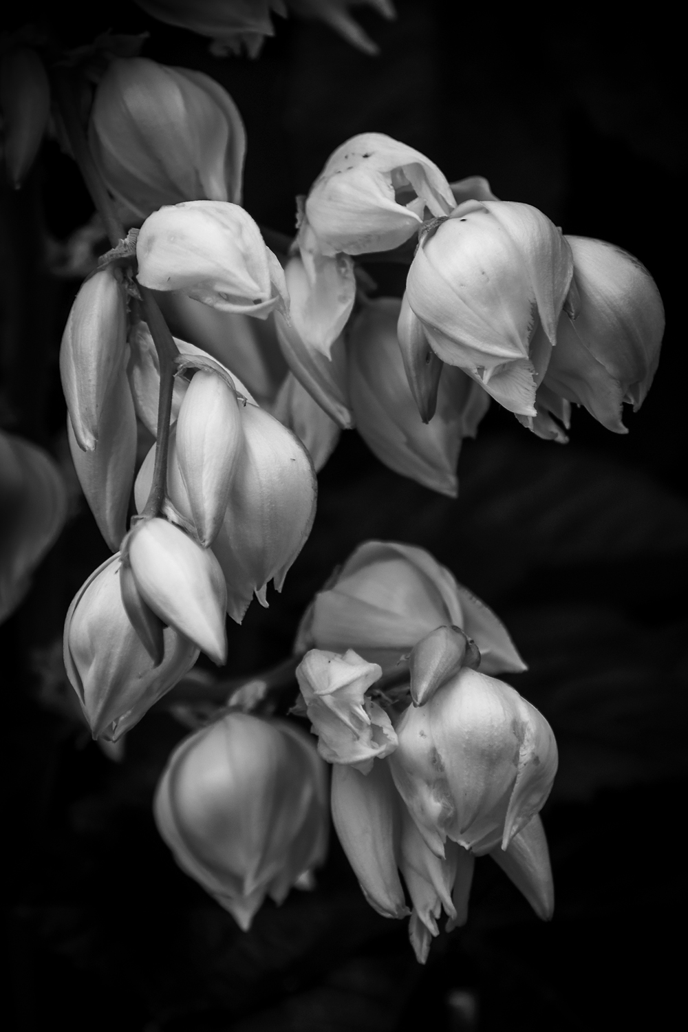
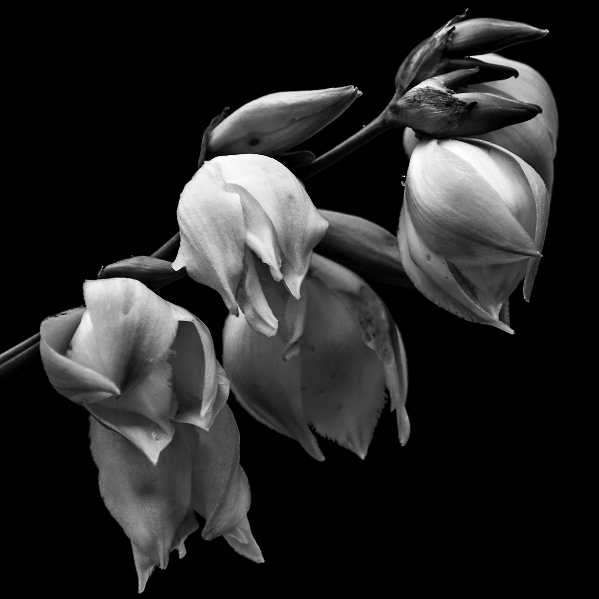
A few days ago, I created this image of a barren branch of a Yucca plan. With the peddles of the blooms all but gone I felt that this image was a statement on three levels about life. First is our need for everything to its perfection. Second is the fact that things in our personal life changes and the blinders we put on to the world around us in order to deal with it. And third, the beauty in death and the life that flourishes around it. I see these things more so now than I had before and it comes from the stage of my life that I find myself in. And because I see it in nature I feel I can draw comfort from it when it gets hard to press on. So here is what I see when I look at this image.

Perfection, or the lack of it. Normally when most photographers create an image they take in account the light, time of year, the state of the subject and the final image. If most of the criteria have been met then the image is created with the knowledge that any flaws found will be corrected in the editing stage. But I find that even in this stage of defoliation still to be a perfect image because it embraces the flaws as well as the beauty that surrounds. In society of today, we are so obsessed with perfection that we can’t tolerate the flaws in our lives. This is displayed so overtly in the way we present ourselves in public and on our social media pages. Anyone who doesn’t fall into our box of perfection is often shunned and relegated to the fringed where “those people” belong. We don’t even tolerate failure. Failure is the way we move forward and learn but to fail in our society risks a negative stigma therefore it is tucked away in a dark place. I have failed and I celebrate this not because I have, but because I learn and move on to succeed. If we just would open up and let people know that it is okay to fail and not to be perfect we may not have so many people to move forward in their lives.

This image conveys to me about personal change, and how we may feel isolated and things have stopped, but it doesn’t stop. If we just look beyond our bubble we can see the beauty around us and with that draw courage and comfort to move on.   In my life, there has been a lot of change that I have been processing, some of it well and some of it I choose to ignore. My first bit of change is the fact that my Son has grown and move out, which you would think I would celebrate and I am in ways. The part I find sad is that the time we had with him as a child is gone and as long as his childhood seemed, it wasn’t. Sometimes I think about in a few years we maybe involved in a wedding and then grandkids. On the surface that seems cool but it is just a reminder of my own mortality and that that my time is growing short with so much yet to accomplish.  

I also feel that this image is analogous to the beauty in the changes of life. Even in death, life around this barren branch flourishes and continues. Despite this branch looking dried and brittle, in a few weeks seed pods should be sprouting from them to begin life’s cycle again. This brings me to my thoughts of my parents who are in their 90’s. A part of me had always thought that my parents would be there for me, to be the solid foundation that keeps life stable. The subtle changes of aging are often missed as a child and sometimes a young adult. It is when you are not constantly around them you see the toll of years drawn upon them. Still we ignore the inevitable as way not to be paralyzed by their impending end, but a way we can celebrate the life together. I believe that is why a sudden death of a loved one or even an acquaintance hits us harder than someone who is suffering a terminal illness. With someone terminally ill we can prepare for the passing of them. Where is a sudden death we are still in the stage of denial that it will happen.

I know this is a lot to read into an image that is just a dead branch in soft lighting surrounded by green leaves, but that is what I see. I plan to do a series of these life and death moments throughout the summer and fall. Who knows I may put them together and build a book or hang them on the wall for a show. I guess we’ll see as the time comes.

Making of a Print #2

I felt that I needed to expand my previous post about making a print. I would like to say first that I have made many of my image into prints before but all of them were on photographic paper and not the watercolor paper. My favorite paper to print on is the Metallic Paper that Kodak produces. Talk about pop of rich colors and contrast. What I am inexperienced with is printing on different media of paper and inks and with the last image I learned I needed to do a little more research before committing to it.

So here is what I envisioned; I wanted this water lily printed on watercolor paper by an inkjet printer and have the look of a photograph. You know that pop of contrast of darks and lights. I wanted then to have ruff torn edges and then float it in a matte and frame it. I was excited about the image I selected and the proof was perfect in the look I wanted. A week after I dropped it off I picked it up and instead of being excited I was disappointed. It was not the printers fault. The image matches the proof but it did not have that pop I was looking for. And why? Because it is the medium I printed on. What I wanted this paper to do was not going to happen. My concept for the image was spot on but the reality was that what I wanted was not happing. All is for not. I will still matte this print and sell it because it is a great print even though it doesn’t fit my needs.  I will just make this image as well as the rest on photographic paper matte and frame them as normal and maybe explore this paper for other images later.

In this digital age, it is very easy to make prints on almost any medium you want. But as easy as it is to print, it can and will go wrong if you don’t choose wisely. The myriad of surfaces, textures, papers and even metals can be overwhelming with all the possibilities they offer. I had mentioned the Metallic Paper earlier; that is a great paper to make your colors and contrast pop off the walls in almost any light but I wouldn’t use it for a portrait of a person. I am sure that the watercolor paper I chose for this project would be great for an image that is soft and low contrast. It just did not meet my expectation in which I falsely had. So, I guess one of the lessons I learned and want to pass on is that you must be careful about what you print on. Do your homework on your medium before you print in order to get what you want. And above all print your work! Which leads me to this next thought.    

The digital age has hurt the art of photography by reducing the desire to print. It is so easy to create an image, work it in PhotoShop and put it on a social media site or two and wait for all to “love” it. Before social sites and digital images, we developed the film, worked the prints in the darkroom to then produce that image in quantities for our audience so they can hang it on their wall. Instead those walls are not at their home but their phone or Facebook page. And those walls are not just where art lives but family portraits hang there as well. Why? Is your family portrait not important enough to grace the walls of your home? I understand the need to carry their images of loved ones around. We have done this for ages but instead of phones it was in our wallets and billfolds. That still doesn’t explain why we don’t hang their images on our wall. Do we not love them enough? I wish I knew the answer.

In this age, many photographers are trying to be different by going back to film or doing tricky manipulations on the camera or in PhotoShop to set themselves apart from the rest. But not enough of us are printing our work. So here is a challenge I echo from a few others. Find an image you love, research the medium you would like to print it on and make a print. But don’t stop there you must matte and frame it to hang on your walls. It’s time to turn the tide of just having images on your phone and social media pages to having prints on your wall. And if your images do not move you to make a print of your best one then you are not making good images. When you have accomplished this task photograph it on your wall and post it on twitter with the tag #PrintingMyWork. I will look for it and post it on my page. Hell, all of us can retweet that to help spread the word. It’s time to start printing again.

Making of a Print

Well I have picked up my print and I am meh about it. The printers did a fine job and printed exactly to the proof but I think where I feel it to be a loss is in the punch of the image. I think where I went wrong is not understanding the medium I was printing on. I was hoping that I would have a lot of the qualities of a photograph on the paper when it was never going to happen. But all is not lost

This is what the image has going for it; it is sharp throughout the image. There are no blown out whites or funny digital hiccups that detract from the image. The greyscale is exactly as I had created it and the dark are full. There is not a flaw in the print anywhere in this print. The only thing I don’t like is the lack of a punch in contrast that you get from a photographic paper. With that said, I am not going to trash it but stare at the print for a while and figure out what to do with it. I may just matte and sell it and let buyer frame it themselves. I am, however, going make a large print of the same image on photographic paper.

But to counter that small disappointment I created some images of my Yucca plant that is blooming in the backyard. This is the second year in a row that both plants have bloomed and so I took advantage of my day off and defused sunlight to make these images. Two of these images are shot in front of the vine plant growing next to it. I find that the green textured leaves of the vine plant make a great modeled background when it’s blurred out. The last one is done with black side of my reflector to hide what was behind the flower.

I really liked the soft defused light in the images I created and feel that it is the key that makes the photograph despite what I had originally planned. I was looking for the sunlight streaming through the tree to create drama of highlights and shadows that are in my water lily photographs. Instead I kept battling the high think clouds of the morning so I just went with it and ending up loving them more then what I had planned. Funny how that works.

If you love these or any images on my site feel free to contact me for a price quote on any size of print you want, as well as any questions you might have. I would love to talk to you. And if you have enjoyed this post or the images I have created, feel free to share I would appreciate it.