waterlily

Waterlily; Absent of Color

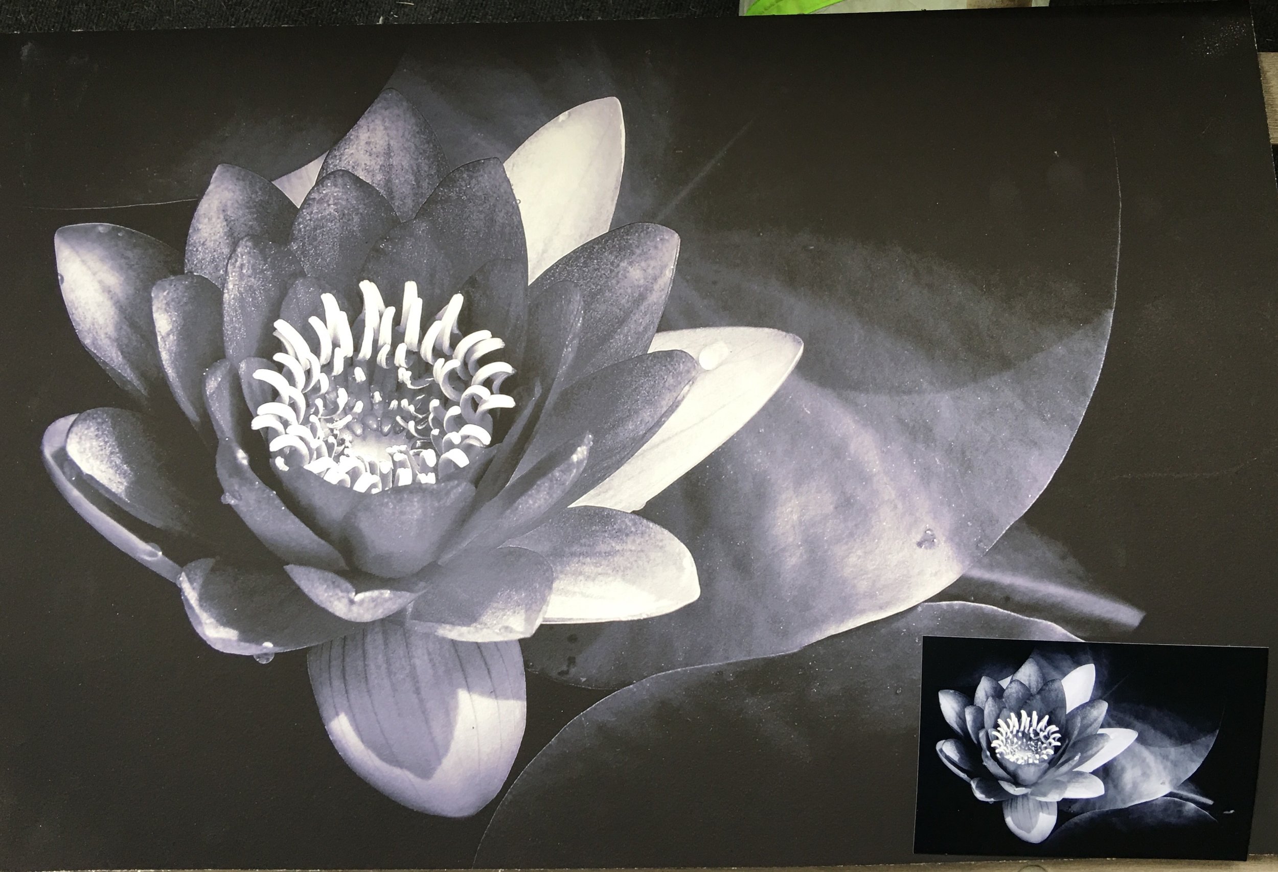
The second image I had chosen is this image of my waterlilies in my back pond. This was the template I had used in my head for the Yucca plants. The success of the direct sun and the dark shadows grabbed me. It reminds me of a film noir as far as the scale of gray tones from the dark shadows to the bright whites. This is probably the more successful tonal range in a black and white that I had accomplished.

Why I chose it.

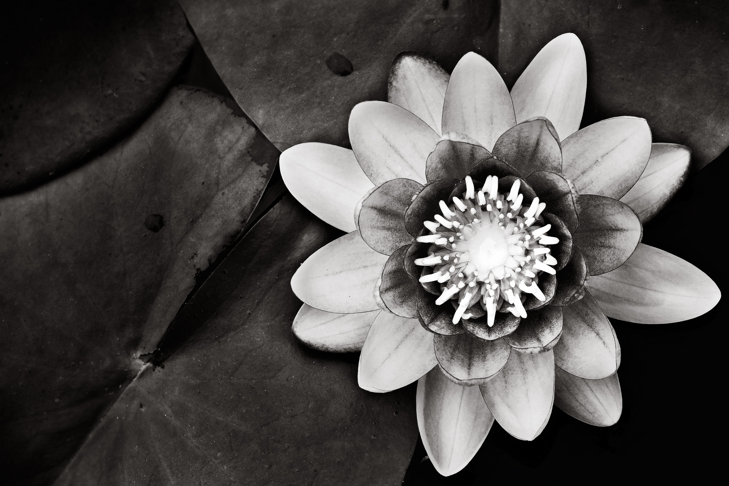
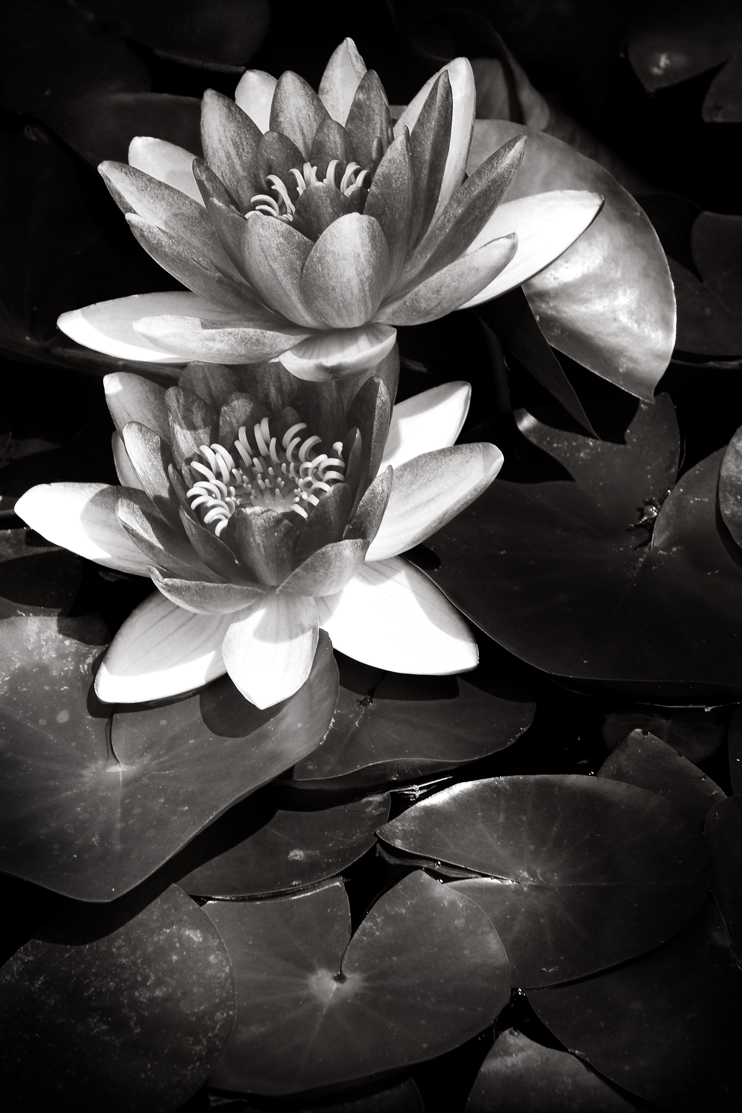
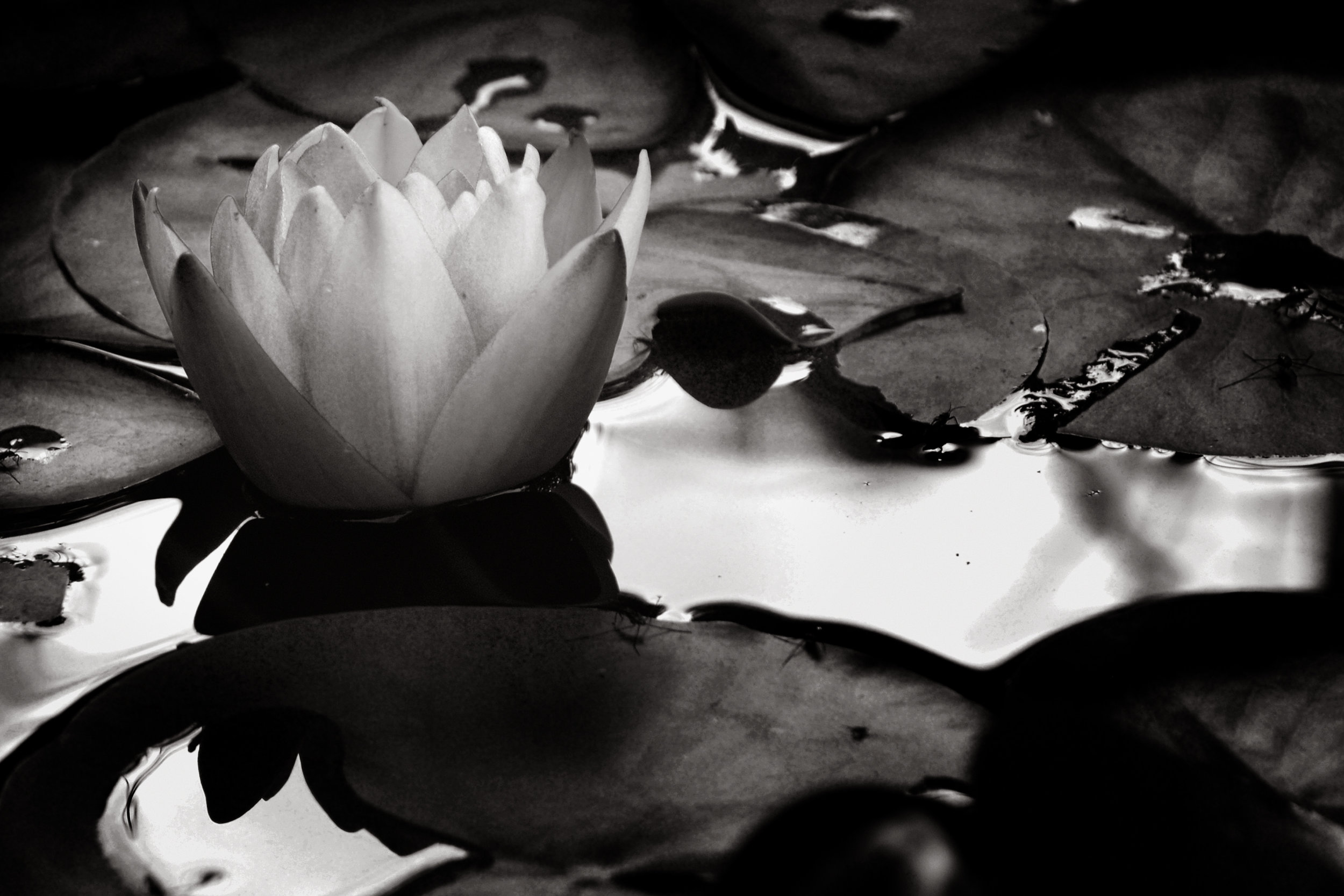
Light, I chose to photograph this subject because the layering of light brings out and the details throughout this image that holds my interest. My eye is drawn first to the flower itself, bright, detailed and textured in the grayscale of the darker peddles. The lighter peddles has a look of collar, reflecting the light on to the subject of the darker and a separator from the leaves around it.  Though the flowers are in the spotlight my eye doesn’t stop there but move to the right and down following a circular motion of the leaves. Each pad having just enough light falling on it to give detail and motion from front and moving to the back into the shadows. With the light and softening of focus I can’t help feeling that there is depth to the composition that compels me to explore.  

I find beauty in compositions that have depth and motion pleasing to the eye and emotionally gratifying. I did not get the same feeling from the color version of this photograph, in fact I felt conflicted by the red of the flower and the lighting of the subject. I could not get past the red to explore the rest of the image. The red of the flower essentially flatten the composition and stalling the motion of the image. By switching it to black and white the image came alive, more interesting leaving me wanting to look from the bright whites of the flowers to what was hidden in the shadows. Like a good story, this image has layers that moves us through the image, to leave and return to discover more.

I know they are only flowers and the depth I see maybe self-serving but I do think this image has a story and moves the view not only to search the image but upon returning, find new details missed from before. To me that is what I am hoping for, an image that is not only pleasing but one that makes you want to look at more than a few times. This is why I feel it would be a good image to donate to the hospital.

What do you think? Am I reading too much into it? Is this a good image for the hospital or not? I’d like to hear from you, good or bad. Leave a comment or email me what you think so far and you could be picked to win a matted and signed copy of your favorite image.

Thanks again and feel free to share this or any other post.

Waterlily; Absent of Color

Making of a Print #2

I felt that I needed to expand my previous post about making a print. I would like to say first that I have made many of my image into prints before but all of them were on photographic paper and not the watercolor paper. My favorite paper to print on is the Metallic Paper that Kodak produces. Talk about pop of rich colors and contrast. What I am inexperienced with is printing on different media of paper and inks and with the last image I learned I needed to do a little more research before committing to it.

So here is what I envisioned; I wanted this water lily printed on watercolor paper by an inkjet printer and have the look of a photograph. You know that pop of contrast of darks and lights. I wanted then to have ruff torn edges and then float it in a matte and frame it. I was excited about the image I selected and the proof was perfect in the look I wanted. A week after I dropped it off I picked it up and instead of being excited I was disappointed. It was not the printers fault. The image matches the proof but it did not have that pop I was looking for. And why? Because it is the medium I printed on. What I wanted this paper to do was not going to happen. My concept for the image was spot on but the reality was that what I wanted was not happing. All is for not. I will still matte this print and sell it because it is a great print even though it doesn’t fit my needs.  I will just make this image as well as the rest on photographic paper matte and frame them as normal and maybe explore this paper for other images later.

In this digital age, it is very easy to make prints on almost any medium you want. But as easy as it is to print, it can and will go wrong if you don’t choose wisely. The myriad of surfaces, textures, papers and even metals can be overwhelming with all the possibilities they offer. I had mentioned the Metallic Paper earlier; that is a great paper to make your colors and contrast pop off the walls in almost any light but I wouldn’t use it for a portrait of a person. I am sure that the watercolor paper I chose for this project would be great for an image that is soft and low contrast. It just did not meet my expectation in which I falsely had. So, I guess one of the lessons I learned and want to pass on is that you must be careful about what you print on. Do your homework on your medium before you print in order to get what you want. And above all print your work! Which leads me to this next thought.    

The digital age has hurt the art of photography by reducing the desire to print. It is so easy to create an image, work it in PhotoShop and put it on a social media site or two and wait for all to “love” it. Before social sites and digital images, we developed the film, worked the prints in the darkroom to then produce that image in quantities for our audience so they can hang it on their wall. Instead those walls are not at their home but their phone or Facebook page. And those walls are not just where art lives but family portraits hang there as well. Why? Is your family portrait not important enough to grace the walls of your home? I understand the need to carry their images of loved ones around. We have done this for ages but instead of phones it was in our wallets and billfolds. That still doesn’t explain why we don’t hang their images on our wall. Do we not love them enough? I wish I knew the answer.

In this age, many photographers are trying to be different by going back to film or doing tricky manipulations on the camera or in PhotoShop to set themselves apart from the rest. But not enough of us are printing our work. So here is a challenge I echo from a few others. Find an image you love, research the medium you would like to print it on and make a print. But don’t stop there you must matte and frame it to hang on your walls. It’s time to turn the tide of just having images on your phone and social media pages to having prints on your wall. And if your images do not move you to make a print of your best one then you are not making good images. When you have accomplished this task photograph it on your wall and post it on twitter with the tag #PrintingMyWork. I will look for it and post it on my page. Hell, all of us can retweet that to help spread the word. It’s time to start printing again.

Waterlily #7

Most of my photographic life I have been told, “if you want to be shown choose any subject other than pets and flowers.” It seems that you are not taken seriously as an artist if you create images of flowers or pets. I don’t believe that to be true for the most part. Take, for instance, Van Gogh’s Sunflowers, Bouquet of Sunflowers by Claude Monet or Tuft of Cowslips by Albrecht Durer. A small portion of larger number of artist that at one time or another had flowers as a subject in their portfolio. “That’s paintings, what about photographs by famous photographers?” you might say. That one was a little tougher but here is what I found. Ansel Adams Rose on Driftwood, Imogen Cunningham Callla Lilly and Edward Weston Succulent. Three of the many photographers who had flowers as a subject matter. Some of these prints are still sought after by collectors today. So why are flowers as subjects of images so frowned upon? I think it is because it is so hard to create an image that, done well, is art whereas it’s very easy to create an image that can be labeled as trite.

If you look at what someone like Edward, or Imogen did you would see it, the flower, is a study of form and shape as well as how light defines that image. The drama of the greyscale and details the or comparison to a relating subject. It is study, an investigation of the subject to get a better understanding of how we feel or how it relates to us and our world. Now most of what I had seen for these three artists have been in black and white, not color. Color, for me, of a flower is a given is part of the subject that we all see form the start. Viewing the subject in black and white forces you to deal with the subject on a light and dark, shape and texture without the bias of the emotion of color. Take color out of the equation of any photograph and if you still have an image that grabs you then you a sound photograph.

Where flowers become trite is when the subject is treated as a sunset, all color with no real thought about form, shape, light or composition. A snapshot an afterthought that caught the photographers eye so they decided to take it. Then after a quick post processing show around to friends and say “ Look how pretty the colors are.”  This, I believe, is why the flower as a subject gets such a bad rap. The total disregard of the subject by so many people that the subject of a flower is tarnished for many people.

With that said I have a study of my waterlilies that I created over a summer season. These were in my pod that received shading from a large tree which created interesting patterns of light. I studied the light and how the shadows would fall on the flowers and when I found an interesting pattern I began to shoot. As spectacular as the color of the flower is, I found the images worked so well in black and white because of how the light played on the flower, leaves and pond.

I will be working on the rest of the photos taking them form color to black and white. I will have a set or a subset of color images only. I will also add more to this group as the season begins.

If you like these my images feel free to explore the rest of my webpage or check out my blog post on the side. Feel free to send me any comment or question you have or share my work with a friend that you’d believe would enjoy it. Thanks.