
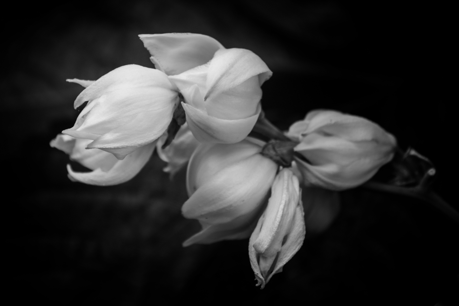
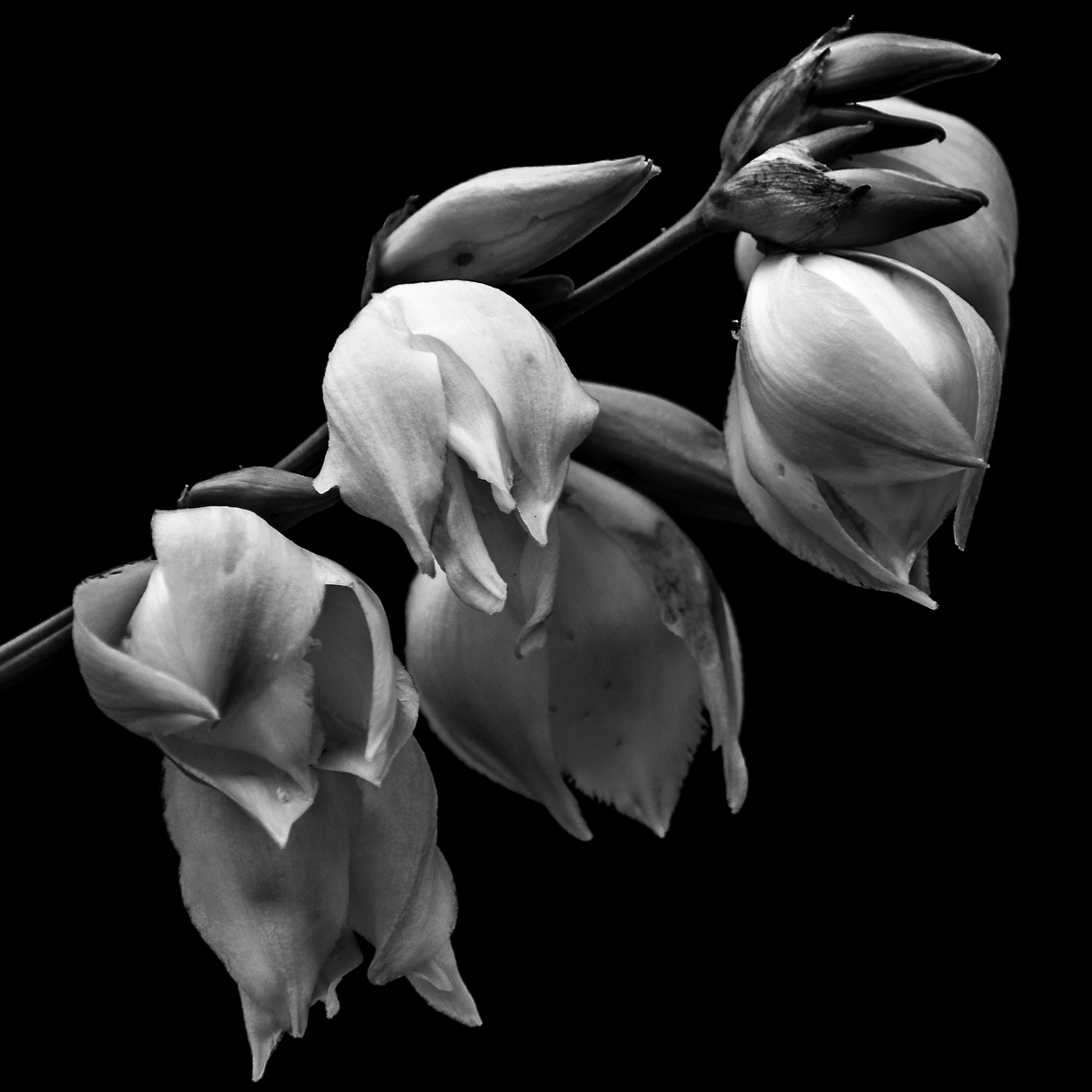
Yucca in Bloom #1
This is the first year I got out and photographed the Yucca Plant in Bloom and I am glad I did. Last year I did not take the time and create a group of proper photographs of the blooms as they should have been. The difference from this year to last, I think is the fact I took the time and had the vision of light I wanted. Of course, when the Yucca plant bloomed the light I was seeking wasn’t there and instead I got this spectacular light instead. Happy accidents are sometimes the best.
This is the first of tree images I have chosen to donate to the hospital and here’s is why.
First thing that I am drawn to is the quality of light. Soft, delicate light that wraps around the peddles of the flowers, pods and branch of the plant. The light’s ability to show the detail in the highlights, the ridges and lines of the blooms show up so well against the black background. This quality not only shows up in the whites of the blooms but the pods. The rich texture of the pod is captured so well in both the highlights and shadows of the image.
The subject matter is simple in composition which give a minimalist feel to it. As a viewer, I am not overwhelmed with what to look at. I can take my time and discover new details of the photograph without feeling the need to take it in all at once. I find it pleasing to start with the highlights of the blooms and move my way through the that detail then to the mid-tones and finally to details in the shadows. I also find the tonal range pleasing. The lack of great contrast between the background and subject matter give a since of peace, relaxed feeling when I view this image. Had I gone with a harder contrast I would have had a feeling of tension with this piece.
Finally, the composition; a soft diagonal line in a square format. The downward line of the main branch is not steep. This is repeated in the line of the bottom tips of the blooms as well as their positions and size on the branch. For me this shallow line does not add tension to the image but helps the viewer slowly move through the photograph. Had it been steep I know it would have given an unintentional speed in which the eye would have traveled form the top to the bottom corner, while missing details.
Over all I find this image peaceful and would fit very well with what the hospital is trying to do. Beautify and give an emotionally pleasing image to help lift the spirits of their patients as well as visitors. I hope if this or one of the others are chosen that the views find it as pleasing as I do

I would like to hear from you. Help me choose one out of the three images and you could win your choice in a 8x12 (or 12x12) matted and signed. Just leave a comment or email me your choice and on Aug 12 I will announce the winner. Thank you for your help.
Episode#2; The Rant

Links: Ted Forbes: The Art of Photography
Now I did mention a podcast he does and you can find it on ITunes , but the bulk of work is on his YouTube Channel
Not So Perfect
A few days ago, I created this image of a barren branch of a Yucca plan. With the peddles of the blooms all but gone I felt that this image was a statement on three levels about life. First is our need for everything to its perfection. Second is the fact that things in our personal life changes and the blinders we put on to the world around us in order to deal with it. And third, the beauty in death and the life that flourishes around it. I see these things more so now than I had before and it comes from the stage of my life that I find myself in. And because I see it in nature I feel I can draw comfort from it when it gets hard to press on. So here is what I see when I look at this image.

Perfection, or the lack of it. Normally when most photographers create an image they take in account the light, time of year, the state of the subject and the final image. If most of the criteria have been met then the image is created with the knowledge that any flaws found will be corrected in the editing stage. But I find that even in this stage of defoliation still to be a perfect image because it embraces the flaws as well as the beauty that surrounds. In society of today, we are so obsessed with perfection that we can’t tolerate the flaws in our lives. This is displayed so overtly in the way we present ourselves in public and on our social media pages. Anyone who doesn’t fall into our box of perfection is often shunned and relegated to the fringed where “those people” belong. We don’t even tolerate failure. Failure is the way we move forward and learn but to fail in our society risks a negative stigma therefore it is tucked away in a dark place. I have failed and I celebrate this not because I have, but because I learn and move on to succeed. If we just would open up and let people know that it is okay to fail and not to be perfect we may not have so many people to move forward in their lives.
This image conveys to me about personal change, and how we may feel isolated and things have stopped, but it doesn’t stop. If we just look beyond our bubble we can see the beauty around us and with that draw courage and comfort to move on. In my life, there has been a lot of change that I have been processing, some of it well and some of it I choose to ignore. My first bit of change is the fact that my Son has grown and move out, which you would think I would celebrate and I am in ways. The part I find sad is that the time we had with him as a child is gone and as long as his childhood seemed, it wasn’t. Sometimes I think about in a few years we maybe involved in a wedding and then grandkids. On the surface that seems cool but it is just a reminder of my own mortality and that that my time is growing short with so much yet to accomplish.
I also feel that this image is analogous to the beauty in the changes of life. Even in death, life around this barren branch flourishes and continues. Despite this branch looking dried and brittle, in a few weeks seed pods should be sprouting from them to begin life’s cycle again. This brings me to my thoughts of my parents who are in their 90’s. A part of me had always thought that my parents would be there for me, to be the solid foundation that keeps life stable. The subtle changes of aging are often missed as a child and sometimes a young adult. It is when you are not constantly around them you see the toll of years drawn upon them. Still we ignore the inevitable as way not to be paralyzed by their impending end, but a way we can celebrate the life together. I believe that is why a sudden death of a loved one or even an acquaintance hits us harder than someone who is suffering a terminal illness. With someone terminally ill we can prepare for the passing of them. Where is a sudden death we are still in the stage of denial that it will happen.
I know this is a lot to read into an image that is just a dead branch in soft lighting surrounded by green leaves, but that is what I see. I plan to do a series of these life and death moments throughout the summer and fall. Who knows I may put them together and build a book or hang them on the wall for a show. I guess we’ll see as the time comes.
Making of a Print
Well I have picked up my print and I am meh about it. The printers did a fine job and printed exactly to the proof but I think where I feel it to be a loss is in the punch of the image. I think where I went wrong is not understanding the medium I was printing on. I was hoping that I would have a lot of the qualities of a photograph on the paper when it was never going to happen. But all is not lost
This is what the image has going for it; it is sharp throughout the image. There are no blown out whites or funny digital hiccups that detract from the image. The greyscale is exactly as I had created it and the dark are full. There is not a flaw in the print anywhere in this print. The only thing I don’t like is the lack of a punch in contrast that you get from a photographic paper. With that said, I am not going to trash it but stare at the print for a while and figure out what to do with it. I may just matte and sell it and let buyer frame it themselves. I am, however, going make a large print of the same image on photographic paper.
But to counter that small disappointment I created some images of my Yucca plant that is blooming in the backyard. This is the second year in a row that both plants have bloomed and so I took advantage of my day off and defused sunlight to make these images. Two of these images are shot in front of the vine plant growing next to it. I find that the green textured leaves of the vine plant make a great modeled background when it’s blurred out. The last one is done with black side of my reflector to hide what was behind the flower.
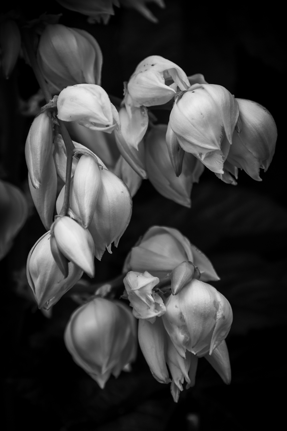
I really liked the soft defused light in the images I created and feel that it is the key that makes the photograph despite what I had originally planned. I was looking for the sunlight streaming through the tree to create drama of highlights and shadows that are in my water lily photographs. Instead I kept battling the high think clouds of the morning so I just went with it and ending up loving them more then what I had planned. Funny how that works.
If you love these or any images on my site feel free to contact me for a price quote on any size of print you want, as well as any questions you might have. I would love to talk to you. And if you have enjoyed this post or the images I have created, feel free to share I would appreciate it.
Catching Up
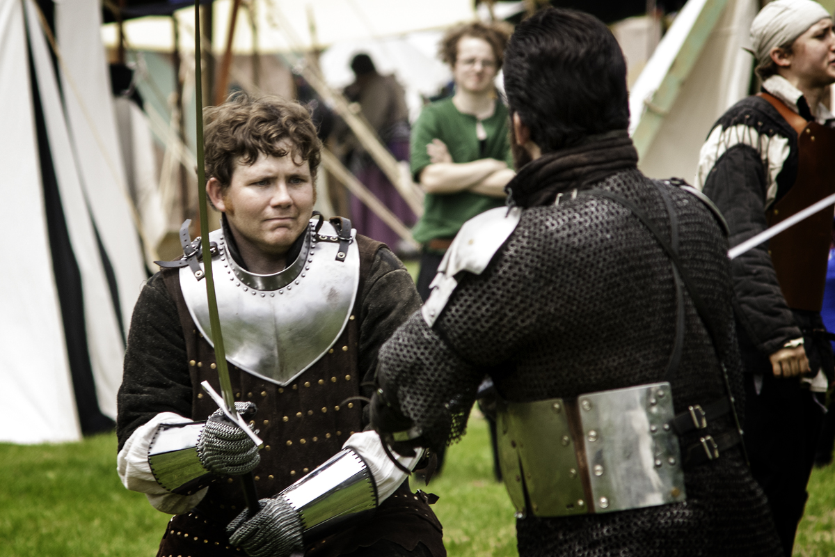
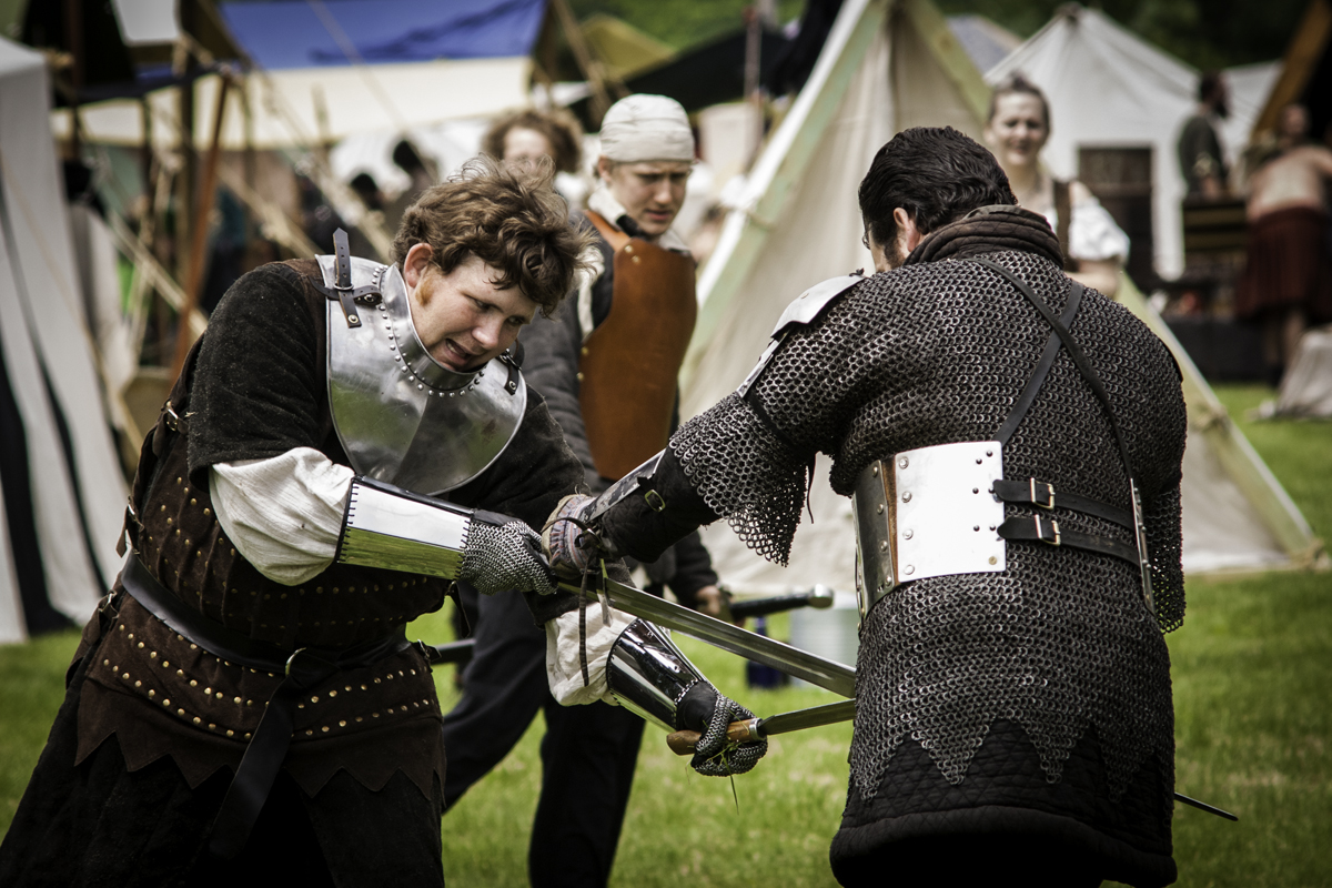
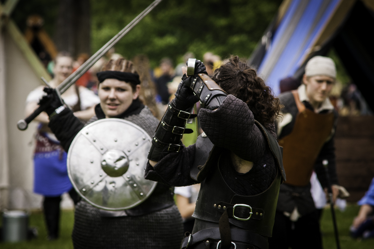
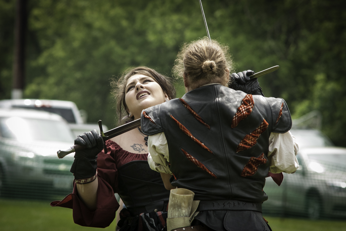
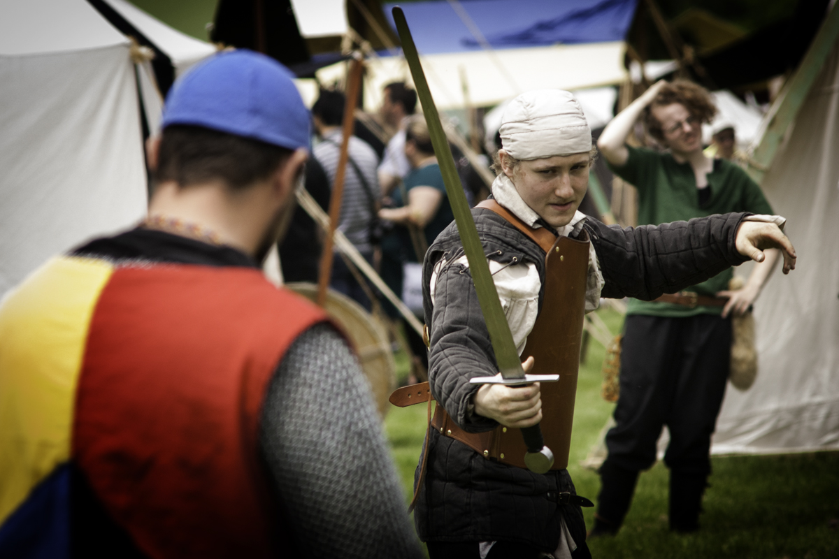
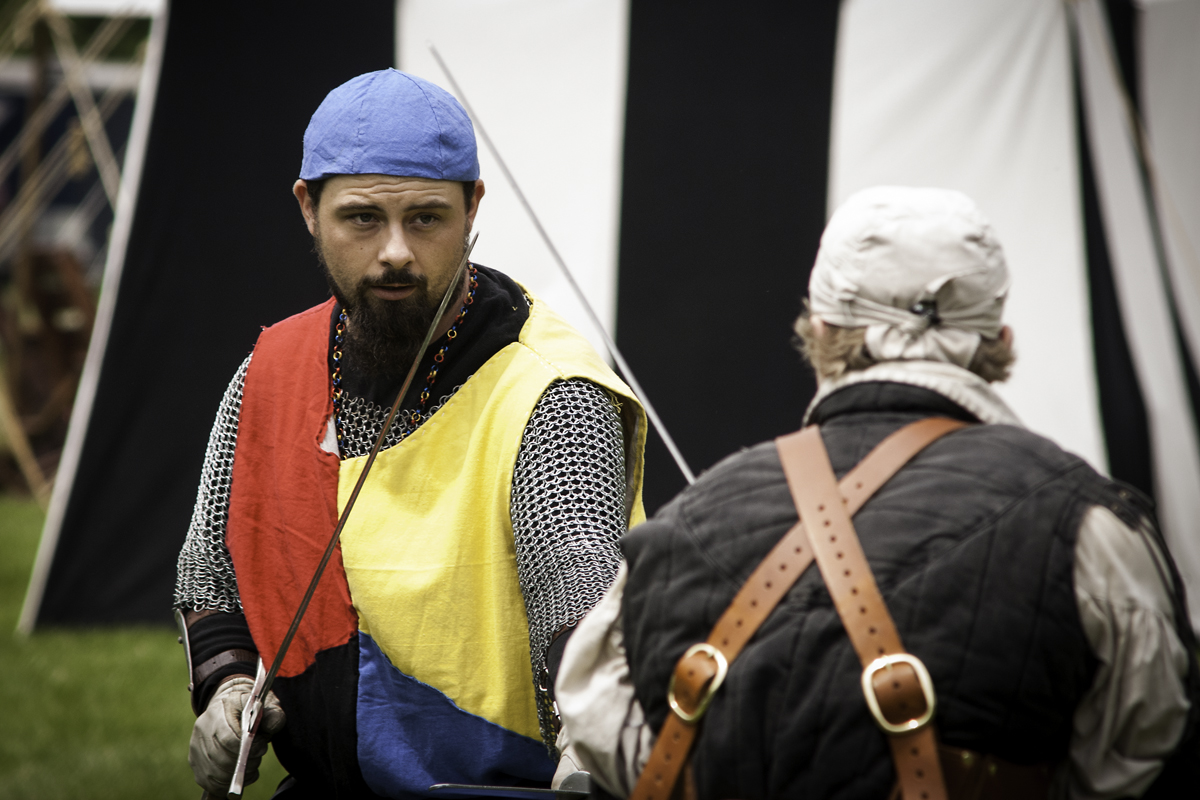
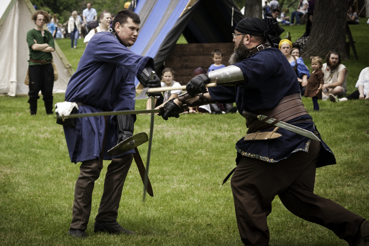
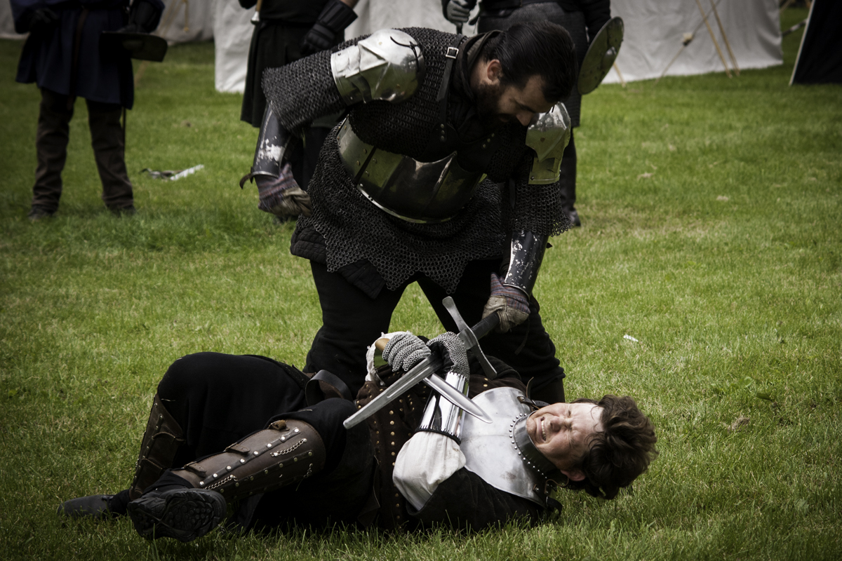
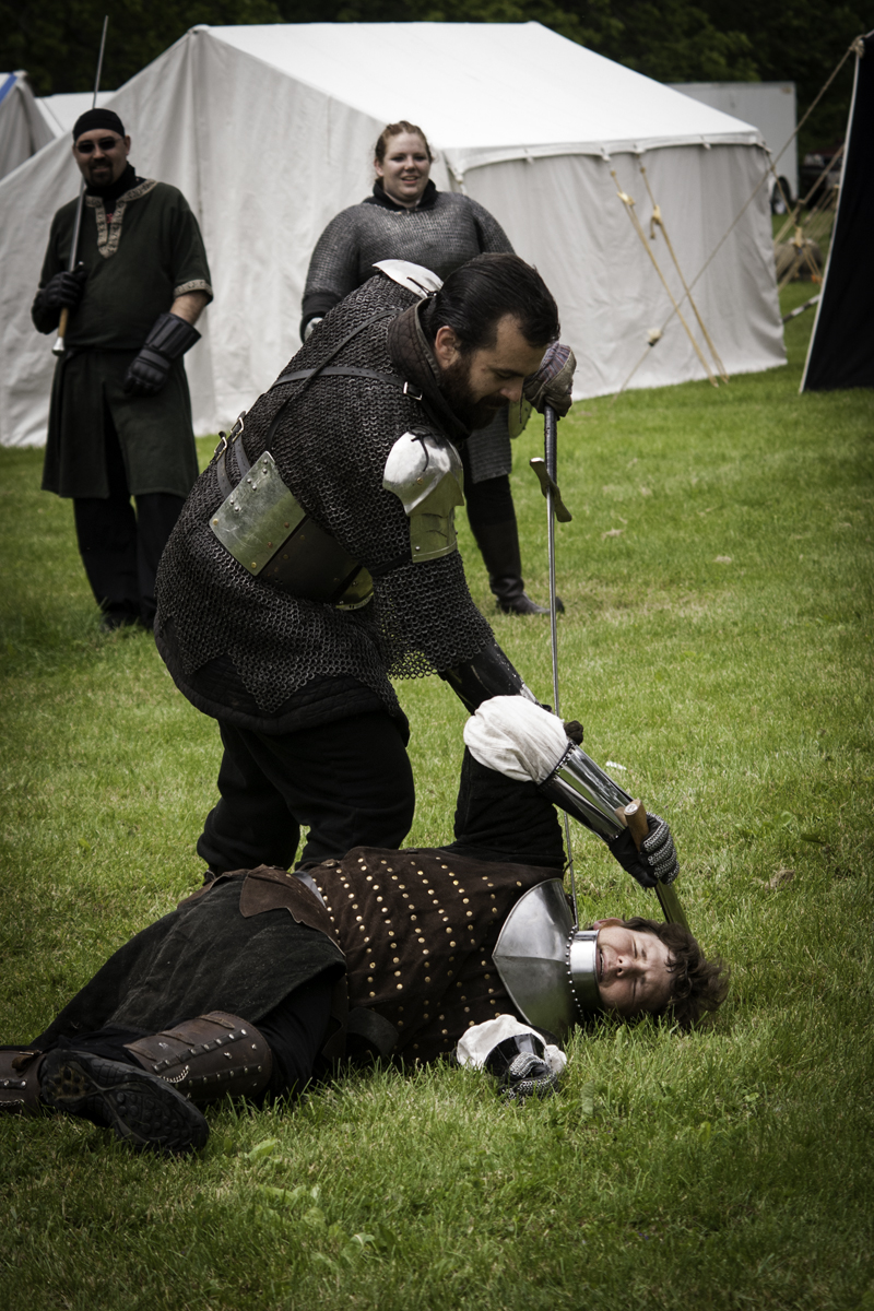
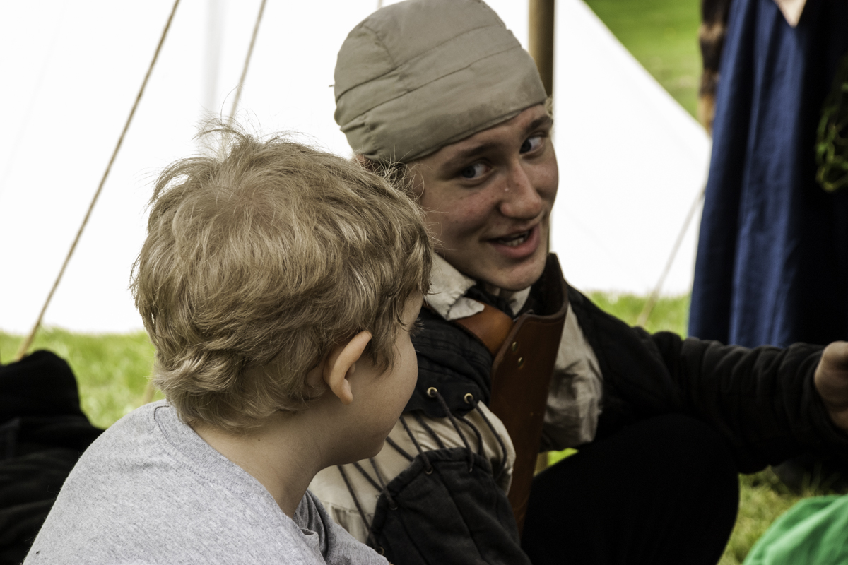
For the past several weeks I have been training, or should I say retraining at my new job. Unlike the group of lucky few photographers, I have not made my passion my fulltime vocation. So, I work as a phlebotomist at a local hospital to support my habit and pay my bills. I started in April and after a couple of months I am now on a solid schedule of 4-10 hour days with having to work every 3rd weekend. My goal is to build my photography up so that I can work part time in a few years. In-between my training I have taken photographs of my son and his Renaissance group at the annual fair, a car show and wedding.
The Renaissance fair was such fun to photograph and surprisingly, the photos turned out better than I had hoped. I usually use a kit lens but this time I wiped out my 70-210 F4 E series Nikon lens. It’s a step between the Nikor lens and a Kit lens. Oh, and did I mention it was a manual lens so yeah that made a little more work for me. I was pleasantly surprised that I did not miss a lot of shots due to soft focus, in fact that lens was better than any of my new lenses I have. It’s the glass I tell you that helps make the shot. Here are a few of my favorite shots. The last few shots were of another troop that my son is not apart of, I just enjoyed their group. And yes those are real and they do fight with swords, javelins and knives.


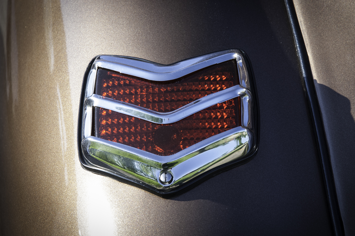
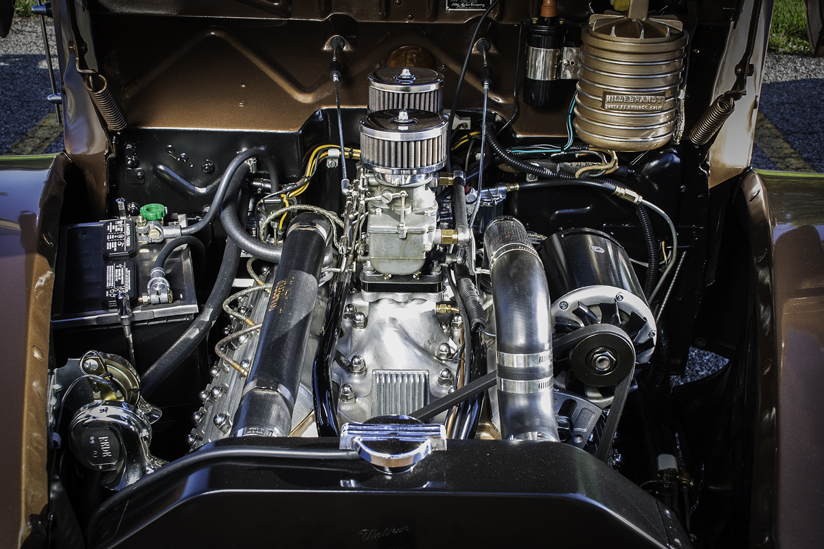
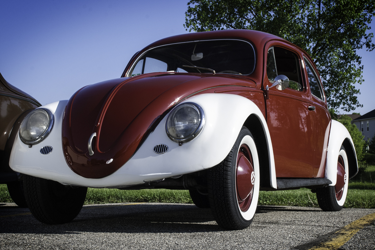
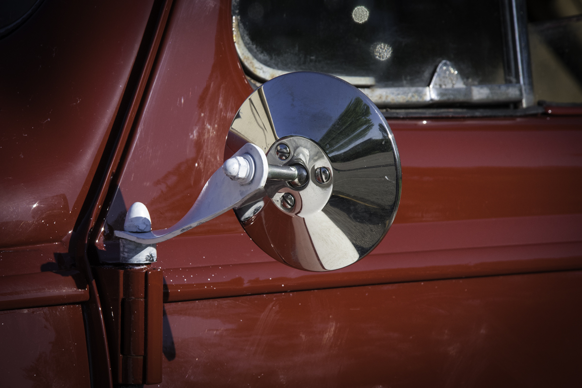
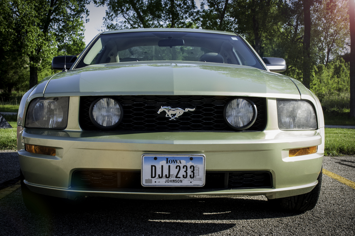
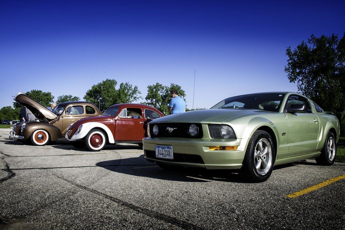
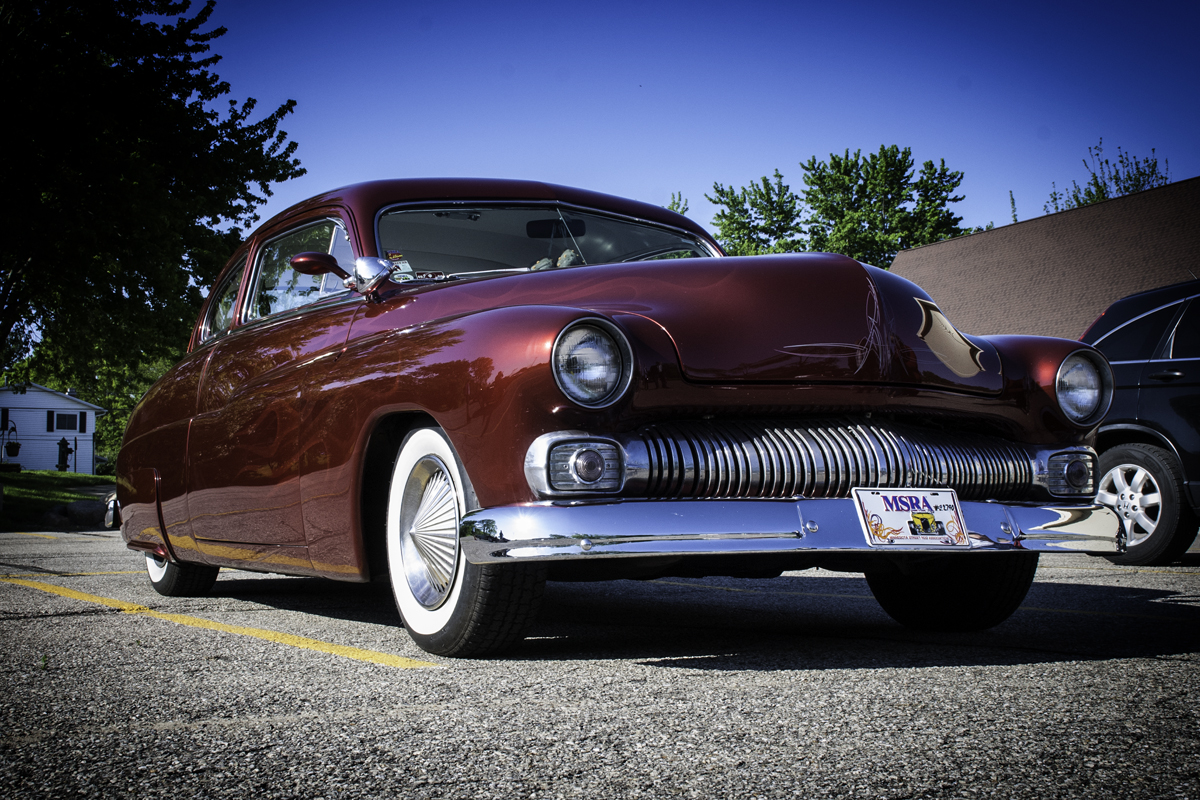
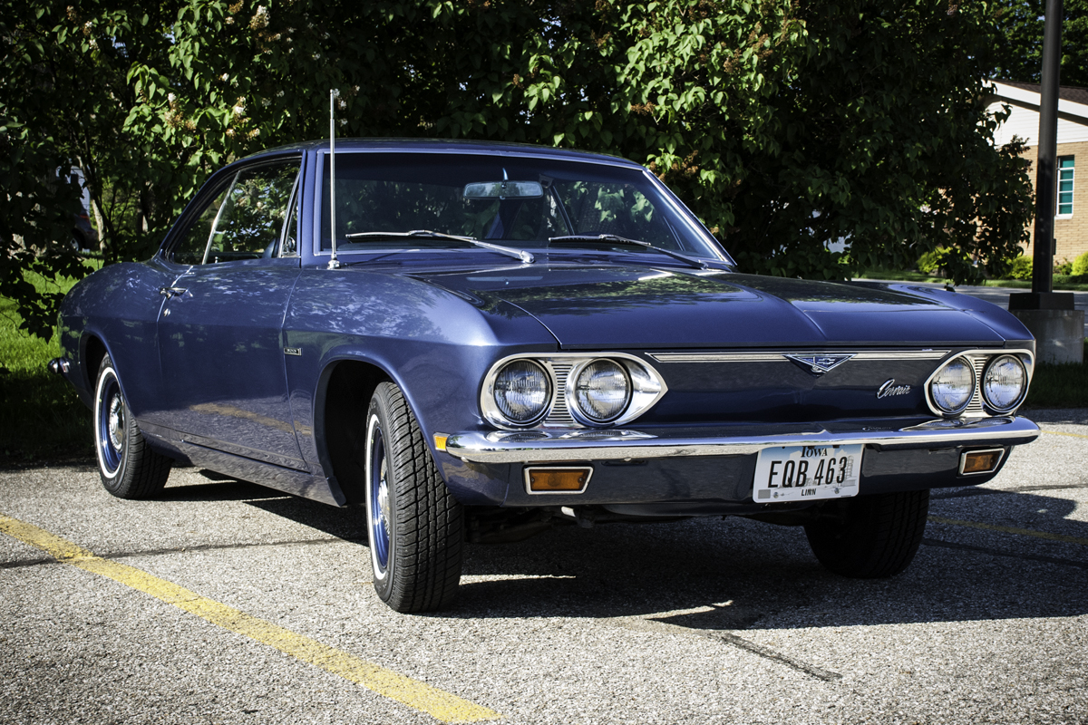
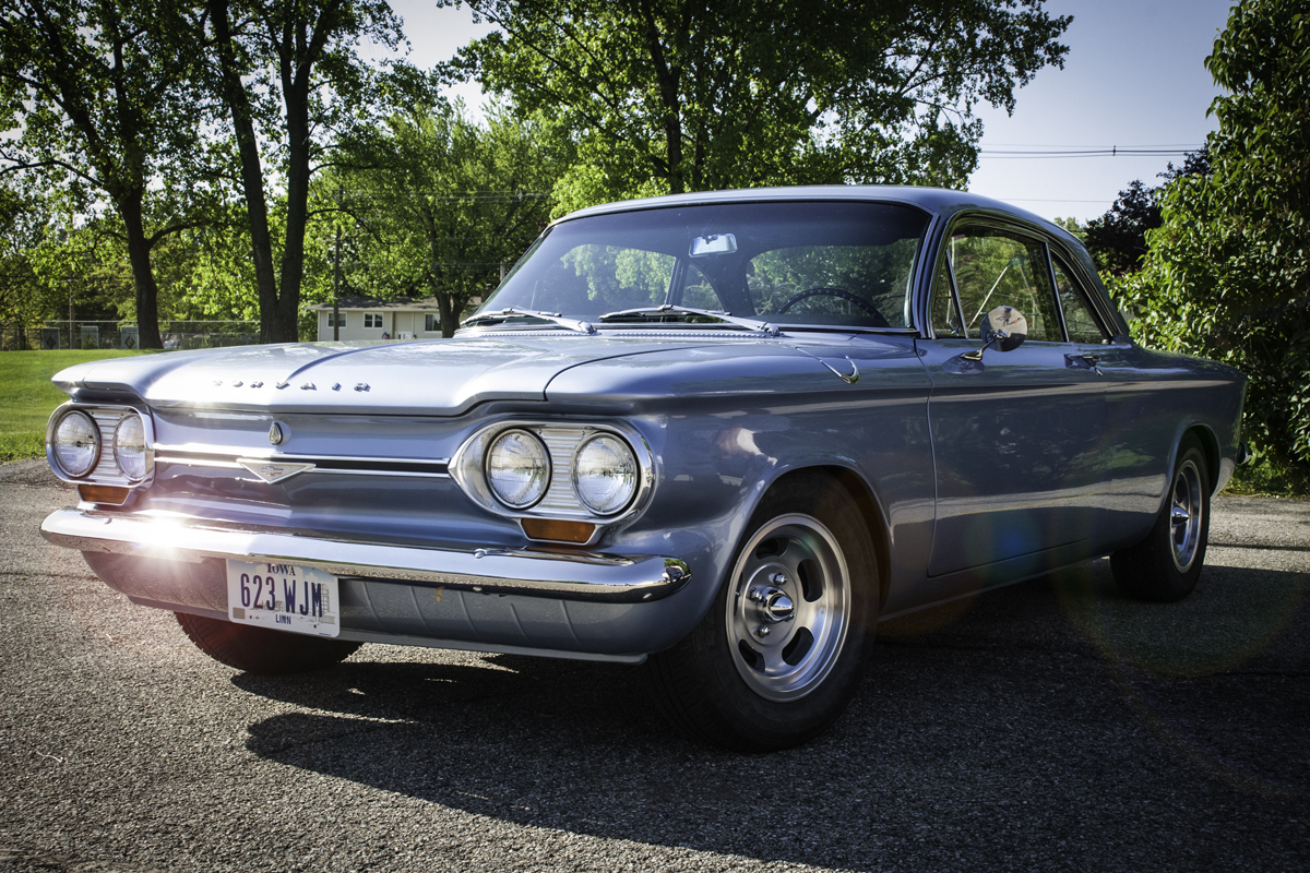
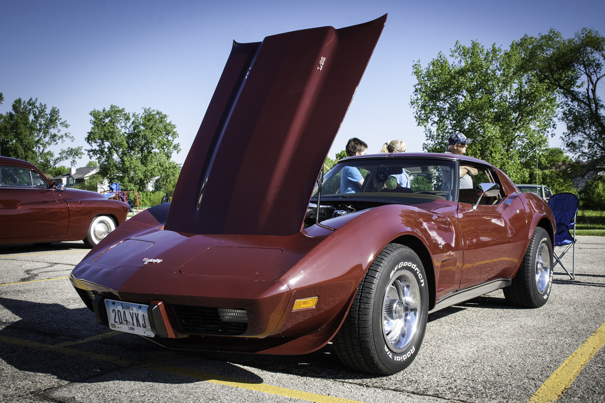
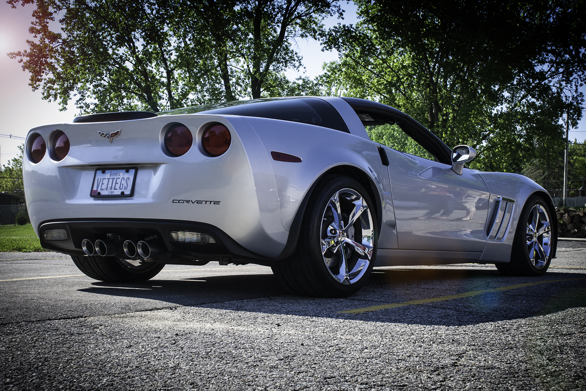
The car show was put on by my church and held in their parking lot. It wasn’t scheduled that way but because of small city council issues it was moved to that space. Which was ok because we wanted great cars to look at and to show off our church as well. The quantity of cars on display was small but the quality was amazing. Some of them were late to arrive and consequently I did not get to photograph them, I was sick that whole weekend and still suffering some effects.


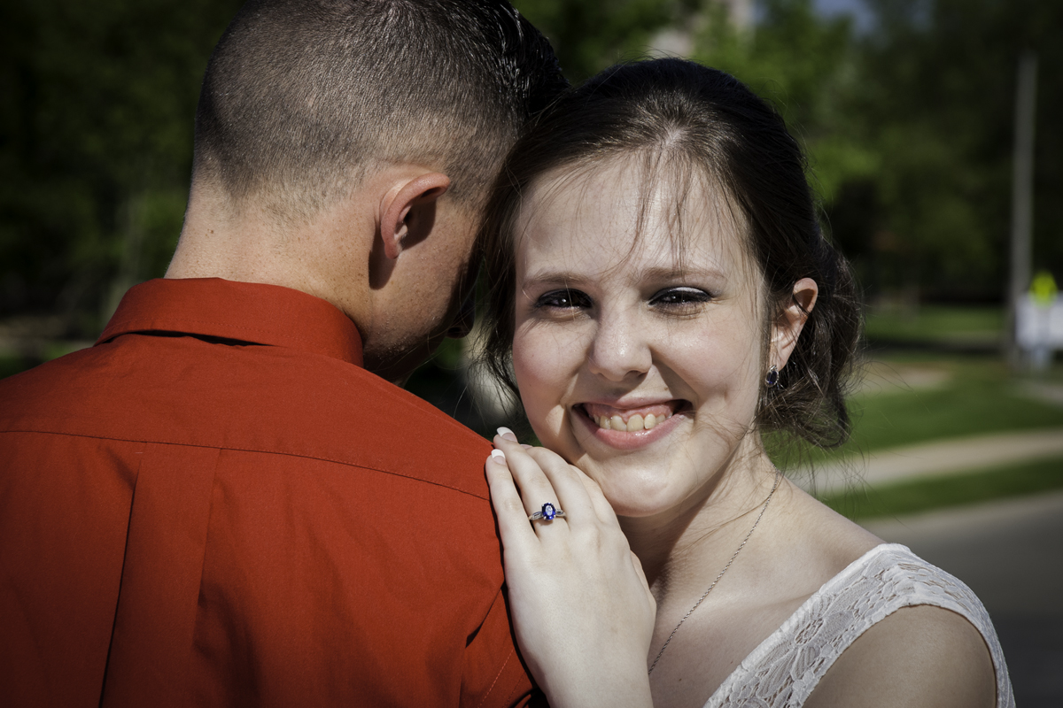
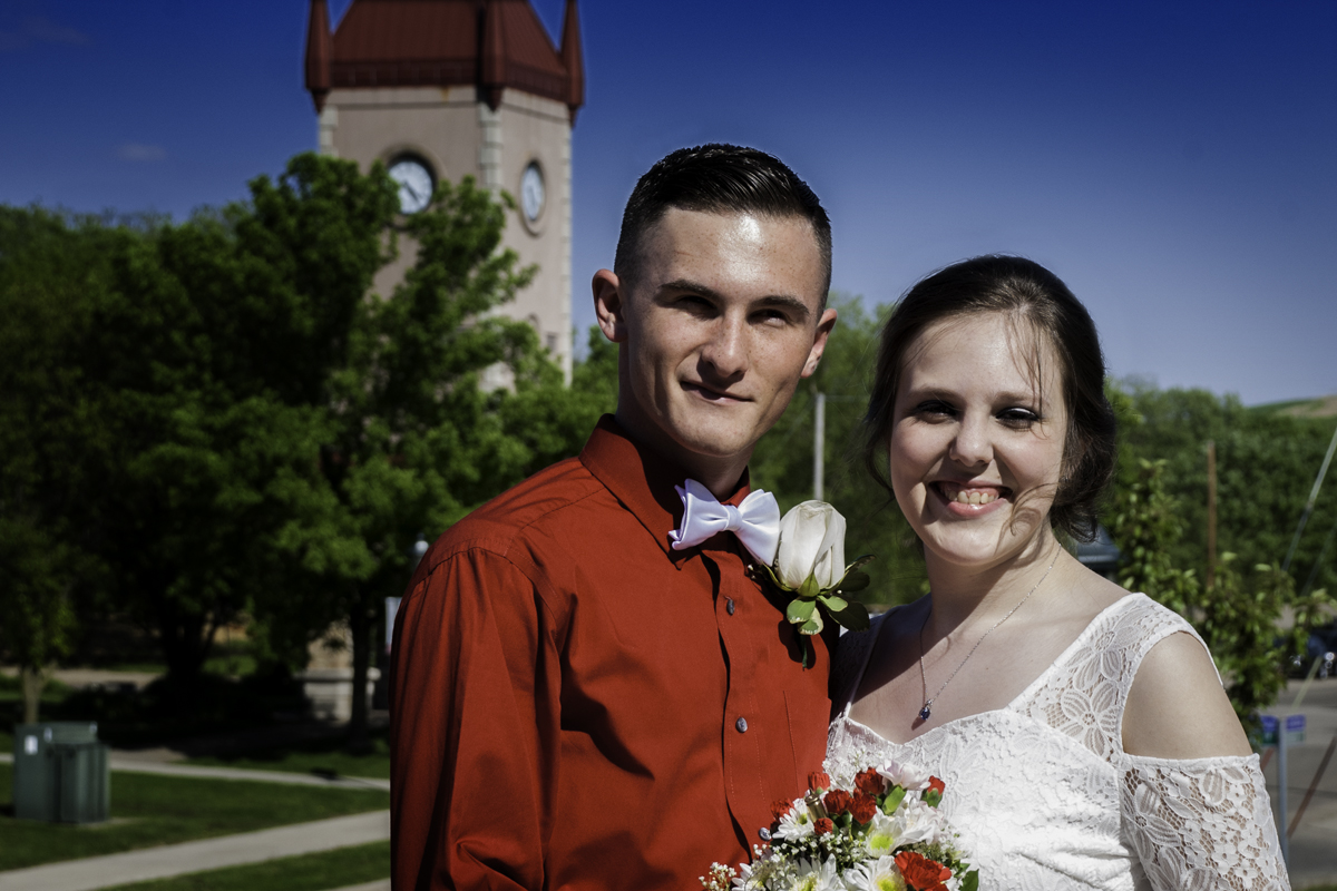
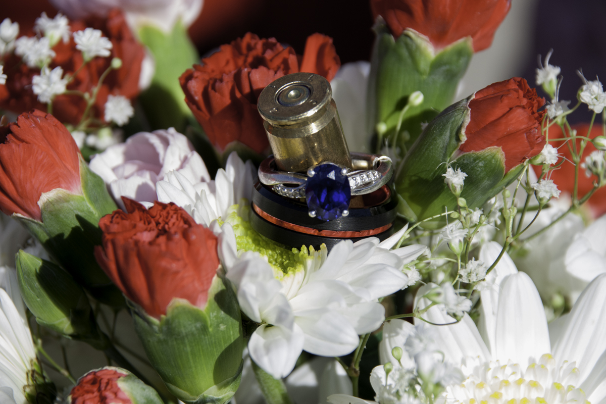
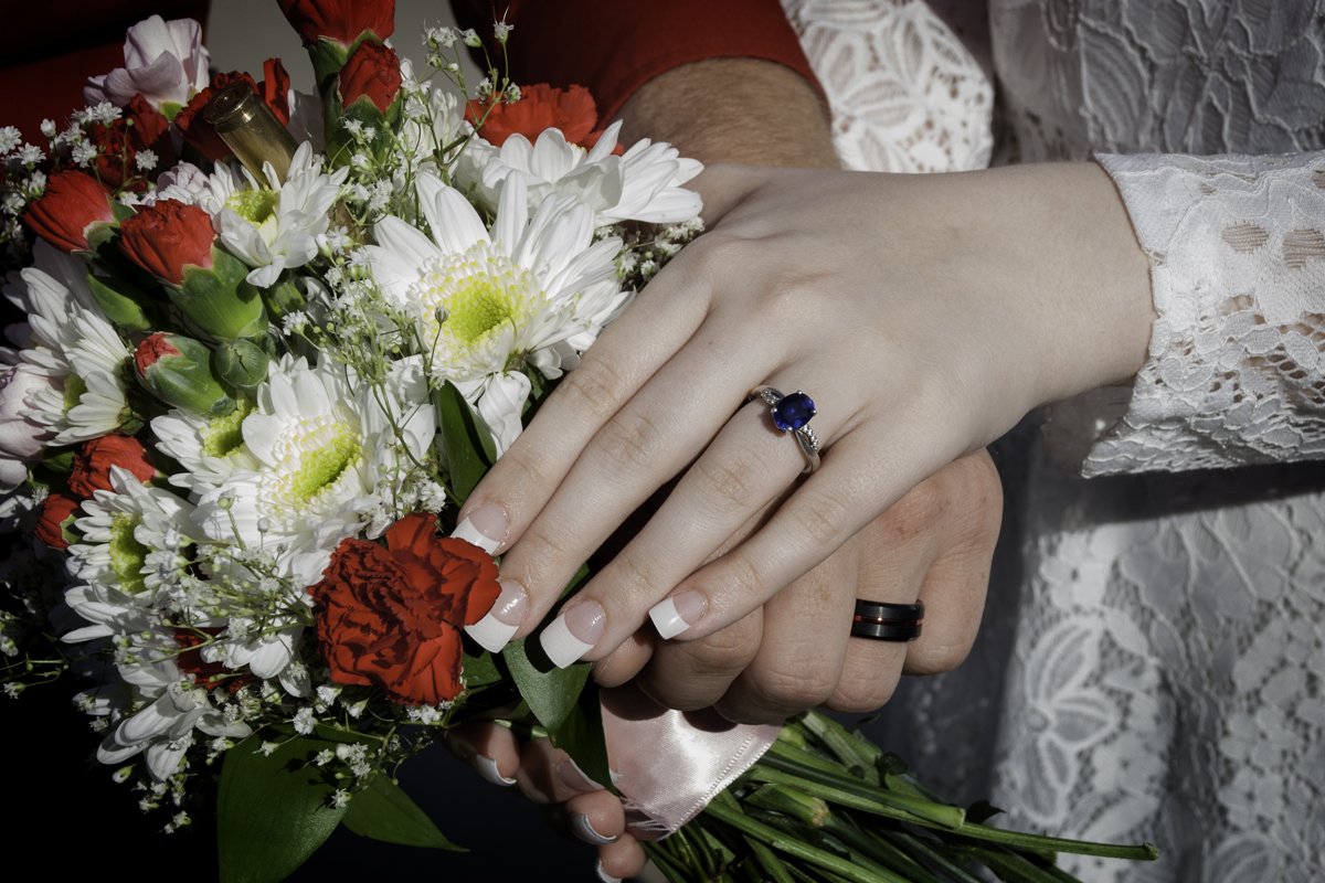
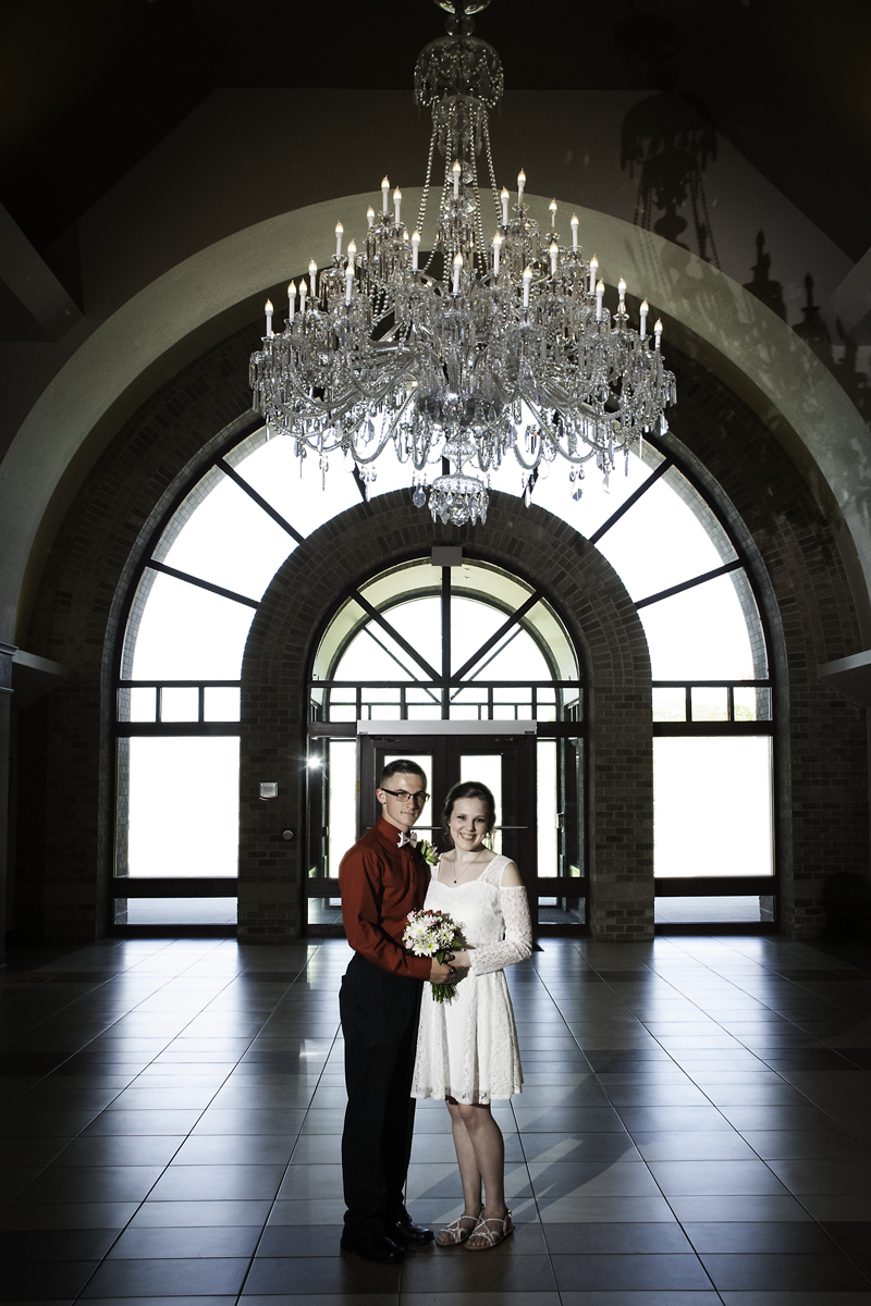
That same day was my niece’s wedding. Nothing big, just us and her family. It was held at our Czech Museum here in town. It was hard to believe she had grown up and was moving to the east coast. For a small wedding, it was very lovely.
I have a few images planned for the weekend and going to work on them as well as getting my stuff together for submitting to the first hand full of galleries not to mention get a print of a lily on water color paper. Its time to get back to work.
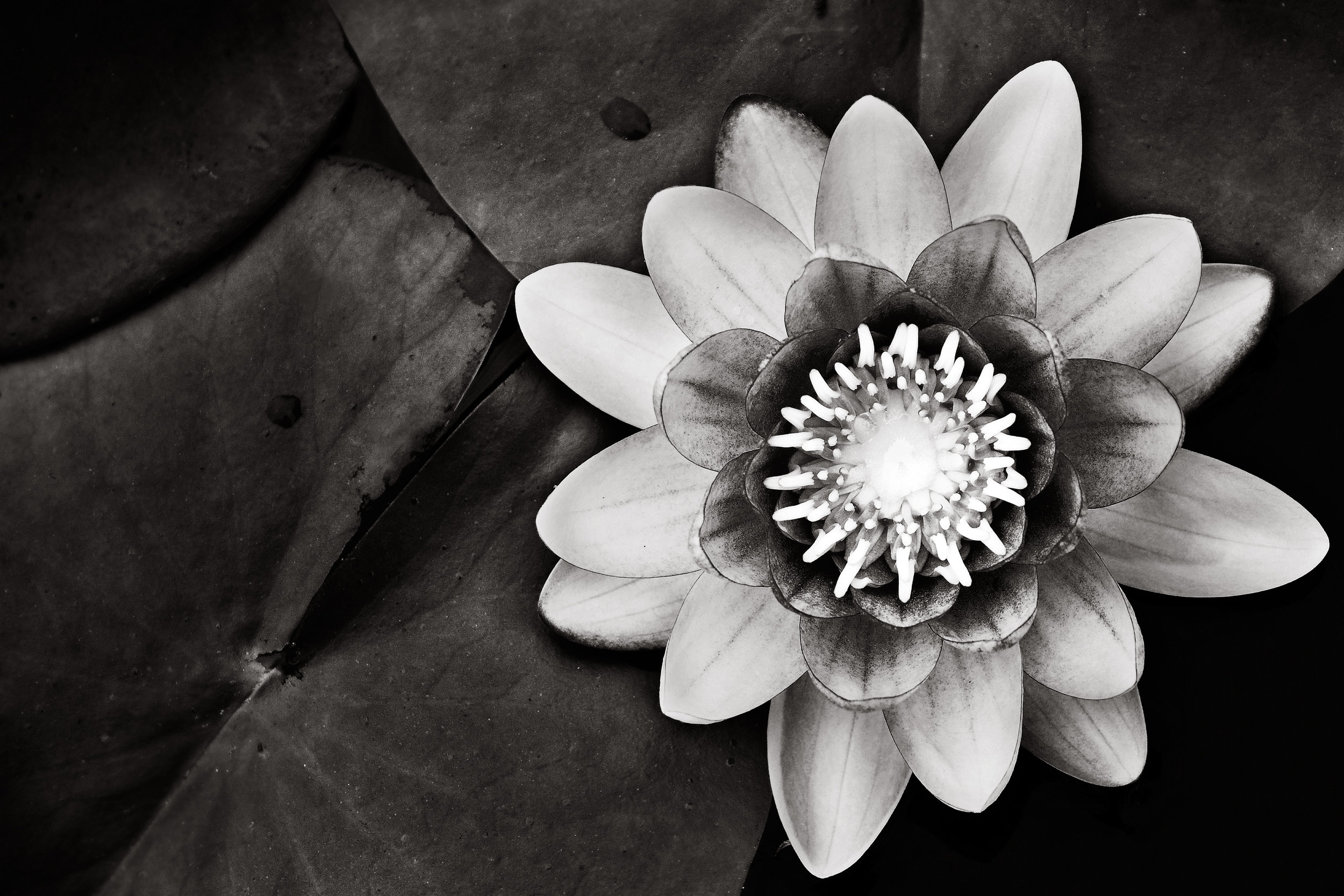
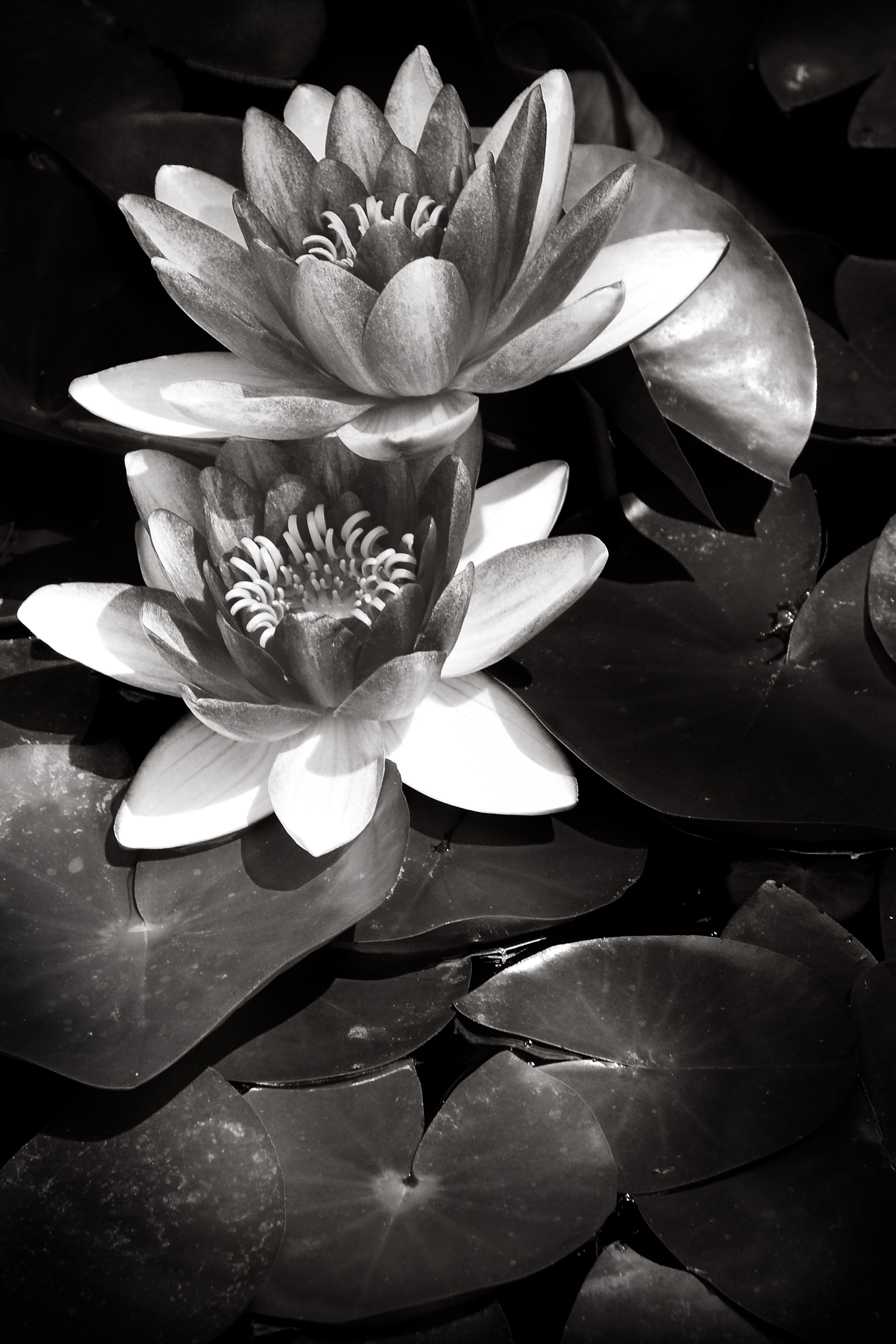
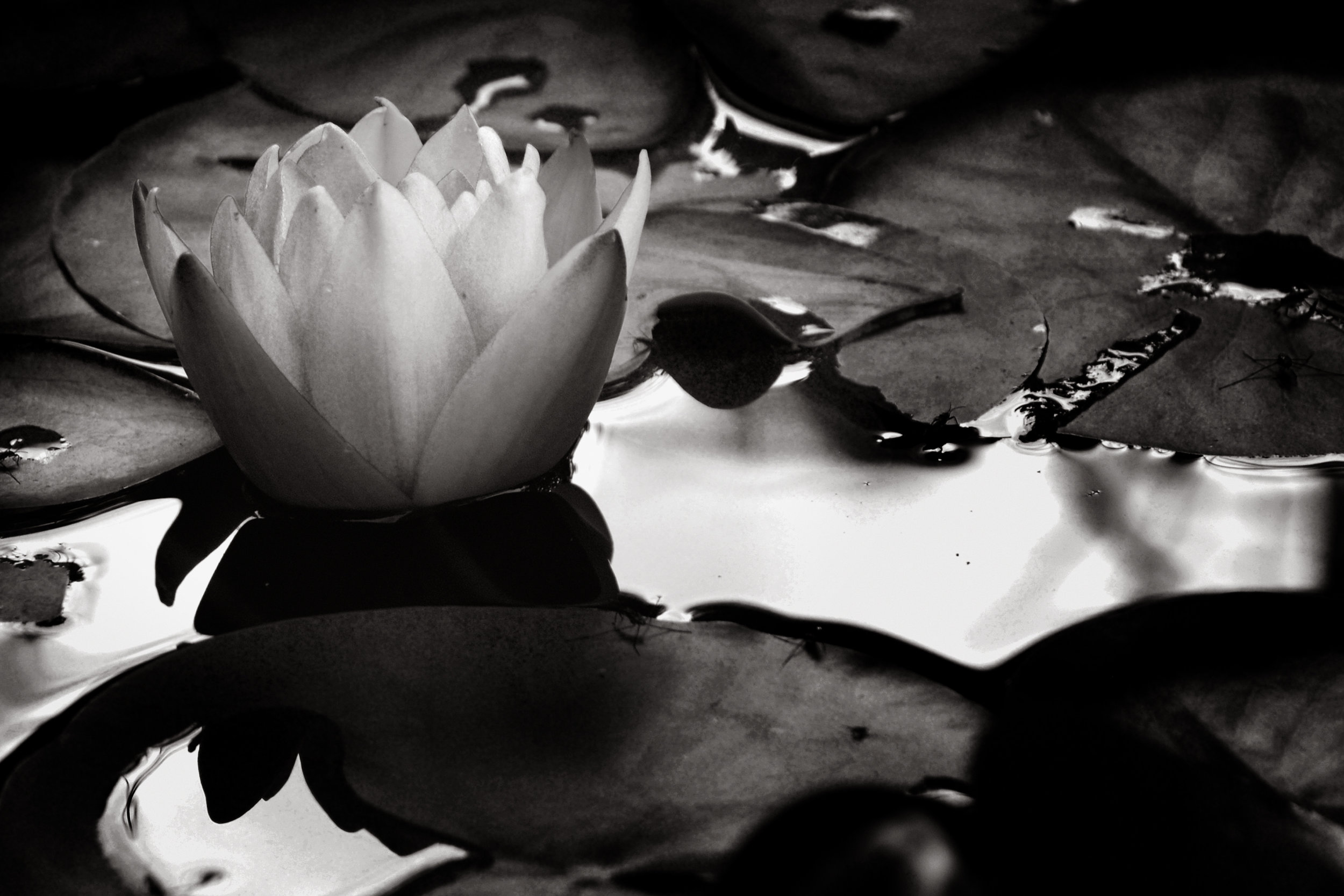
Waterlily #7
Most of my photographic life I have been told, “if you want to be shown choose any subject other than pets and flowers.” It seems that you are not taken seriously as an artist if you create images of flowers or pets. I don’t believe that to be true for the most part. Take, for instance, Van Gogh’s Sunflowers, Bouquet of Sunflowers by Claude Monet or Tuft of Cowslips by Albrecht Durer. A small portion of larger number of artist that at one time or another had flowers as a subject in their portfolio. “That’s paintings, what about photographs by famous photographers?” you might say. That one was a little tougher but here is what I found. Ansel Adams Rose on Driftwood, Imogen Cunningham Callla Lilly and Edward Weston Succulent. Three of the many photographers who had flowers as a subject matter. Some of these prints are still sought after by collectors today. So why are flowers as subjects of images so frowned upon? I think it is because it is so hard to create an image that, done well, is art whereas it’s very easy to create an image that can be labeled as trite.
If you look at what someone like Edward, or Imogen did you would see it, the flower, is a study of form and shape as well as how light defines that image. The drama of the greyscale and details the or comparison to a relating subject. It is study, an investigation of the subject to get a better understanding of how we feel or how it relates to us and our world. Now most of what I had seen for these three artists have been in black and white, not color. Color, for me, of a flower is a given is part of the subject that we all see form the start. Viewing the subject in black and white forces you to deal with the subject on a light and dark, shape and texture without the bias of the emotion of color. Take color out of the equation of any photograph and if you still have an image that grabs you then you a sound photograph.
Where flowers become trite is when the subject is treated as a sunset, all color with no real thought about form, shape, light or composition. A snapshot an afterthought that caught the photographers eye so they decided to take it. Then after a quick post processing show around to friends and say “ Look how pretty the colors are.” This, I believe, is why the flower as a subject gets such a bad rap. The total disregard of the subject by so many people that the subject of a flower is tarnished for many people.
With that said I have a study of my waterlilies that I created over a summer season. These were in my pod that received shading from a large tree which created interesting patterns of light. I studied the light and how the shadows would fall on the flowers and when I found an interesting pattern I began to shoot. As spectacular as the color of the flower is, I found the images worked so well in black and white because of how the light played on the flower, leaves and pond.
I will be working on the rest of the photos taking them form color to black and white. I will have a set or a subset of color images only. I will also add more to this group as the season begins.
If you like these my images feel free to explore the rest of my webpage or check out my blog post on the side. Feel free to send me any comment or question you have or share my work with a friend that you’d believe would enjoy it. Thanks.
Door #72
Doors as a subject matter doesn’t sound like much of an interesting subject matter but for me the old building doors around town fascinate me. Old as in the buildings of the 20’s and 30’s because the designer of the building incorporated the door to the design, unlike today. Today’s buildings seem to treat the door as an afterthought or something to hide. Today’s doors are just a pane of glass with a handle and words painted on it, or it is glass framed in a metal sleeve. A cold barrier that is relative unimpressive and uninviting.
Looking at the buildings of the era you can see that the door is something that was thoughtfully designed to accent the building. A door way is a place that greets visitors, to prepare them for the wonders of the design of the inside and the object that announces you to the outside. A door is functional keeping the weather out but a door should incorporate the design of the whole building. A door is more that its name implies.
The Matyk Building Door is set in, giving you the feel of being in the space without being truly in. The welcoming being closer to the inside, the shelter of the space from the weather gives the space warmth. This accented by the plants, which are dead, and the glow of the gas light above and the wood. The wood that gives life and character of the door. Wood is warm, life and a welcoming feeling to the space to the house. I believe no matter what the rest of the building is made from, a wooden door will always warm you before you go into the house and that is how it should be.
The exit door from the TCR Building has that quality as well. The doors have that feeling of the warmth of the inside sheltering us announcing us to the world. What this space says to me, “Thanks for coming, we have enjoyed you but now the story is over and it’s time for a new story somewhere else.” That sounds funny but to me that is what a good exit door should be.
Doors, there is a lot of them around town that I will be photographing because I believe in some way they are a part of our town visually and metaphorically.

The Matyk Building Door. The plants are long past dead but still gives life to the space.

The TCR Exit Doors. This space is a warm thoughtful exit out to the world that says to "thanks and comeback again."
Lamp #1
Despite the gloomy skies, I made my way downtown and began my photographic journey creating images of Cedar Rapids. Because the grey flatness of the sky I looked for subjects that did not depend on it to be enhanced. I headed to the Iowa Bank Building to see if I could create an image using the street lamps and building. As I passed this building I have often felt the arches are something you see in a bigger metropolitan city in the financial district. The street lamps seem to compliment that feeling when you see them next to or visually placed on the building. That is what I am after.
The one side, 3rd Street sidewalk, has construction going making it impossible to create an image without a lot of clutter. So, I opted for the 2nd avenue sidewalk and created this image. I had shot many angles but felt that I created close to what I wanted to create on the other sidewalk.
What draws me to this building and why I created this image is the fact it looks like a building for a bigger town. It was built in the 20’s when the money was flowing and big and important was the design of the financial institutions. There are a few buildings in town that were built at the same time but do not have the arches and windows this does. The arches give it that step up. I have often wanted to photograph just the arches but at this point I can’t get at the same level as they are to create the image.
The other part of this building I find fascinating is the columns that are currently being covered up by the construction work. They too have that big city look to them and I have often wanted to photograph them as people walk by them. And being in a small town the foot traffic is not that heavy. I think I would have a harder time finding to one or three people walking by them at the right time than having too many people in the shot.
I plan to make more images of this building and the street lamps through this project. I believe I have a taste of what I am looking for but not it entirely. Once the construction clears away I will create images of both the street lamps and arches along with the columns.

Guaranty Bank Building
This image is a great example of how lines both direct and indirect can move one’s eye through a composition.
This image is of the Guaranty Bank Building, one of the oldest buildings in Cedar Rapids. I created this photograph about 5 or so years back while a friend of mine, Johnny B, and I were on a photo walk. It was created about sun set on a warm summer day. I was across the street when the warmth of the red of the bricks reflected the quality of light while everything on street level was growing dark. So, with camera on tripod I made a few exposures before the light disappeared.
This image is a great example of how lines both direct and indirect can move one’s eye through a composition. Direct lines that show up due to the ledges and the shadow cast by them move the eye from the bottom left to the top right. The indirect lines are created by the darken windows and the perfect alignment of direction as the ledges. I believe adding to the ease of the eye traveling through the image is the fact the lighter end is on the left to the darker end on the right, the same way we read.
The movement up and down this photograph is done in much the same way with the windows moving the eye and the raised outcrop in the center helping. Again, the light has the ability to move your eye through the piece. With the brighter spot bordering the first and second third of the photograph, you eye is drawn to move to the darker right side.
Light does not only convey a mood but helps with the details of the building that is unique to its design. There are 4 truly visible window air conditioners that move from bottom left to top right which expose the two different window types, arched, and straight edged almost framed. Light also reviles the bands that seem to be holding the outcropped portion of the building. These raised pieces almost look like the tape that holds the outcrop on to the building. Finally, the highlights of the small reliefs that are in the shadowed side of the photograph.
Lastly the quality of the light captured along with the simple pattern give this piece a calming effect. This could hang on a wall and not get a lot of great attention but with the warm color your room would be a warm calm place away from the stresses of the day. I get a feeling of serenity and confidence that all will be well while you are here and when you leave.
Over all this was a piece that I at first did not give too much consideration to. In fact, it sat for some time before I decided to process it. Once I did I have enjoyed it as a background screen on my computer and phone. I could see this in a large print size, matted and framed hanging on a wall in my office or my Living room.
Side Track
Got a little side tracked in the photos I wanted to create. I was going to start working on my city project but an opportunity came up and I took it. The thing about photography is that you have to jump to get the images you want when they present themselves. Too many photographs missed when you think " I'll get it next time." Well too many times I thought that and next time never presented itself. So instead of going downtown, which given that it was St Patrick's Day I headed to the Hawkeye Wildlife Management Area and took photos.
The Iowa River is low and large tree stumps were visible and I felt that my opportunity was now or never. So an hour before sun set I arrived and headed to a spot I had seen from the road on my way to work. It was either going to be as good as it looked form the road or it wasn't. I had to risk it.
So with the wind blowing hard and no real clouds for reflected color of the sun set, I thought it best to do long exposures of the water against the tree stumps or rocks of the shore. I arrived at a group of stumps that look more like pier columns then tree stumps and got started. I knew that the motion of the water would make interesting shadows on the surface of water and give it an strange glassy smoke look to it. I wanted to create strong contrast without losing detail of some of the mind tones. Create a strong emotion through the line, grey scale, and motion of the water despite the subject matter.
After setting up I moved around the subject and picked a few angles to try. I kept the horizon out because it was too busy, too distracting for the image. After a few shots I arrived at this final image.
As I look at this image I see three lines; the first is the shore line, rough but distinct. Running parallel is the two columns of wood sticking out and tying them together are the two rocks between the two. The water came out great between the strange appearance the reflection and shadowed areas I couldn't have created this any better. My final processing really gave this image the weight it needed to convey the emotion I wanted from it.
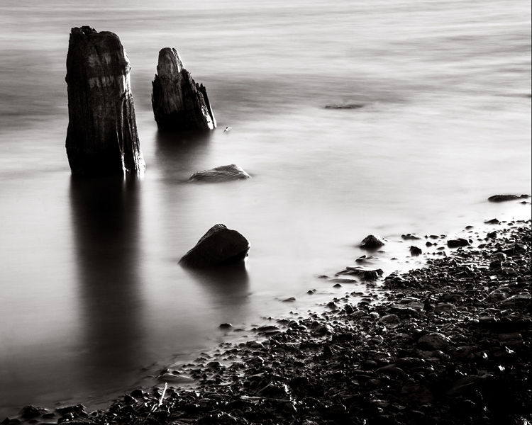
The second image of the shore line isn't as strong as the first but I believe that there is a lot going on. I processed this image in much the same way but I tried to give it layers of detail that the first image did not have.

Now that St Patrick weekend is over it should be safe to go downtown and explore for the images I want to create. Until then I would like to hear from you. What impressions does these images give you? Comment below and stay tuned for more.
Latest Blog Post
-
April 2024
- Apr 8, 2024 Eclipse Apr 8, 2024
- Apr 6, 2024 Building Lines Apr 6, 2024
- Apr 3, 2024 Selfie Apr 3, 2024
- Apr 2, 2024 Got nothing Apr 2, 2024
- Apr 1, 2024 Lines Apr 1, 2024
-
March 2024
- Mar 30, 2024 Equipment Mar 30, 2024
- Mar 29, 2024 Puppy treachery Mar 29, 2024
- Mar 28, 2024 Stairs Mar 28, 2024
- Mar 27, 2024 The Morning Downpour Mar 27, 2024
- Mar 25, 2024 Mulligan Mar 25, 2024
- Mar 24, 2024 Shovel Mar 24, 2024
- Mar 23, 2024 Doorways Mar 23, 2024
- Mar 22, 2024 Gnomes Mar 22, 2024
- Mar 21, 2024 Under The Bridge Mar 21, 2024
- Mar 20, 2024 Spring! Mar 20, 2024
-
April 2023
- Apr 8, 2023 Quick Start Apr 8, 2023
-
January 2023
- Jan 16, 2023 Another Year Jan 16, 2023
-
October 2022
- Oct 31, 2022 Invisible Sun Oct 31, 2022
-
April 2022
- Apr 8, 2022 Week One Apr 8, 2022
- Apr 1, 2022 Second Weekend Apr 1, 2022
-
March 2022
- Mar 25, 2022 Saturday Morning Fog Mar 25, 2022
- Mar 21, 2022 Friday Packup Mar 21, 2022
- Mar 14, 2022 First Reveal Mar 14, 2022
-
February 2022
- Feb 14, 2022 Starting Over Feb 14, 2022
-
July 2020
- Jul 24, 2020 Bikes I'd like to Buy Jul 24, 2020
-
May 2020
- May 1, 2020 What Time Has Done To My Photo May 1, 2020
-
April 2020
- Apr 20, 2020 What I`ve Done Apr 20, 2020
-
March 2020
- Mar 25, 2020 Covid19 #2 Mar 25, 2020
- Mar 23, 2020 We're Back Mar 23, 2020
-
February 2020
- Feb 19, 2020 The clean out Feb 19, 2020
- Feb 14, 2020 Going Silent Feb 14, 2020
-
January 2020
- Jan 13, 2020 Top 10 Photo of the Year Jan 13, 2020
- Jan 6, 2020 Top 5 Images Jan 6, 2020
-
December 2019
- Dec 7, 2019 Back Bone Odyssey 2019 Dec 7, 2019
-
October 2019
- Oct 4, 2019 Ailuro: Her Story Oct 4, 2019
-
September 2019
- Sep 19, 2019 I got Published! Sep 19, 2019
- Sep 12, 2019 The Next Fall Project Sep 12, 2019
- Sep 7, 2019 Video and Fall Sep 7, 2019
- Sep 3, 2019 The Print Shop Sep 3, 2019
-
July 2019
- Jul 23, 2019 A life’s End Jul 23, 2019
- Jul 19, 2019 Look No Farther Jul 19, 2019
- Jul 12, 2019 The Last Time Jul 12, 2019
- Jul 4, 2019 Happy Birthday Jul 4, 2019
-
January 2019
- Jan 19, 2019 Snow Day with Stella Jan 19, 2019
- Jan 4, 2019 12 Portraits of 2018 Jan 4, 2019
-
December 2018
- Dec 17, 2018 Still Here Dec 17, 2018
-
September 2018
- Sep 28, 2018 Morgan's Interview Sep 28, 2018
- Sep 27, 2018 The Stella Project Sep 27, 2018
- Sep 14, 2018 The Pet Show Sep 14, 2018
-
August 2018
- Aug 27, 2018 Stella Aug 27, 2018
- Aug 17, 2018 817 Aug 17, 2018
- Aug 3, 2018 Interview with Justin Tedford Aug 3, 2018
-
July 2018
- Jul 20, 2018 Parker's Senior Session Jul 20, 2018
- Jul 6, 2018 June Revisted Jul 6, 2018
-
June 2018
- Jun 15, 2018 "The Crow" Session Jun 15, 2018
- Jun 6, 2018 Water Lily Jun 6, 2018
-
May 2018
- May 31, 2018 Munchkin May 31, 2018
- May 24, 2018 Two Images That Relate May 24, 2018
- May 7, 2018 Landscape and Why May 7, 2018
- May 4, 2018 Great Portrait Session May 4, 2018
-
April 2018
- Apr 26, 2018 Vacation is Coming Apr 26, 2018
- Apr 25, 2018 Kepler State Park images Apr 25, 2018
- Apr 13, 2018 What's New? Apr 13, 2018
-
February 2018
- Feb 17, 2018 Food and Health Feb 17, 2018
-
January 2018
- Jan 2, 2018 Happy New Year Jan 2, 2018
-
November 2017
- Nov 16, 2017 Take Charge of Your Health Nov 16, 2017
- Nov 8, 2017 First 45 Day Review Nov 8, 2017
-
October 2017
- Oct 26, 2017 Day 34 Oct 26, 2017
- Oct 2, 2017 Day 10 Oct 2, 2017
- Oct 1, 2017 Day 9; The Winding Road Oct 1, 2017
-
September 2017
- Sep 30, 2017 Episode #7 Sep 30, 2017
-
August 2017
- Aug 26, 2017 The Solar Experience Aug 26, 2017
- Aug 12, 2017 Solar Eclipse Aug 12, 2017
- Aug 4, 2017 Aug 4, 2017
-
July 2017
- Jul 31, 2017 First Opening Jul 31, 2017
- Jul 28, 2017 Waterlily; Absent of Color Jul 28, 2017
- Jul 26, 2017 Yucca in Bloom #1 Jul 26, 2017
- Jul 21, 2017 Episode 4 Joel Sartore Jul 21, 2017
- Jul 19, 2017 Episode#3 Reflective Jul 19, 2017
- Jul 17, 2017 Episode#2; The Rant Jul 17, 2017
- Jul 15, 2017 Audiocast#1 Jul 15, 2017
- Jul 13, 2017 The other job Jul 13, 2017
- Jul 1, 2017 Not So Perfect Jul 1, 2017
-
June 2017
- Jun 28, 2017 My Favorite Image (for the moment) Jun 28, 2017
- Jun 24, 2017 Making of a Print #2 Jun 24, 2017
- Jun 22, 2017 Making of a Print Jun 22, 2017
- Jun 8, 2017 Catching Up Jun 8, 2017
-
May 2017
- May 15, 2017 Water Lilies May 15, 2017
- May 11, 2017 May 11, 2017
- May 8, 2017 CR Museum Gallery May 8, 2017
-
April 2017
- Apr 19, 2017 Waterlily #7 Apr 19, 2017
- Apr 12, 2017 Door #72 Apr 12, 2017
- Apr 10, 2017 Bill #1 Apr 10, 2017
- Apr 7, 2017 Lamp #1 Apr 7, 2017
- Apr 6, 2017 Frost #4-7-9 Apr 6, 2017
- Apr 5, 2017 Door Handle #5 Apr 5, 2017
-
March 2017
- Mar 31, 2017 Landscape #3 Mar 31, 2017
- Mar 27, 2017 Guaranty Bank Building Mar 27, 2017
- Mar 19, 2017 Side Track Mar 19, 2017
- Mar 18, 2017 New Project Mar 18, 2017
- Mar 14, 2017 Hardest thing to do... Mar 14, 2017
-
June 2016
- Jun 13, 2016 Triskaideka's Bithday Session Jun 13, 2016
-
May 2016
- May 26, 2016 Last Portrait May 26, 2016
- May 24, 2016 Lilly's Vet Day May 24, 2016
- May 11, 2016 Matt and Holly May 11, 2016
- May 9, 2016 Colin May 9, 2016
-
March 2016
- Mar 28, 2016 60 billion spent on Pets Mar 28, 2016
- Mar 26, 2016 Meet Holly and Matt Mar 26, 2016
- Mar 23, 2016 Wilson Mar 23, 2016
- Mar 21, 2016 Triskaideka's Spring Portraits Mar 21, 2016
- Mar 6, 2016 How is your head shot? Mar 6, 2016
- Mar 5, 2016 Morgann Mar 5, 2016
-
February 2016
- Feb 28, 2016 A Key to Great Portrait Outcomes Feb 28, 2016