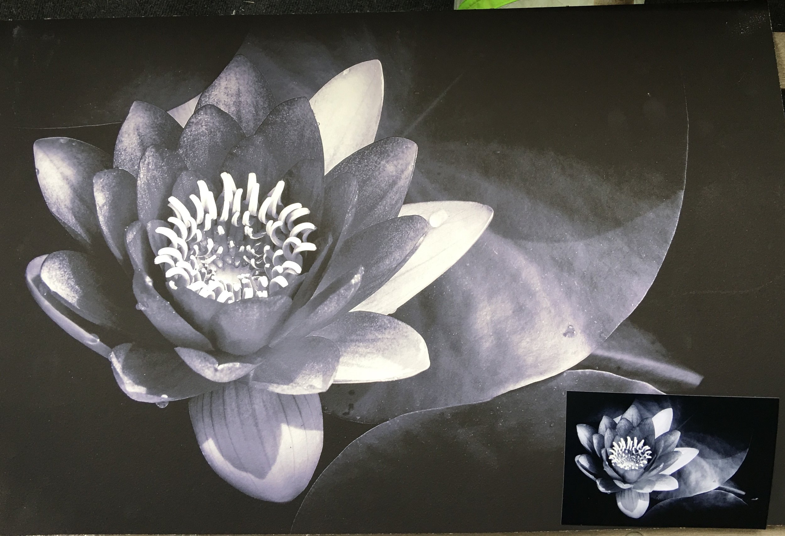
I felt that I needed to expand my previous post about making a print. I would like to say first that I have made many of my image into prints before but all of them were on photographic paper and not the watercolor paper. My favorite paper to print on is the Metallic Paper that Kodak produces. Talk about pop of rich colors and contrast. What I am inexperienced with is printing on different media of paper and inks and with the last image I learned I needed to do a little more research before committing to it.
So here is what I envisioned; I wanted this water lily printed on watercolor paper by an inkjet printer and have the look of a photograph. You know that pop of contrast of darks and lights. I wanted then to have ruff torn edges and then float it in a matte and frame it. I was excited about the image I selected and the proof was perfect in the look I wanted. A week after I dropped it off I picked it up and instead of being excited I was disappointed. It was not the printers fault. The image matches the proof but it did not have that pop I was looking for. And why? Because it is the medium I printed on. What I wanted this paper to do was not going to happen. My concept for the image was spot on but the reality was that what I wanted was not happing. All is for not. I will still matte this print and sell it because it is a great print even though it doesn’t fit my needs. I will just make this image as well as the rest on photographic paper matte and frame them as normal and maybe explore this paper for other images later.
In this digital age, it is very easy to make prints on almost any medium you want. But as easy as it is to print, it can and will go wrong if you don’t choose wisely. The myriad of surfaces, textures, papers and even metals can be overwhelming with all the possibilities they offer. I had mentioned the Metallic Paper earlier; that is a great paper to make your colors and contrast pop off the walls in almost any light but I wouldn’t use it for a portrait of a person. I am sure that the watercolor paper I chose for this project would be great for an image that is soft and low contrast. It just did not meet my expectation in which I falsely had. So, I guess one of the lessons I learned and want to pass on is that you must be careful about what you print on. Do your homework on your medium before you print in order to get what you want. And above all print your work! Which leads me to this next thought.
The digital age has hurt the art of photography by reducing the desire to print. It is so easy to create an image, work it in PhotoShop and put it on a social media site or two and wait for all to “love” it. Before social sites and digital images, we developed the film, worked the prints in the darkroom to then produce that image in quantities for our audience so they can hang it on their wall. Instead those walls are not at their home but their phone or Facebook page. And those walls are not just where art lives but family portraits hang there as well. Why? Is your family portrait not important enough to grace the walls of your home? I understand the need to carry their images of loved ones around. We have done this for ages but instead of phones it was in our wallets and billfolds. That still doesn’t explain why we don’t hang their images on our wall. Do we not love them enough? I wish I knew the answer.
In this age, many photographers are trying to be different by going back to film or doing tricky manipulations on the camera or in PhotoShop to set themselves apart from the rest. But not enough of us are printing our work. So here is a challenge I echo from a few others. Find an image you love, research the medium you would like to print it on and make a print. But don’t stop there you must matte and frame it to hang on your walls. It’s time to turn the tide of just having images on your phone and social media pages to having prints on your wall. And if your images do not move you to make a print of your best one then you are not making good images. When you have accomplished this task photograph it on your wall and post it on twitter with the tag #PrintingMyWork. I will look for it and post it on my page. Hell, all of us can retweet that to help spread the word. It’s time to start printing again.


